Quantcast
Channel: Fast Company
Viewing all 2823 articles
Browse latest View live

Meet The Chuck II, The First New Converse All Star Design In 100 Years

$
0
0

Released for the first time in 1917, the Converse Chuck Taylor All Star is an American design classic. The Chuck's canvas, star-blazoned silhouette isn't just iconic, it's sacrosanct, and for good reason: according to the company, All Star sales made up the "majority" of Converse's $1.7 billion in revenue in 2014. Yet today, for the first time in almost 100 years, Converse is finally unveiling an honest-to-god sequel to the Chuck Taylor All Star. Meet the Chuck II, a more premium pair of kicks that were designed from the ground-up with a simple mandate: "Let's obsess the Chuck."

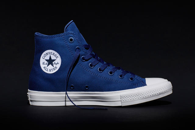
Although they sport a Rambo II style sequel number at the end, part of what makes the Chuck II so singular is they don't necessarily look like a new design. With a cursory glance, they could be mistaken for a regular set of kicks. Only when you examine the Chuck II more closely do the differences make themselves apparent. They're a little more premium, a little more luxe. The stitching is nicer. So is the canvas. Details like the All Star patch and the eyelets have a little more depth and dimension. The Chuck II is also slightly more comfortable to wear. But this isn't the futuristic Air McFly update you might expect from a brand that has abstained from updating its singular sneaker for almost a century. And that's very much by design.
An ex-Coca-Cola executive, Converse brand VP Geoff Cottrill knows there's an inherent risk in "improving" an iconic product. "You better believe New Coke came up in meetings," laughs Cottrill, referencing the consumer riot that was sparked in the 1980s when Coca-Cola, backed up by overwhelming data from blind taste-tests, had the temerity to change the formula of their soft drink. Almost 100 years old, the Chuck Taylor All Star is in many ways the Coca-Cola of sneakers. But if anything, the danger of alienating Converse's core consumer with thoughtless corporate tinkering is greater, because Converse's core consumer are creatives and artists, rockers and skateboarders, rebels and iconoclasts.

In many ways, Cottrill notes, these customers adopted the All Star against Converse's will: up until the 1980s, Converse was still trying to market the Chuck primarily as a sports shoe, even as musicians like The Ramones and Blondie were giving All Stars counterculture cred. What attracted them to the Chuck was the sneaker's authenticity. From a design perspective, the Chuck Taylor All Star is about as simple a sneaker as it's possible to make. It's basically just a canvas shell stitched to a rubber sole. The canvas sometimes changes colors, and it's sold as both a high-top and low-cut, but besides that, the design has virtually gone unchanged for 98 years. (Pro tip: You can primarily tell a vintage Chuck by the position of the ventilation holes, which have crept higher up away from the sole over the decades.)

From the kind of consumer attracted to the All Star's history, authenticity, and design simplicity, then, Converse has heard the same thing over the years: "Don't fuck with my Chucks." But they were also hearing some other rumblings. Maybe the Chuck Taylors could be a little more comfortable? A little easier to wear all day long? That's according to Converse All Star Brand VP/GM Richard Copcutt, who toured around England with bands with names like Axewound and Cancer Bats to gather firsthand market research on the Chuck II. "These guys don't necessarily want to step out in the same pair of sweaty, beaten-up, beer-soaked sneakers they performed in if they go out for some fun after the show," Copcutt says. "And they wear their Chucks hard, so they started asking if maybe there was a way to make an All Star that was a little easier on their feet."

"The brief was to change everything without changing anything," says Damion Silver, Converse's design director. At the company's new waterfront headquarters in Boston, he walks me through the Chuck II differences.

The biggest change is probably the footbed, which contains Lunarlon technology provided by Converse's parent company, Nike. A soft and resilient foam core that helps more evenly spread out impact, Lunarlon makes the Chuck II more comfortable than previous Chucks. An inner ultra suede lining also makes the Chuck II feel a little more luxurious than a standard All Star, which is supplemented by foam cushioning in the tongue and collar.

But most of the changes are in the detailing. Take the iconic All Star patch. An iron-on in the core Chuck Taylor, the Chuck II sport a woven version, nicer looking and less likely to wear down over time. The eyelets in the Chuck II are molded, creating a feeling of greater depth; same thing with the Converse heel patch, which now has three-dimensional letters, instead of just a painted-on logo. The canvas used in the Chuck II has a better hand feel than the original Chucks too.

While all of these little details add up to a big improvement in the feeling of comfort, quality and craftsmanship of the Chuck II, the iconic silhouette of the All Star is untouched. The Chuck II is still undeniably a pair of Chucks. They're just the slightly more stylish and comfortable pair of Chucks you might wear when you're stepping out. In fact, with a retail price just $20 more than a set of classic All Stars, Converse is hoping many Chuck fans will buy both.

Although redesigning a product is generally a sign that sales are flagging, that's not true in the case of the Chuck II. Converse's revenues have increased 10-fold since 2003, when Nike bought the company, saving it from bankruptcy. Instead, says Cottrill, the Chuck II is the result of a thought experiment within Converse, a company that has throughout most of its history chased basketball players and athletes as customers while ignoring the actual people buying their shoes. "We wanted to entertain the notion that maybe we don't know our customers as well as we think we do," Cottrill says. "That maybe they want more."

And if they do, and the Chuck II is a success, who knows? Maybe they'll be followed by a Chuck III, a Chuck IV, or a Chuck V. For his part, Cottrill's already got some ideas on what could come next. "People keep telling us they don't like to wear their Chucks when it rains," he slyly hints.

Available in black, white, red, and blue, the Converse Chuck Taylor All Star II's go on sale next Tuesday, July 28, at a suggested retail price of $70 for the Oxfords, or $75 for the high-tops.
Sign up to learn more about Fast Company's Innovation Festival in November

'); $form.parent('div').removeClass('error'); }; function _formFail ($form, error) { if (!$form) { return; } // Use message from server response var message = JSON.parse(error.responseText); if (message.response && message.response.message) { message = message.response.message; // Error message not provided } else { message = 'Please enter a valid email address.'; } var $parent = $form.parent('div'); // Remove other errors first var $errors = $parent.find('.alert-box'); if ($errors) { $errors.fadeOut(300, function() { $(this).remove(); }); } if (message && (message.code === -100)||(message.code === 220)) { message = 'Please enter a valid email address.'; } // Append new errors $form.parent('div').prepend('
' + message + '
'); $form.find('input').prop('disabled', false); }; }); })

When Handwriting Dies, Neural Networks Will Be The Only Calligraphers Left

$
0
0

In the digital age, proficiency with a keyboard is considered more important to a student's education than legible handwriting, leading some to despair that the art of writing by hand is going extinct. How ironic, then, that just as humans are throwing away their fountain pens, machines are picking them up?

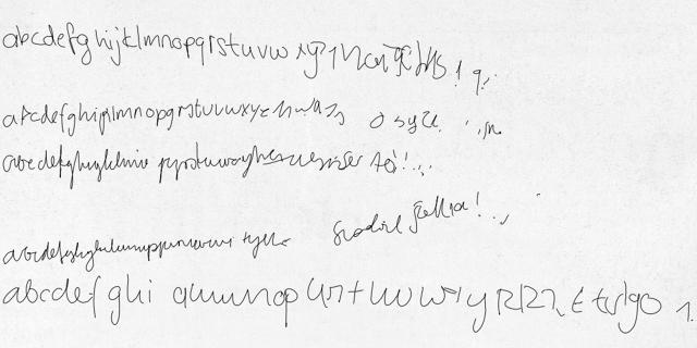
A new project by Alex Graves at the University of Toronto has successfully taught a neural network how to write by hand. Well, not by hand, I guess—neural networks don't have appendages. (Yet.) And the "ink" is still just a generated image. But the text outputted by Graves's neural network looks like it was written by hand, and that's the point.

If you the official project page, you can test out Graves's Neural Network Handwriting Generator for yourself. Just type in some text, select a style, adjust the bias (essentially making the sample more or less legible), and so on. It's pretty neat, considering the fact that this isn't just a computer outputting text in a pre-rendered cursive font. It's actually developing its own handwriting style on the fly from scratch.

How does it do that? Just like Google's Deep Dream AI, which sees the whole world in terms of hallucinogenic dog faces. They're both neural networks, which means they simulate the way the human brain works by "firing" up a computer core in the same way the brain fires up a cluster of neurons. By training a neural network on a robust dataset, then initiating a predictive feedback loop, you can program it to 'generate'seemingly original art.

Graves's neural network has been trained on the IAM Online Handwriting Database. This allows it to 'predict' how any given character is usually drawn by hand, point by point: tell it you want an 'r' and it'll abstract all the r's it knows into a single glyph. Feed that glyph back into the neural network enough times, and pretty soon, the machine has generated its own idiosyncratic handwriting style.

It's pretty cool stuff that makes me wonder when we'll start seeing our first neural network designed fonts. (Perhaps they could even be iterated in real-time, right on your own computer.) In the meantime, Graves's neural network ought to be interesting to computer science lovers, and of particular interest to would-be kidnappers drafting a ransom note.

Sign up to learn more about Fast Company's Innovation Festival in November

'); $form.parent('div').removeClass('error'); }; function _formFail ($form, error) { if (!$form) { return; } // Use message from server response var message = JSON.parse(error.responseText); if (message.response && message.response.message) { message = message.response.message; // Error message not provided } else { message = 'Please enter a valid email address.'; } var $parent = $form.parent('div'); // Remove other errors first var $errors = $parent.find('.alert-box'); if ($errors) { $errors.fadeOut(300, function() { $(this).remove(); }); } if (message && (message.code === -100)||(message.code === 220)) { message = 'Please enter a valid email address.'; } // Append new errors $form.parent('div').prepend('
' + message + '
'); $form.find('input').prop('disabled', false); }; }); })

This Beautiful iPhone Game Is All About Bonsai On An Alien World

$
0
0

Bonsai seems like a slow-paced subject for a great video game, but Prune might be the best designed iOS game to come around since Monument Valley: a lovely, serene, and haunting puzzler about bonsai on an alien planet.

In Prune, you need to guide a tree as it grows from the shadowy floor of an abstract world. The goal of every level is for the tree to grow to a sufficient height for it to flower and spread its seeds. Each branch of the tree reduces the possible height it can grow to, so in order to guide the tree's path and make sure it flowers, you need to prune it as it grows, tracing a finger across the limbs you want to excise.

It seems simple and gentle enough, but over the course of dozens of levels, Prune consistently ratchets up the difficulty: later levels, for example, introduce the concept of pollination, so you need to string trees together. Other gameplay elements include giant red orbs that will poison your tree if they touch them. The simple silhouette art seems like it was just plucked off a Japanese silk screen, while the chill, ambient music makes even the most frantic bonsai session seem relaxing.

What makes Prune even more special, though, is what a departure its subject is for the game's designer. Joel McDonald has been a fixture of the FPS gaming scene for years: after programming the classic Quake 4 map, Placebo Effect, he went on to work on the Call of Duty series, among others. It feels like in another world, Prune could have been about a far gorier and less imaginative form of amputation.

"Don't get me wrong, I love shooters, and grew up on Quake," McDonald told the Verge. "But working on first-person shooters for so long is like only eating oatmeal for breakfast, lunch, and dinner. Oatmeal can be pretty darn tasty, but sometimes you just want some huevos rancheros, y'know? Prune is my huevos rancheros."

You can download Prune for iOS here, starting at $3.99.

Sign up to learn more about Fast Company's Innovation Festival in November

'); $form.parent('div').removeClass('error'); }; function _formFail ($form, error) { if (!$form) { return; } // Use message from server response var message = JSON.parse(error.responseText); if (message.response && message.response.message) { message = message.response.message; // Error message not provided } else { message = 'Please enter a valid email address.'; } var $parent = $form.parent('div'); // Remove other errors first var $errors = $parent.find('.alert-box'); if ($errors) { $errors.fadeOut(300, function() { $(this).remove(); }); } if (message && (message.code === -100)||(message.code === 220)) { message = 'Please enter a valid email address.'; } // Append new errors $form.parent('div').prepend('
' + message + '
'); $form.find('input').prop('disabled', false); }; }); })

A Pair Of Sunglasses That Simulate LSD Hallucinations

$
0
0

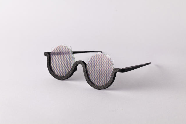
Viewing the world through rose-colored glasses is boring. What about hallucinogenic-, psychotropic-, electric-Kool-Aid-colored glasses instead? Wayfarer, meet way out: Hungarian artist Bence Agoston has created a pair of sunglasses that can simulate hallucination. (At least the visual kind.)

In appearance, Mood's 3-D printed frames look like a cross between John Lennon's wire-rimmed ovals and the old maven glasses Elton John sometimes wears in concert. But the frames aren't really the star of the show here: the lenses are. Agoston's sunglasses can be used to simulate all sorts of technicolor freakouts thanks to six special inserts which can be layered over one another. Each lens is based on a different Moiré pattern that filters red, green, or blue light. Three lenses can be placed in front of each eye; by rotating them, different patterns can be created.

"Because each color filters the incoming lights differently, and the patterns can overlap each other or leave blank fields, the new view is completely random and twisted," says Agoston. Not that you have to trip out all the time. "Mood can also be used with clear lenses, for everyday living," he notes.

Asked when you should use his Mood sunglasses, Agoston basically comes right out and says the optimal use case is in the back of a colorfully painted school bus with Ken Kesey and his Merry Pranksters.

"The ideal situation for use is during travel, when people listen to music, just looking out the window and watching the ever-changing sights, in perfect harmony with the music. The shape is designed with the aim of simplicity and distinctness, as if the wearer belongs to a kind of subculture." Just any old subculture, huh?

You can find more of Agoston's work on Bēhance here.

Sign up to learn more about Fast Company's Innovation Festival in November

'); $form.parent('div').removeClass('error'); }; function _formFail ($form, error) { if (!$form) { return; } // Use message from server response var message = JSON.parse(error.responseText); if (message.response && message.response.message) { message = message.response.message; // Error message not provided } else { message = 'Please enter a valid email address.'; } var $parent = $form.parent('div'); // Remove other errors first var $errors = $parent.find('.alert-box'); if ($errors) { $errors.fadeOut(300, function() { $(this).remove(); }); } if (message && (message.code === -100)||(message.code === 220)) { message = 'Please enter a valid email address.'; } // Append new errors $form.parent('div').prepend('
' + message + '
'); $form.find('input').prop('disabled', false); }; }); })

This Colorful Compilation Of Fake UIs Is The Best Thing You'll See Today

$
0
0

It's Friday, and we're all a little tired. So here's some frothy Friday design fun for you: a loop of 100 super fun, pre-animated fake user interface elements, backed up with the intro song to some crazy '80s BBC computer show.

If you're interested in where these come from, they're by developer Peter Quinn, who actually sells them as part of his FUI Toys After Effects pack, good for dropping in to your project whenever you need to come up with a fancy fake UI quick. Seems like a good deal for just $35!

Now who out there can tell me what show the music in the video's from?

Sign up to learn more about Fast Company's Innovation Festival in November

'); $form.parent('div').removeClass('error'); }; function _formFail ($form, error) { if (!$form) { return; } // Use message from server response var message = JSON.parse(error.responseText); if (message.response && message.response.message) { message = message.response.message; // Error message not provided } else { message = 'Please enter a valid email address.'; } var $parent = $form.parent('div'); // Remove other errors first var $errors = $parent.find('.alert-box'); if ($errors) { $errors.fadeOut(300, function() { $(this).remove(); }); } if (message && (message.code === -100)||(message.code === 220)) { message = 'Please enter a valid email address.'; } // Append new errors $form.parent('div').prepend('
' + message + '
'); $form.find('input').prop('disabled', false); }; }); })

Why Is This House Dangling From The Arm Of A Crane?

$
0
0

70 years after World War II, some places in Germany are still rebuilding. For this and other reasons, the sight of a construction crane is a common blight upon the German skyline. But in the artsy city of Karlsruhe, they've got a knack for turning even the dreariest tokens of the post-industrialized landscape into something surreal and wonderful.

Case in point: this sculpture by Argentinian artist Leandro Erlich, which dangles a row house constructed after the style of architect Friedrich Weinbrenner from the arm of a crane. Wiggling its roots over the site of an under-construction subway station in Karlsruhe Marktplatz, Erlich's sculpture looks like some inebriated crane operator literally yanked a building out of the ground, as cleanly as an amateur dentist pulling a tooth out with a pair of pliers.

Called, appropriately enough, "Pulled by the Roots", Erlich tells Dezeen that the piece is meant to "challenge the residents' perception of the construction works as an 'eyesore' and to act as a reminder that 'underneath the tons of metal and concrete of our cities, a vital organic presence remains.'" The ZKM Center for Art and Media further elaborates that it is meant to symbolize themes such as familial uprooting and engineering.

The piece will dangle above the construction site until September, when Erlich will grab a pair of bolt cutters, shimmy down the crane's hoist to the house roof, then dramatically snap the rope, bungee-cording to safety while the sculpture crashes to the ground, completely obliterating the just-completed subway station. At least, I wish: in reality, it will likely be removed in a far more subdued manner. Probably involving more cranes.

(Via: CityLab]

These Animated Walls Of Type Show Off Monotype's Fonts Like Print Never Could

$
0
0

As part of a commission from the world's largest type foundry, Field—a studio led by Marcus Wendt and Vera-Maria Glahn that delivers branded art for a global audience, whose work we have admired in the past—created three animated murals, exploring Monotype's typefaces through light, color, and motion.

Called "Type Reinvented", Field has created three murals so far. The first, Sensual Power, was presented at Le Book in Paris, and allowed visitors to interact with some of Monotype's more popular typefaces using Kinect-like motion sensing.

The second, Glyph.Index, is my personal favorite. First commissioned by Google, Noto is a font family that is unique in that it is designed to cover every single character and glyph in the Unicode standard. That means it contains more than 120,000 characters: so many characters that the chances of you naturally stumbling upon them all are infinitesimally small. Shown at the Resonate Festival in Belgrade, Glyph.Index uses multi-hued characters from Noto Sans as pixels in a rhythmic, playful, and constantly changing digital piece.

The last mural is called Responsive Energy, and was shown at Cannes Lion. Similar to Sensual Energy, without the interactive aspect, Responsive Energy dynamically displays different Monotype animations as luminous, twisting, animations, making them appear as well-produced as a Hollywood production company bumper.

It's tempting to dismiss this sort of animation as pretty, but without substance. I think, though, animation is actually in some ways a more natural way of interacting with type. The truth is that the vast majority of the typefaces we use are obscured from us. At best, we use a handful of characters in a language or two, while 90% or more of a typeface's design details are locked away in a file on our computer. Animation allows type to be liberated from the black box of a font file, exploring and highlighting the beauty of its design details in a way that print doesn't often allow.

You can read more about Type Reinvented here.

A Staircase Designed For Dogs

$
0
0

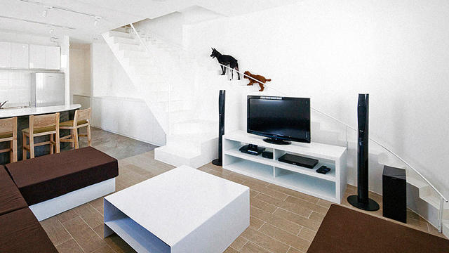
We design houses for humans. We design houses for dogs. What we don't design are houses for humans and dogs, which is somewhat odd, considering the fact we often co-habitate. But dogs and humans have different design needs... especially if you're the owner of some stumpy-legged bulldog or schnauzer, huffing and puffing his or her way up stairs meant for the long stride of human legs.

In Vietnam, Ho Chi Minh-based architectural firm 07Beach was asked to renovate a home for a dog-owning client. Thinking of the canines, 07Beach built a separate staircase for dogs into the plans, complete with doggy balustrade, smaller steps, and a shallower incline, perfect for a pooch's shorter legs.

07Beach's client was a personal friend of Joe Chikamori, principal architect, and in the pitch, Chikamori wrote a friendly note. "I designed this so that your house could represent your affection for your wife and your two dogs, with the idea that this house will be like a gift to your family." The plans took 17 days to design, then an additional 26 days for construction.

The integration here is quite nice, giving the dog staircase a whimsical, almost fairy-like feeling. If the house is resold to someone without dogs, the staircase can also be repurposed, as a series of bookshelves, or a private staircase for the family cat, who — let's face it — isn't going to deign to use the same staircase as the homo sapien plebs she's been forced to board with.

(Via: Hypebeast)


Calligraphy And Choreography Merge In These Magical Light Paintings

$
0
0

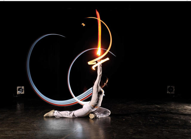
Scribing luminescent glyphs of power, French artist Julien Breton travels the world, combining dance, light, and photography to create stunning works of Arabic calligraphy that seem to magically hang in mid-air.

A self-trained calligrapher, Breton says that he spent the first five years of his career working on paper, but he felt as if he was missing something: he wanted to put his entire body into his art. "Light painting solved all the problems I'd been facing," Breton says. "It gave me the ability to work with my entire body on much larger scales than traditional calligraphy, and create three-dimensional works."

Light painting is done in a dark setting by waving a light source in front of a camera that has been set with a long exposure and a high ISO, which determines how sensitive the sensor is to light. When the image is developed, the motion of the light blurs together, sinuously combining several moments in time into a single image. The painter himself dresses in dark colors, and keeps in constant motion. If it's done right, the painter will become nearly invisible in the finished image, while the light painting itself seems to hover like a neon ghost in the dark.

To create his light paintings, then, Breton first needs to exhaustively train himself to turn his calligraphy into a meticulously choreographed dance. Making this process more complicated, Breton's light calligraphy needs to be done in reverse to expose legibly; he also works with a beveled, tapered light source, which makes it possible to simulate the thin and thick strokes of calligraphy. When Breton has prepared his choreography, he chooses a scene for his painting, usually in Arabic-speaking countries like Egypt or Morocco. He then works with light photographer David Gallard to record his fluorescent dance as a finished image. "We work in the night, in the cold, until we have the good one," says Breton.

Asked why his calligraphy is in Arabic, which is not Breton's native language, the artist says he can't imagine it any other way. "I'm not able to speak Arabic, but it's clearly perfect for light painting," he says. "The curves, and the aerial aspect of Arabic letters, just fits perfectly with my technique." The fact that, at least to Western eyes, Arabic helps make Breton's finished light paintings seem all the more otherworldly, like spells out of Arabian Nights? Just another small perk.

Wes Anderson Meets Tim Burton In These Creepy, Intricate Dioramas

$
0
0

Looking at the dioramas of French artist Marc Giai-Minet, you'd be forgiven thinking they were props from some strange Hollywood team-up between Tim Burton and Wes Anderson. His scenes of unseemly libraries, forgotten laboratories, rusty workshops, and ramshackle slaughterhouses seem like they were plucked from a series of dollhouses, detailing some unknown holocaust.

They're as fascinating as they are abstractly unsettling, an effect very much designed with intent. "In my work, the strained relationship between light and shadow—in other words between good and evil, spirit and matter, knowledge and ignorance—is the very essence of the metaphor of mankind I am trying to paint," Giai-Minet says. "A portrait of mankind that is both fascinated by the divine and tempted by bestiality."

Le grand digÇrant n¯4, 102 x 162 x 15

Artistically, Giai-Minet is obsessed with the dark nature of man. Primarily a painter, his works largely focus on human monsters. "As a young child, I was utterly shocked when I saw photographs of concentration camps and their methodicially lethal facilities: the piles of dead bodies and the huge stacks of stolen items, carefully sorted to be re-used," he says. His dioramas are an abstraction of these themes, attempting to convey the monstrous dark side of man without actually featuring human figures.

"When I started making boxes in the early 90s, they were small formats dealing with the same themes as my paintings: brainwashing scenes, visiting mummies, crawling worms and various transfusions," Giai-Minet says. "Small cardboard cutout figures performed the ironically cruel and existential ballet of my painting. As my work evolved into much larger constructions, the characters disappeared and books, whole libraries of them, filled the space along with warehouses, interrogation rooms, prison cells, staircases, walkways, ovens, sewers or platforms and docks."

L'arrivee des choses noires, 58 x 60 x 35

According to Giai-Minet, who spent the majority of his career as a painter before embracing dioramas in the '90s, his "boxes" are an exploration of his playful side: the part of him that liked to play with toy soldiers and model trains as a boy. But that playful side still has morbid obsessions.

"From the whiteness of books to the darkness of sewers, everyone will see in my work a wandering, a never ending to and fro between the two main poles of humanity: bestiality and transcendence, human fragility and inaccessible divinity," he says. Hey, Nic Pizzolatto: hire this guy to write for True Detective season 3, stat!

[via Flavorwire]

Sign up to learn more about Fast Company's Innovation Festival in November

'); $form.parent('div').removeClass('error'); }; function _formFail ($form, error) { if (!$form) { return; } // Use message from server response var message = JSON.parse(error.responseText); if (message.response && message.response.message) { message = message.response.message; // Error message not provided } else { message = 'Please enter a valid email address.'; } var $parent = $form.parent('div'); // Remove other errors first var $errors = $parent.find('.alert-box'); if ($errors) { $errors.fadeOut(300, function() { $(this).remove(); }); } if (message && (message.code === -100)||(message.code === 220)) { message = 'Please enter a valid email address.'; } // Append new errors $form.parent('div').prepend('
' + message + '
'); $form.find('input').prop('disabled', false); }; }); })

This 1,400-Foot Desert Citadel Would Be A Self-Sustaining City Of Tomorrow

$
0
0

It may look like Immortan Joe's Citadel from Mad Max: Fury Road, but this abstract desert obelisk isn't a citadel of the post-apocalypse. It's a self-contained city—also called an arcology—that French firms Nicholas Laisné Associés and OXO Architects propose to build in the Saharan desert.

Although it's just a concept right now, La Ville Tour Des Sables (translated: "The Sand Tower Town") would stand over 1,400 feet, if completed. Designed to resemble an outcropping of stone—or, at least, Bjarke Ingels' idea of what an outcropping of stone might look like—the arcology would contain everything needed for a self-sustaining city, including living quarters, agricultural units, factories, and more.

According to OXO's official description of the project, the Sand Tower Town would have a total floor space of around 192 acres. Food would be grown in a vertical garden ascending the structure. Roughly 20% of the building would be taken up by office space, while another 30% would be taken up by hotel and living quarters. Inside, the building would be designed to resemble futuristic, 21st Century souks.

Another big aspect of the design involves making maximum use of the desert's resources. The arcology is designed to collect rainwater, and although the architects propose to build it in the Sahara, they still think it should be able to collect 45,000 cubic meters annually. This water would be stored four kilometers underground, where it would be turned into steam, which would power the building along with solar panels.

There's currently no plans to actually begin construction of the Sand Tower Town, but the architects suggest that if construction began in 2025, it might be completed in 50 years. Just in time for the Water Wars.

[via io9]

Cards Against Humanity's Latest Pack Is All About Design

$
0
0

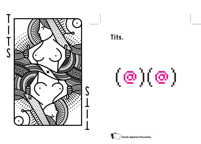
Have you ever wondered how famed Mac designer Susan Kare might go about designing a pair of pixel art tits, or how ornery ad legend Milton Glaser might handle a design brief that simply read "cocksucker?" Now you can find out, thanks to a new booster pack for the popular party game Cards Against Humanity, featuring original designs by Glaser, Kare, Debbie Milman, Paula Scher, Erik Spiekermann, and 25 more world famous designers.

Not bad for $10, even if you don't consider the fact that all proceeds (and many of the designer's fees) are going to benefit the Chicago Design Museum, a grassroots gallery that exhibits contemporary design.

Jez Burrows/Susan Kare

"The idea for the Design Pack came from a conversation I had with the founder of the Chicago Design Museum, Tanner Woodford," Cards Against Humanity creator Max Temkin tells me. "He was telling me about the struggle to make this new kind of community museum sustainable, and I was talking about how much I wanted to do an "Artists' Edition" of Cards Against Humanity, and it just sort of clicked that this would be a great partnership."

Cards Against Humanity isn't exactly known for its eye-catching graphic design. In fact, the cards—a random assemblage of profane or taboo words and sayings typed in Helvetica Bold on glossy monochrome stock—are about as simply designed as they get. But that's certainly not the case with the new Design Pack, which features some graphic design as notable as it is profane.

To design the cards, Temkin and Woodford put together a list of their favorite designers, and asked if they'd contribute designs. "Nearly everyone we asked said yes," Temkin marvels. "We gave each of the designers one of George Carlin's famous Seven Dirty Words You Can Never Say On Television, but beyond that, we didn't give them any limits or requirements."

Temkin says that he wants the actual designs of the cards themselves to be a surprise for the people who order them, but he gave us a sneak peek at designer Susan Kare and Jez Burrows' designs for the word 'tits', which you can see above. That was enough to get my money: if these two cards are this good, imagine what Erik Spiekermann could do with 'motherfucker'!

The Cards Against Humanity Design Pack is available for purchase now, and the packs should start arriving at customers' doors next week.

Sign up to learn more about Fast Company's Innovation Festival in November

'); $form.parent('div').removeClass('error'); }; function _formFail ($form, error) { if (!$form) { return; } // Use message from server response var message = JSON.parse(error.responseText); if (message.response && message.response.message) { message = message.response.message; // Error message not provided } else { message = 'Please enter a valid email address.'; } var $parent = $form.parent('div'); // Remove other errors first var $errors = $parent.find('.alert-box'); if ($errors) { $errors.fadeOut(300, function() { $(this).remove(); }); } if (message && (message.code === -100)||(message.code === 220)) { message = 'Please enter a valid email address.'; } // Append new errors $form.parent('div').prepend('
' + message + '
'); $form.find('input').prop('disabled', false); }; }); })

A Carpet That Hooks Up To Your Radiator To Kill Dust Mites

$
0
0

For those with acute asthma, owning a carpet can be murder. Even if you vacuum regularly, a rug serves as a perpetual pleasure garden for tens of thousands of attack-inducing dust mites. "Pillows, curtains, upholstery, mattresses and carpets all add to the emotional value of the home," say Anne Pabon and Siem Lenders of the Eindhoven-based design firm, Studio Siem & Pabon. "Should [the homes of asthmatics] stay cold and impersonal?"

Their solution is the Fervent Carpet, a coiled throw rug with an anti-allergenic twist: every two months, it can be connected to a radiator and heated up to 140 degrees Fahrenheit, killing the dust mites teeming in every nook and cranny.

According to the design duo, who displayed the Fervent Carpet at last year's Dutch Design Week upon graduating from Design Academy Eindhoven, the idea for the Fervent Carpet came after meeting a person whose asthma was so acute he couldn't have any textiles in his home: rugs, couches, and curtains. His house, they said, felt very "impersonal and unsociable," so they challenged themselves to figure out a way for him to reintroduce textiles into his life.

The Fervent Carpet is made of two lengths of textile-covered hose, which have been arranged in an artful coil. At the edge of the rug, the hoses connect, making the carpet look like a perfectly normal and seamless rug. Every two months, though, the carpet is designed to be hooked up to a standard radiator, which blasts hot water through the coils, heating up the surrounding textiles to a a high enough temperature to kill both dust mites and any eggs they may have laid.

To an American audience, a carpet that hooks up to a radiator seems a little weird, but Studio Siem said they chose it as a heat source because in Europe, it's a technology everyone has at hand. "We decided to use the radiator because it's a heating system already, so that was a logical step,"they say. If they can follow that up with a version that hooks up to a central heating vent, maybe they'll have an audience in the States, where roughly 25 million people have asthma.

[via (PSFK]

Sign up to learn more about Fast Company's Innovation Festival in November

'); $form.parent('div').removeClass('error'); }; function _formFail ($form, error) { if (!$form) { return; } // Use message from server response var message = JSON.parse(error.responseText); if (message.response && message.response.message) { message = message.response.message; // Error message not provided } else { message = 'Please enter a valid email address.'; } var $parent = $form.parent('div'); // Remove other errors first var $errors = $parent.find('.alert-box'); if ($errors) { $errors.fadeOut(300, function() { $(this).remove(); }); } if (message && (message.code === -100)||(message.code === 220)) { message = 'Please enter a valid email address.'; } // Append new errors $form.parent('div').prepend('
' + message + '
'); $form.find('input').prop('disabled', false); }; }); })

The Golden Rectangle Makes For A Great Set Of Shelves

$
0
0

The Golden Ratio might be design's biggest myth, but that's not to say that it's useless. Aesthetics aside, the Fibonacci Sequence upon which the Golden Ratio is based is a very useful formula for modeling growth and compartmentalization.

Qualms about imbuing the Golden Ratio with mystical aesthetics aside, there's plenty to love about the Fibonacci Shelf, a matryoshka-like nesting shelf system by designer Peng Wang of Utopia Architecture & Design.

Constructed out of anodized aluminum, the shelf takes its inspiration from the Fibonacci Sequence, a simple mathematic system in which each number is the sum of the two digits that preceded it: 1, 1, 2, 3, 5, 8, 13, and so on. It's a useful sequence for mathematicians looking to model natural growth (say, programming a computer to simulate the spiral pattern of a nautilus shell). The Fibonacci Sequence can also be seen in the so-called "golden rectangle," which breaks down a single large rectangle into a nested series of successively smaller squares.

But more than just a tribute to the Golden Ratio, the structure allows the shelves to be reconfigured. Although by default they neatly nest in side the larger Golden Rectangle, each unit of the shelf can be pulled out of the unit and rearranged to suit your taste, or just removed entirely.

This configurative freedom means you could use the Fibonacci Shelf as an entertainment center, a book shelf, a liquor cabinet, or even a shoe tree. The shelves even detach from the legs, allowing the bottom half of function as a side table. The Golden Rectangle might have nothing to do with great aesthetics, it sure as hell makes for a nice set of shelves.

[via TheDPages]

Sign up to learn more about Fast Company's Innovation Festival in November

'); $form.parent('div').removeClass('error'); }; function _formFail ($form, error) { if (!$form) { return; } // Use message from server response var message = JSON.parse(error.responseText); if (message.response && message.response.message) { message = message.response.message; // Error message not provided } else { message = 'Please enter a valid email address.'; } var $parent = $form.parent('div'); // Remove other errors first var $errors = $parent.find('.alert-box'); if ($errors) { $errors.fadeOut(300, function() { $(this).remove(); }); } if (message && (message.code === -100)||(message.code === 220)) { message = 'Please enter a valid email address.'; } // Append new errors $form.parent('div').prepend('
' + message + '
'); $form.find('input').prop('disabled', false); }; }); })

A DIY Pantone Stained Glass Door Anyone Can Make

$
0
0

Not to get all Instructables on you, but as a design writer, sometimes you come across a design detail that is just so lovely and well executed and approachable, you want to call attention to it, so other people can give it a try. That's how I feel about this beautiful Pantone Stained Glass Door by Italian designer Armin Blasbichler.

I should probably wrap "stained glass" in quotes, because it's not really stained glass: i.e. glass that has been colored by adding metallic salts to the mixture while it was being manufactured. Instead, the 585 separate colorful squares have simply been affixed to a glass pane. They're actually diapositives, like the slides you'd put in an old reel projector. Each one is essentially a picture of a different Pantone swatch, but when stuck to the door, they become a mosaic of multi-hued light that is breathtaking to behold.

What I like most about the project is that it's achievable. For lack of a better term, this is a very elegant design hack. It's something that anyone anyone could do on a budget with access to a camera, a window, a scrapbook of paint chips, and a photo lab.

The rest of the house that this door belongs too isn't shabby either. Blasbichler's own home, it's an unusual log cabin designed to resemble musls, or piles of logs stacked in the fields, featuring a number of eccentric design details, such as a series of nested doors that look straight out of Willy Wonka. You can see more images of it here.

[via Trendir]

Sign up to learn more about Fast Company's Innovation Festival in November

'); $form.parent('div').removeClass('error'); }; function _formFail ($form, error) { if (!$form) { return; } // Use message from server response var message = JSON.parse(error.responseText); if (message.response && message.response.message) { message = message.response.message; // Error message not provided } else { message = 'Please enter a valid email address.'; } var $parent = $form.parent('div'); // Remove other errors first var $errors = $parent.find('.alert-box'); if ($errors) { $errors.fadeOut(300, function() { $(this).remove(); }); } if (message && (message.code === -100)||(message.code === 220)) { message = 'Please enter a valid email address.'; } // Append new errors $form.parent('div').prepend('
' + message + '
'); $form.find('input').prop('disabled', false); }; }); })

Netflix Designed A Symphony From Random Brainwaves

$
0
0

Netflix's new sci-fi show by Babylon 5 alum J. Michael Straczynski, Sense 8, is all about eight characters around the world who can suddenly communicate with each other telepathically. Suitably, that's also how Straczynski and company came up with the show's synthy, trance-like theme song: they took eight random subjects, showed them some looping psychedelic footage, and recorded their brainwave patterns, extrapolating it all into a single Brainwave Symphony.

"There is something musical about the way the brain works," Straczynski observes. "It's a symphony on its own terms."

Working with technologist Patrick Gunderman, the Sense 8 showrunners took eight random subjects, and exposed them to trippy images that were designed to provoke an emotional response. Fitting them with headband sensors, Gunderman and his team then recorded their subjects' alpha, beta, delta, gamma, and theta waves.

But how were these waves turned into music? Here's how the official site describes the process:


The Symphony itself was conceived like a jazz chart where the structure of the overall tune is defined and followed, but the individual performances aren't known until they happen, they're improvised in the moment. We provided the rhythm section and the song flow, but the individual melody points are taken from our participants' brainwaves as a form of improvisational performance.

In other words, while the majority of Brainwave Symphony was specifically composed, certain variables in the melody ended up being controlled by the brainwave patterns of the Symphony's human subjects.

It's a little bit of a cheat, but the finished composition still has a sort of guttural, id-like musical effect: it does feel like the random throbbing of a psychic gestalt.

This Roll-Up Map Highlights Parks And Pools When It's Hot Out

$
0
0

We're used to digital maps that can automatically adapt themselves to road conditions, traffic, and time of day, but paper maps are usually a different story. This map by British designer Camilla Hempleman, though, manages to capture some of the dynamic nature of digital maps by using special ink to highlight the best parts of a city to be in for the weather.

It's called the Bath C° Thermo Color Map, and it uses thermochromic ink on resilient waterproof Tyvek fabric to activate different parts of the map at different temperatures and in different conditions. It has three main states. When it rains, the map highlights different museums and indoor attractions around Bath where you can escape the deluge. In the heat, the Thermo Map will light up nearby rivers and lakes; and when it's more moderate out—and thus more comfortable to walk around town and see the sights—the map becomes more detailed to accommodate.

It's a clever idea, especially since it's totally analog, using the same principles as a Hypercolor T-shirt to change a physical map according to atmospheric conditions. But it also somehow feels digital; it makes me yearn for Google Maps or another smartphone mapping app to start contextualizing their maps according to what the barometer is doing.

A recent graduate from Kingston University, more of Hempleman's design work can be found here.

[via Designboom]

Sign up to learn more about Fast Company's Innovation Festival in November

'); $form.parent('div').removeClass('error'); }; function _formFail ($form, error) { if (!$form) { return; } // Use message from server response var message = JSON.parse(error.responseText); if (message.response && message.response.message) { message = message.response.message; // Error message not provided } else { message = 'Please enter a valid email address.'; } var $parent = $form.parent('div'); // Remove other errors first var $errors = $parent.find('.alert-box'); if ($errors) { $errors.fadeOut(300, function() { $(this).remove(); }); } if (message && (message.code === -100)||(message.code === 220)) { message = 'Please enter a valid email address.'; } // Append new errors $form.parent('div').prepend('
' + message + '
'); $form.find('input').prop('disabled', false); }; }); })

Is Space About To Experience A Design Renaissance?

$
0
0

Getting human beings off the planet is the hardest design challenge mankind has ever undertaken. Yet it's also a solved problem: we've been sending people into space since 1961.

50 years later and space feels both closer (NASA's New Horizons mission to Pluto!) and farther away (last month's loss of a SpaceX rocket) than ever before.

Is space about to experience a design renaissance, thanks to privatized New Space companies fronted by international billionaires and Silicon Valley geniuses?

New Space

When we talk about New Space, we're basically talking about two companies and their billionaire founders.

First, you've got SpaceX—extremely efficient, extremely practical, yet dreaming of a million people living on colonized Mars. Founded by Tesla's Elon Musk, SpaceX has made enormous progress: it's the first privately held company to ever dock with the International Space Station, for example. Even so, SpaceX has had its setbacks, including the explosion of one of its Falcon 9 rockets last month from a broken strut.

Then there's Virgin Galactic, billionaire Richard Branson's long-delayed attempt to make traveling to space as easy as jumping on a plane. It has a spaceport (SpacePort America) designed by Norman Foster to rival the best airports in the world, and hundreds of eager passengers sitting on tickets worth upwards of $250,000 each. Yet so far, Virgin Galactic has had very little luck actually getting into orbit. The company's maiden space voyage is six years late, and following the mid-flight breakup of SpaceShip Two late last year—a catastrophe caused largely by avoidable human error— it's likely to be delayed even longer.

Virgin Galactic

All of which proves: getting into space is just as hard as it has been since the 1960s. But New Space companies like SpaceX and Virgin Galactic also have the freedom to innovate in a way that NASA hasn't since the Moon Landing.

How NASA Got Derailed

"The astonishing thing that is happening right now is that space is getting back to its roots," says Nicholas de Monchaux, an associate professor of architecture and urban design at U.C. Berkeley, and author of the book Fashioning Apollo, a history of the Apollo Spacesuit."The industry is once again focusing on science, and exhibiting the lightness and nimbleness that were lost during the Space Shuttle years."

One important thing to understand about the history of space exploration is it has largely been driven by politics, not science. By 1961, the Soviet Union had put both the first artificial satellite and the first astronaut in space. As a result, President Dwight Eisenhower challenged NASA: here's a blank check. I'll bodyblock Congress for you. If we can't be the first country in space, come up with a different kind of space race we can conceivably win. Just eight years later, in 1969, NASA had put a man on the moon.

But then things stalled. America had won the space PR war, but now what?

"The Nixon administration was under intense pressure to announce the next heroic thing we're doing in space," says de Monchaux. "But there was no longer a propaganda reason to do it, so no one wanted to spend money on it."

NASA

So under his administration, Richard Nixon went back to an idea that had first been proposed 30 years before by famous Nazi rocket scientist, Werner von Braun: a reusable space plane. The result was the Space Shuttle, an albatross of a project that hung around NASA's neck for the next three decades.

From its inception in 1969 to the day it first launched in 1981, the Space Shuttle was a camel of a horse. It was supposed to do everything: launch satellites, retrieve satellites, have defensive purposes, and so on. The Space Shuttle's complicated brief served a political purpose in itself, allowing the Nixon administration to kick the can down the road when it came to funding, while taking all the credit for developing it.

"I love the Space Shuttle as an object, but it was a design with an almost impossible brief," says de Monchaux. It was incredibly expensive, and answerable to too many masters. The president wasn't covering for NASA in Congress anymore if the Space Shuttle failed. Nor was Congress writing a blank check for it: if anything, NASA was expected to come in under budget on delivering the Space Shuttle. And so NASA became conservative.

Why Space Is Getting Exciting Again

In a way, you can think of the Space Shuttle as setting back space travel by miring it in a bureaucracy that stood in impossible opposition to the spirit of purpose and daring that is necessary to put a man in space. But now that the albatross has been cut free from NASA's neck, allowing it to focus on bold, singularly purposed science missions (like New Horizons, or the Rosetta comet landing) while the private sector focuses on the parts of space that can be commercialized, like space's touristic possibilities or even materials extraction through asteroid and comet mining.

"The industry is once again focusing on science, and exhibiting the lightness and nimbleness that were lost during the Space Shuttle years," says de Monchaux. Companies like Virgin Galactic and SpaceX can rapidly iterate, and most importantly, push through failure and turn it into something productive in a way that NASA hasn't been able to do since the Cold War.

The result is that both newer space companies and NASA itself can be more focused. While NASA laser-focuses on what it does best—expanding our relationship with the cosmos by undertaking scientific missions no public company could justify—the private sector has the leeway to push the boundaries off of getting us off this rock without the threat of being called in before a Senate subcommittee.

What The Future Holds

Those expecting SpaceX or Virgin Galactic to deliver some Star Trek style innovations in the short term are probably hoping for too much, says Roger Launius, associate director at the Smithsonian's National Air and Space Museum. He points out that SpaceX or Virgin Galactic are basically just rehashing technology and ideas pioneered during the Cold War Space Race.

SpaceX

SpaceX is essentially strapping payloads to the tips of modified ICBM missiles, the same way we put Apollo into space. Launius says that in the private sector, Virgin Galactic is pushing the technological boundaries of what's possible with their rocket plane, SpaceShip Two. Even so, it's using an approach we've used to send planes into suborbital space since the X-15 in 1959: it's hauling a rocket into the high atmosphere with a conventional airplane.

And besides towing rockets into orbit, or having astronauts crouching on the heads of ICBMs, we don't really have a lot of good ideas on how to get into space. All we have are concepts like the space elevator, a 22,000-mile cable extending from the surface of the earth to geosynchronous orbit that would use laser-powered robots to tug payloads into space. "We won't see it in our lives, if it's even practical at all," says Launius.

Liftport via Wiki Commons

"The way we get into space today is still largely based on 1940's jet propulsion technology," Launius says. "We have the ability to fire chemical rockets into space. That's all we really know how to do. All we can do is make them gradually safer and more efficient."

None of that's to say that SpaceX and Virgin Galactic can't make a huge impact in man's ability to reach the stars. When Elon Musk says he can put a man on Mars, or Richard Branson says that he wants to open an international space hotel, we shouldn't bet against them.

When they do it, though, it's going to be the same way we got to the Moon: by rapidly iterating, powering through failure, and focusing on improving the designs of what we already know works until going up and down from space is as reliable as taking an airplane.

Sign up to learn more about Fast Company's Innovation Festival in November

'); $form.parent('div').removeClass('error'); }; function _formFail ($form, error) { if (!$form) { return; } // Use message from server response var message = JSON.parse(error.responseText); if (message.response && message.response.message) { message = message.response.message; // Error message not provided } else { message = 'Please enter a valid email address.'; } var $parent = $form.parent('div'); // Remove other errors first var $errors = $parent.find('.alert-box'); if ($errors) { $errors.fadeOut(300, function() { $(this).remove(); }); } if (message && (message.code === -100)||(message.code === 220)) { message = 'Please enter a valid email address.'; } // Append new errors $form.parent('div').prepend('
' + message + '
'); $form.find('input').prop('disabled', false); }; }); })

This Sensor Will Tell You How Busy The Gym Is Before You Even Leave The House

$
0
0

No one likes a bar that's too crowded, or for that matter, one that's too dead. But what if you could pull out your smartphone and see just how jumping your favorite hot spot was before you made your way there? That's the idea behind Density, a simple little sensor that measures the real-time population of bars, gyms, clubs, cafés, and shops, and then broadcasts them over the internet.

The sensor itself isn't much more than a break beam sensor, the same kind that elevators and automatic doors use. Place it near an entrance, and when someone passes in front of it, it registers that someone is entering or leaving. It's not exactly rocket science, but thanks to easy installation and an open developer API, Density has a lot more possibilities.

Using Density, a restaurant could detect, and then broadcast, if there are open tables, or, for that matter, blast coupon codes for free drinks over Twitter if foot traffic was too low. If you want to go to the gym, you could check online if the treadmills are free; if you have the choice of working from home, you could load up an app to see if your office is crowded.

Density is already being used by Requested, an app that allows users to request discounts at popular restaurants when business is slow. It's also in the wild at Workfrom, a site that gives real-time seating capacity at possible remote working locations, as well as school gyms at U.C. Berkley.

As a noted hater of busy bars and clubs, this is just the kind of sensor I want to catch on, allowing me to gauge the likelihood that my territorial bubble will be pierced before I even leave the house. On the other hand, though, this seems like the kind of thing that would provide a ready excuse to stay in when I shouldn't. "Oh, the gym has heavy traffic today? Better crack open a beer."

[via PSFK]

Sign up to learn more about Fast Company's Innovation Festival in November

'); $form.parent('div').removeClass('error'); }; function _formFail ($form, error) { if (!$form) { return; } // Use message from server response var message = JSON.parse(error.responseText); if (message.response && message.response.message) { message = message.response.message; // Error message not provided } else { message = 'Please enter a valid email address.'; } var $parent = $form.parent('div'); // Remove other errors first var $errors = $parent.find('.alert-box'); if ($errors) { $errors.fadeOut(300, function() { $(this).remove(); }); } if (message && (message.code === -100)||(message.code === 220)) { message = 'Please enter a valid email address.'; } // Append new errors $form.parent('div').prepend('
' + message + '
'); $form.find('input').prop('disabled', false); }; }); })

Pinterest Hires Mac Design Legend Susan Kare

$
0
0

Susan Kare, the legendary designer behind the original Mac's icons and fonts (and, more recently, a killer set of pixel art tits for Cards Against Humanity), is hoisting her pirate flag at a new Silicon Valley company: Pinterest

Susan Kare

Kare will be joining the Pinterest Creative Team as product design lead, reporting to Pinterest's head of product, Bob Baxley. Her directive will be to improve the company's interfaces, but aside from that, details are vague.

"As one of the small group of people who helped invent and popularize the graphical user interface, Susan's contributions to this industry are immeasurable," said Pinterest cofounder and chief creative officer Evan Sharp. "More exciting for us, though, are her current and future contributions at Pinterest. We're always looking for that rare intersection of talent and humility..."

Kare's impact on the design world has been so profound that her work is displayed in New York's Museum of Modern Art. After getting her start at Apple in the early '80s by lying her way into a design job, Kare quickly became a pioneer in early computer iconography and typography. The Happy Mac icon, Facebook's virtual gifts, the Windows solitaire cards, and the Chicago font that shipped on the first four generations of iPods are all her designs, to name just a few.

Kare's statement on her new position is short, bubbly, and to the point. "From the first time I met Evan Sharp and Bob Baxley, I felt in sync with the Pinterest design philosophy and company vision," she says. "I'm looking forward to working with such a passionate design team; the talent pool at Pinterest is impressive, and I'm excited to get started."

Viewing all 2823 articles
Browse latest View live