Quantcast
Channel: Fast Company
Viewing all 2739 articles
Browse latest View live

8 Incredible Prototypes That Show The Future Of Human-Computer Interaction

$
0
0

Every year, the Association for Computing Machinery—the world's largest scientific and educational computing society—gathers to explore the future of computer interaction in a legendary conference called CHI. It's an amazing event, in which thousands of researchers, scientists, and futurists get together to push the boundaries of what it means to interact with machines.

It's a dizzying collision involving enough ideas about what the future of man and machine will look like to put the world's science-fiction authors out of their jobs for good. This year's CHI 2016 conference in San Jose was no exception—but among the hundreds of projects, here are eight that stood out.

Haptic Retargeting

The problem: In VR, objects might look real, but they don't feel real. In fact, for the most part, they don't feel like anything at all. So Microsoft Research came up with a system using a very limited number of physical props to take the place of a nearly infinite number of virtual objects.

They call it "haptic retargeting," and it works by tricking a VR user into thinking they aren't interacting with the same prop over and over again. It does this by skewing a user's virtual vision so the object they think they are reaching for in-game is the physical prop they already interacted with in meatspace.

It's hard to put into words, so just watch the video above. In it, Microsoft Research shows how haptic retargeting could be used to trick a VR Minecraft player into thinking he's physically stacking innumerable blocks, when in reality he's just moving the same block around over and over again.

Dexta Haptic Gloves

Speaking of haptics, another company with a very different plan for allowing people to "feel" virtual reality is Dexta Robotics, which has come up with a set of exoskeleton-style gloves that lets VR push back.

Here's how they work. Upon entering virtual reality, Dexta's Dexmo Gloves simulate feedback by locking and unlocking finger joints when you try to touch digital objects with varying degrees of force. Using this relatively simple technique, the gloves can simulate haptic sensations such as hardness, springiness, softness, and more.

As Dexta Robotics explains: "How will this force feedback technology affect your VR experience? When inside the virtual environment, you can feel the difference between elastic and rigid virtual objects. You'll be able to hold a gun and feel a realistic 'clicky' level of resistance from the trigger. More subtly, you'll be able to pick up a virtual object and discern by touch whether it's a rubber ball or a rock."

Pre-Touch

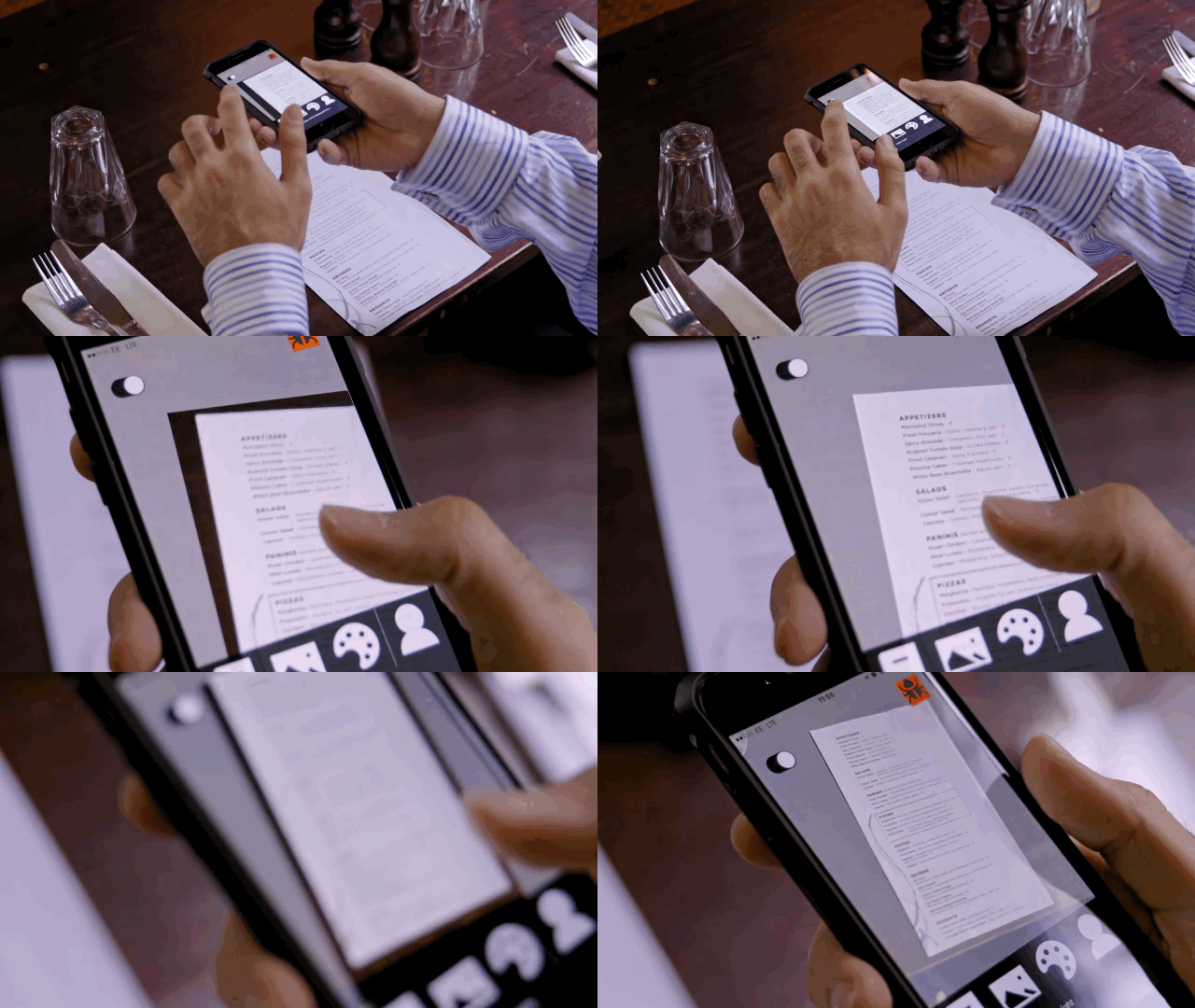
What if your smartphone could read your mind? That's what Microsoft Research is trying to do with "pre-touch sensing." It showed off a new type of smartphone that can detect how it's being gripped, and also detect when a finger is approaching the screen. This could open up some amazing new UI possibilities in mobile by improving the precision of tapping on small on-screen elements, and dynamically adjusting what on-screen interface a user sees according to how they're holding their device—or if a finger is approaching the screen. For more detail, read our full article on the new touchscreen here.

PaperID

What if paper could be just as interactive as a touchscreen? Researchers from the University of Washington, Disney Research, and Carnegie Mellon University have figured out how to do that, giving a piece of paper the ability to sense its surroundings and respond to gesture commands, as well as connect to the Internet of Things.

It's called PaperID, and it uses a printable antenna. The possibilities are fascinating: Imagine a physical book that is linked to your Kindle e-book, so that turning a page in the real world also turns the page on your e-reader. Or imagine a page of sheet music that can detect the motion of a conductor's wand being waved over it.

SkinTrack

A smartwatch screen just isn't big enough to allow many interactions. You have room to tap or swipe the screen, but that's pretty much it. SkinTrack is a new technology developed by the Human-Computer Interaction Institute's Future Interfaces Group, which expands your smartwatch's "touchscreen" over your entire hand and arm—just by wearing a specially designed ring.

Imagine using your palm to make a call on your Apple Watch by hovering a finger over your hand, acting as a cursor on a dial pad. SkinTrack could even be used to allow you to play more sophisticated video games on your wearable, by enabling a far broader library of gestures to control what's happening on that postage stamp-sized screen. Find out more about SkinTrack here.

Materiable

Materiable is the latest incarnation of Inform, a physical interface of moving "pixels" developed by MIT's Tangible Media Group in 2013. Materiable gives this existing Inform display the ability to mimic the tactile qualities of real-world materials, like rubber, water, sand, and more. Depending on the settings, flicking the surface of an Inform might make all of its pixels ripple, or quiver like jelly, or even bounce like a rubber ball. It's all accomplished by giving each individual Inform pixel its own ability to detect pressure, and then respond with simulated physics. It's like a big block of shape-shifting digital clay, which can be used in a variety of mind-blowing ways by designers, medical students, even seizmologists.

For more details, you can read more about Materiable here.

Holoflex

Remember that bendable screen Co.Design covered a few months ago? Holoflex is the next generation of that screen: a flexible smartphone that you bend to interact with. What's groundbreaking about the Holoflex, though, is that its display is truly holographic. Two people viewing a 3-D teacup on the display would both see it from the correct perspective, regardless of where they were positioned in relation to the screen.

The Holoflex is capable of achieving this neat trick by projecting 12-pixel-wide circular "blocks" through more than 16,000 fisheye lenses. It's really low resolution right now (160 x 104—less than the original Apple II), but give this technology five years, and we might all be walking around with holographic iPhones. Read more information about the Holoflex here.

SparseLight

Augmented reality headsets like Microsoft's HoloLens allow wearers to see the physical and the digital at the same time, but the lenses they depend on have such small field of view that it's easy for the effect to be ruined. The same is true in VR, where the scene you're viewing often looks like it's at the end of a long tunnel.

Microsoft's been thinking about this problem, and SparseLight is its solution. The idea is that you can augment the field of view in head-mounted displays by putting cheap grids of LEDs in the peripheral of a user's vision. Because humans' peripheral vision is so much fuzzier than what we're directly looking at, these LEDs essentially just match an object's color and brightness—and trick our brains into thinking we're seeing the whole thing.

SparseLight technology can be applied to both virtual reality headsets and augmented reality headsets to increase immersion, and Microsoft Research even reckons it can help cut down on some of the motion sickness problems users experience when wearing these headsets too. Read more about SparseLight here.
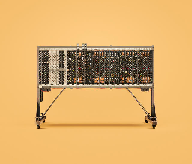

The Brutal Beauty Of The Earliest Super Computers

$
0
0

To hear some people talk, computers were never even remotely sexy until Apple released the first Mac. That's a lie. Computers have always been sexy, as these pin-up photographs of vintage computer mainframes from U.K. photographer James Ball show. They just have a more brutal beauty: broad and buxom mainframe fatales, compared to today's silicon sylphs.

The computers in Ball's Guide To Computing series all come from computer museums around the world, including the National Museum of Computing at Bletchley Park, the central site for Britain's codebreakers during World War II. Appropriately, then, one of the earliest machines featured in the series is the Pilot Ace, designed in the early 1950s by Alan Turing.

Other machines include the EAI Pace (the absurdly screen-less "desktop computer" manufactured in the early '60s that looks straight out of Mad Men), the Harwell Dekatron (an early British relay-based computer which looks like a Rube Goldberg-esque contraption of random knobs, dials, and soup cans), and the CDC 6600, which was the world's fastest computer from 1964 to 1969: a blistering three megaflops, about 170 times slower than the processor inside an Apple Watch today.

Ball tells me his inspiration for shooting classic computers and mainframes was his affinity for the analog. "I've always had great affection for knobs, dials, and switches," he says. "I was looking for ways to express this and happened to start looking through eBay for old oscilloscopes and computer parts. I was going to actually build something until I realized that my analogue-fantasies actually existed, in the real life computing designs from yesteryear."

Unfortunately, many of the computers that Ball photographed were not kept in great condition. So after shooting the series, Ball teamed up with a digital retouching team at INK to make these vintage beauties look young and toothsome again. Ball thought this was important, because without digitally retouching his photographs, early computer design trends could easily be lost: for example, the explosion of colorful mainframes in the swinging '60s.

What was interesting about this process, Ball says, is that many of the machines are so old, there's just no color photographs available of what they originally looked like, before they became faded over time. In a way, Ball says, "the retouching has provided a kind of meta-twist in that they present [these machines] in a never before seen history and context."

All Images: via Behance

Can A Video Game Teach Designers To Build Better Cities?

$
0
0

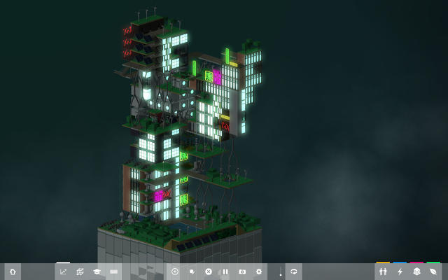
Minecraft, Microsoft's explosively popular Lego-like world building game, has already inspired a whole generation of kids to become architects. Block'hood is a game that aims to do the same thing for a new generation of urban planners.

Block'hood was designed by Jose Sanchez, a Chilean architect-turned-University of Southern California School of Architecture associate professor-turned-game developer, who hopes his game will get people thinking about the delicate balance of resources and services necessary to create an ecologically and socially sustainable city.

Block'hood is a construction game, similar to SimCity, except the goal isn't to build a city: It's to build a city block—one that grows vertically like a Jenga tower. Unlike other construction games, money is no object in Block'hood; for all intents and purposes, you've got infinite cash to create the neighborhood of your dreams. What isn't infinite? Resources. Every rooftop garden, solar panel, school house, apartment, or cafe you install in your Block'hood depends on existing resources, regardless of those they create.

So as your Block'hood gets bigger, the resource network becomes exponentially more complex: If too much pollution from your neighborhood kills your rooftop garden, for example, you might not have enough food to feed your children. Soon, there aren't enough educated workers to staff your offices, which drives your economy to a halt. If this complex urban circuit fails, your entire block'hood might come crashing down—at which point, the only way to fix things is to rebuild.

Although Sanchez was a Minecraft player, there was a more suspiring inspiration for Block'hood: the Whole Earth Catalog, a legendary product catalog from the late '60s that focused on self-sufficiency and ecological sustainability. The idea here was that by buying the tools and learning the techniques listed in the catalog, you would have everything you needed to build your own society—a DIY guide for utopians.

"The Whole Earth Catalog was like this big list of tools and technology that you could have in your backyard which could solve any problem by being combined and recombined," Sanchez says. "I wondered if I could gamify that idea, by creating a catalog of things and simulating how they interact with each other," specifically, at an urban scale.

Sanchez says he has a two-fold agenda. Block'hood, he said, already situates itself into the legacy of sandbox construction games, like Will Wright's Sim games. But that's not necessarily the audience he wants Block'hood to reach. "This game has the ability to reach a different kind of audience," he says. It could be used in city councils, he says, to show the effects of new zoning plans, or in classrooms to teach kids how urban planning works, so they can see what happens in a neighborhood without enough water, or a particular social dynamic.

Right now, Sanchez is just trying to finish all the planned features for the game, but he's already exploring the idea of releasing an education-only version. Long after Block'hood stops selling to gamers, he imagines it being used to teach the next generation of urban planners in classrooms.

The model of urban planning Sanchez is advocating for with Block'hood is about sustainability. "It's about understanding ecological relationships," Sanchez says. "In the game, there's no such thing as waste, as long as it can be used. Once you learn this way of thinking, the city and world we live in starts looking very differently." At the very least, Sanchez hopes he'll get people thinking about the ways in which a city's resources are interconnected. "Somehow we live in a world where you flush your toilet and you have no idea where it ends up, and I think that's absurd."

After two years of development, Block'hood is currently available as part of an open beta for PC and Mac (it can be purchased for around $10 here). Just like planning a real city, there's no real way to "win" it. It just keeps on evolving forever, and the best you can hope for is you manage to stave off chaos and disrepair for as long as you possibly can.

Google Is Enlisting Artists To Paint Its Massive Data Centers

$
0
0

Our letters, our schedules, our photos, and our memories: all the most intimate details of our lives are increasingly stored in the cloud. But "cloud" is a bit of a misnomer. Our data isn't stored in the ether, but in massive data centers—stark, windowless buildings that couldn't look more anonymous, despite the deeply important role they play in our world. These buildings are huge and impersonal, and rarely actually feel "at home" in the fabric of the communities that host them.

Google wants to change that—so it's launched the Data Center Mural Project. Similar in nature to Google's partnership with local artists to paint its self-driving cars, it's a new initiative in which Google has made several of its massive data centers around the world available as blank canvases to muralists. The goal is to not only better integrate these buildings into their local communities, but to also give them an appearance that better reflects the oceans of colorful, personal data they store inside.

According to Joe Kava, vice-president of Google Data Centers, the idea behind the mural project is to draw attention to buildings which—while functionally very important to almost everyone—are usually ignored. "Because these buildings typically aren't much to look at, people usually don't—and rarely learn about the incredible structures and people inside who make so much of modern life possible," Kava says.

The Mural Project has skinned two data centers so far. The first is located in Mayes County, Oklahoma, where artist Jenny Odell used satellite images of salt ponds, swimming pools, circular farms, and wastewater treatment plants plucked from Google Maps to create a series of four breathtaking, multi-story collages. Odell's intent was to use satellite images that showing overlooked infrastructure—much like data centers are themselves.

The second mural is in St. Ghislain, Belgium, on the side of a data center which serves Google requests through Western Europe. Here, Google invited Brussels-based street artist Oli-B to spray paint the walls with fun, creature-filled abstract representations of "the cloud." The painting also contains a number of sly little visual references to both Google and the local community: for example, in one cloud, Oli-B has hidden one of the bikes Google has scattered around its Mountain View campus, while another cloud contains a dragon—a reference to a local festival called the Doudou de Mons, in which they recreate the legend of St. George and the dragon).

Google doesn't intend to stop there. Future sites for data center murals include Dublin, Ireland, which will be handed over to Irish illustrator Fucshia Macaree, and Council Bluffs, Iowa, which will be realized by local painter Gary Kelley. Those two murals will be finished sometime this year.

It's a clever project, and an even better public relations initiative. After all, data centers tend to be ominous-looking buildings, and it's a little uncomfortable thinking of all your personal data being stored in one. Painting the equivalent of a big happy face on the side can go a long way towards making people feel more comfortable with just how much of their lives they entrust to Google. And even if it doesn't do that, turning data centers into blank canvases for talented artists definitely makes them less of an eyesore.

MIT's Latest Project? Giving You An Extra Robot Hand

$
0
0

For all of the promises made by Apple and Google, none of their smartwatches will give you superpowers. Strap on MIT's new wearable, though, and you can suddenly have an extra pinky, a third thumb, or even a totally new cyborg hand.

Robotic Symbionts is a new wrist-worn wearable from New from MIT's Fluid Interfaces Group that adds programmable robot joints to any human hand. The wristband contains 11 different motors, which can detect brain signals sent to the brachioradialis muscle in the forearm. Since these muscles are not directly used by the human hand, anyone can learn how to use their Robotic Symbionts as an extension of their arm in as little as a few hours of practice.

For example, someone wearing a Robotic Symbionts wristband could easily use their smartphone while simultaneously carrying something in the same hand. Journalists could use their wristband to hold a pad of paper for them while they write on it. It could also be configured into what its creators call a "user interface on the go," adapting to different needs in real time. When connected by Bluetooth to a computer, the wristband can operate as a combination stylus and joystick, allowing you to grab one of your robot fingers and use it to draw on a screen, or play a video game. It's easy to imagine how the Robotic Symbionts could be used as accessibility device, too. For example, if you were born without an arm, you could make up for it by just strapping on MIT's wristband to give yourself one super-powered cyborg hand that can do just as much.

But according to the device's creator, PhD student Sang-won Leigh, it wasn't necessarily developed with the disabled in mind. Instead, the group was inspired by Stelarc, a transhuman performance artist whose work often involves robotics integrated with his body. For example, Stelarc once grew a human ear in a petri dish—and then had it surgically attached to his left arm. While Stelarc's work is fairly "dystopian," Leigh says that the Fluid Interface Group wanted to try to adapt his approach to make it a little more mainstream and upbeat. "A lot of people think about machine augmentation in terms of rehabilitation, but we envisioned it as an assistive technology that wasn't just for people with challenges, but which could turn people with normal physiology into superhumans," Leigh says.

Eventually, Leigh says his group envisions humans and robots living in total symbiotic harmony, like a goby fish (hence the name, Robotic Symbionts). But the days of total human-robot symbiosis are still far off. Like all of MIT Media Lab's projects, the goal of Robotic Symbionts isn't to produce a commercial product, but to create a device that allow designers to think about the UI principles of tomorrow: in this case, the ones that will be created when grafting on a new robot limb is as easy as buying a new Apple Watch.

All Photos: courtesy MIT Fluid Interfaces Group

The Only Way To Turn On This Work Lamp? Turn Off Your Phone

$
0
0

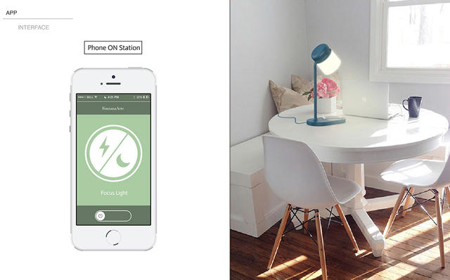
Staying focused and concentrating when your smartphone is at hand is a perpetual problem. Tranquilo, a lamp by New Zealand-based designer Avid Kadam, offers a unique solution: the only way to turn it on is to switch your smartphone off. Luckily, it does the latter for you.

Kadam designed the Tranquilo as a lamp made of a few different distinct parts. First, there's the light itself, a detachable LED lightbulb with Philips Hue-style color shifting abilities. The base, meanwhile, comes with both near-field communication (NFC) support and wireless charging, so when you place your smartphone on it, the Tranquilo can turn on the lamp as well as start wirelessly charging your handset. But the Tranquilo doesn't just turn on a lamp when you place your smartphone on its base. It also does the opposite, switching your phone to "Do Not Disturb" mode for as long as that light is shining.

It's a genius affordance. These days, most of us don't actually use things like switch-on desk lamps—unless we're doing something analog: squinting over a book, for example, or writing something in our notebooks. But in the always-online 21st century, these analog activities rarely go interrupted by the blips, bleeps, and blurps coming from our smartphones. The Tranquilo makes going analog an exchange: to turn this lamp on, your smartphone must go off.

Unfortunately, the Tranquilo is just a concept for right now, mostly because there are a few practical details that would stop it from working. First, NFC can't be used to switch a smartphone like an iPhone into "Do Not Disturb" mode right now. Second, wireless charging support is still fairly rare among smartphones, and doesn't work at all on the iPhone without a special case.

So maybe the Tranquilo isn't an idea whose time has come quite yet. Even so, all the technology is technically there to make this product a reality, it's just a matter of the companies catching up.

Ultimately, the idea is more important than the technology itself. As our devices continue to impinge on our lives, there's an increasing need to balance things out. Perhaps this is the ultimate role of the Internet of Things: not to make devices smarter for the sake of being smarter, but to make them smart enough to turn themselves off at the right moment—and let us live our lives.

Google's Secret Weapon Against Amazon Echo? Just Being Google

$
0
0

With Amazon's voice assistant in a can, Echo, the company found a small but smart niche of users and a foothold in the smart homes of the future. It hasn't had much competition—until now. Today at I/O, Google announced its own Alexa-killer: Google Home.

It may look like a Muji-brand aromatherapy machine, but Google Home is really more like a super Chromecast for your entire living space. By prompting the device with the phrase "OK Google" or "Hey Google", Google Home can stream movies to the biggest screen in your house, send text messages for you, book you a reservation at a nearby restaurant, make changes to your schedule, pull your travel itinerary, tell you when you need to leave for work, and control your other smart home devices. You can even tell it to synchronize music to all the speakers in your home.

It's a bottle that houses Google Assistant—Google's natural language processing AI—and gives it a natural home inside your space.

In a lot of ways, Google Home feels like a natural evolution of several of Alphabet's products and services. In appearance, it looks a bit like someone took a katana to an OnHub router. It integrates seamlessly with Chromecast, and uses its existing streaming APIs. It pairs up with all of Google's smart home initiatives, like Nest. It uses all of the advances Google has made in natural language processing and Knowledge Graph to contextually understand users, no matter how they express themselves.

It's all of the power of Google, always listening and centralized in a soft white tube of high-tech.

True, Amazon's Echo already does many of these things. Part of what has made the Echo such a sleeper hit is how surprisingly capable it is. Amazon updates Echo every week with new commands. Echo's anything you want it to be, including an elaborate kitchen timer, the best radio you've ever had, a shopping assistant, and so on.

But Alexa can't, say, read you an incoming email coming into your Gmail account, locate your Android phone, translate a conversation in real-time, send directions to your phone, stream a video to your TV, or any of the millions of things Google can do that we all take for granted. So as good as Echo is, it's going to have a hard time competing with Home, for the simple reason that Google's secret weapon over Amazon is just being Google.

Home will be released sometime later this year, and no pricing details are available yet. But make no mistake: this is an important product. Introducing Home during today's keynote, Pinchar made it clear that he views the future of Google as "ambient." It will exist everywhere, not just on your phones or your devices. Increasingly, what we think of as "Google" is becoming decoupled from what we think of as computers. Home takes that decoupling to the next level.

Google is no longer something you just use on a screen. It's a disembodied voice, floating through your home. With Home, the bottle trapping Google's genie has been smashed.

Bringing Wheelchair Design Into The Digital Age

$
0
0

Human bodies come in all shapes and sizes, especially where disability is involved. But for the most part, wheelchairs are a one-size-fits-all affair. It's absurd, says British designer Benjamin Hubert, founder of the experience-driven industrial design agency Layer. Shouldn't the wheelchair a person spends their entire waking day in be at least as tailored to their body as the pants, the shirt, or the shoes they wear?

So Layer designed a wheelchair that is. It's called the Go: a partially 3-D printed wheelchair that is custom-fit to its owner's unique proportions. It not only looks cool, it uses some smart design tricks—like one plucked from rugby players—to make pushing yourself around in a wheelchair a little easier.

An Archaic Industry
Layer was once a more traditional industrial design studio—an incarnation that Hubert found a little hollow. The studio refocused itself on using design to solve real issues, and to raise important questions about industries that deserve scrutiny. That was how the design team came to the idea of redesigning the wheelchair, the product of an "archaic" industry which traditionally treats the wide spectrum of disability with a one-size-fits-all approach.

The Go was the result of a two-year research process, in which Layer spoke to dozens of wheelchair users about what they wanted from their chairs. In general, the complaints people had about their wheelchairs was that it didn't feel like their wheelchair. Sometimes it was because their wheelchair didn't really "fit," causing them to move around in the seat too much, or that a poor fit meant they didn't feel secure. But just as much of the conversation was stylistic. "One of the insights that came out of our research was that a lot of people wanted something they could use during the day, but they would also look cool in lined up at the club," Hubert says.

So unlike traditional wheelchairs, the Go doesn't look like a typical medical device, all steel frames and square angles. Instead, it's decidedly minimalist: little more than a black webbed bucket seat attached to a couple of light-weight wheels. This gives the Go a space-age, organic look. "We wanted the form of the Go to feel more sinuous and anthropomorphic, with a splaying design language and soft, flowing shapes next to the body," Hubert says. "We were chasing this idea that a wheelchair should be an extension of the form and format of the human body, without becoming a cartoon."

An Ergonomic Challenge
Another consideration when designing the Go was safety. The human body isn't designed to push itself around with its arms and shoulders all day, so injuries in wheelchair users area common occurrence, including rotator cuff injuries, repetitive strains, arthritis, torn muscles, and more. "It was horrific hearing the ways in which wheelchair users routinely hurt themselves," Hubert says. "Until robotics progress enough to we can wire people's wheelchairs directly into their nervous system, though, wheelchair users are going to have to keep pushing themselves. So we thought about ways we could incrementally improve the experience and make it easier."

The solution Layer came up with was plucked from the design playbook of professional athletes. The Go's wheels comes with super tactile push rims, covered in hundreds of tiny silicone grip patterns. These patterns are designed to key into similar patterns printed on a pair of gloves which ships with the Go (which is in itself unique: most wheelchairs don't come with their own gloves). These gloves make it easier for users to actually grip onto their wheels, not unlike the gloves football and rugby players wear to improve their ability to catch a slippery ball. The result is that the Go delivers a greater power-to-push ratio than other wheelchairs, reducing the risk of injury.

To custom fit each Go to its user, Layer has teamed up with Materialise, a 3-D printing and scanning company. After visiting one of dozens of Materialise facilities, a customer would be "scanned in," mapping the contours of their body and then adjusting the dimensions of the Go's seat and footrests accordingly. Two weeks later, a new Go wheelchair comes down the assembly line, custom-fit to that specific customer's needs and proportions.

Because of the nature of Go's design, only the seat and footrest need to be 3-D printed, but there are other options that users can specify when they order their Go: for example, whether or not their wheelchair comes with push bars on the back of the seat. "It turns out not everyone wants them," Hubert says. "People see push bars, and they think that person needs pushing. But we talked to a lot of people who were frustrated that strangers kept on trying to push them around like toys." Lift bars, which help a wheelchair user transfer himself into the chair, are another option, and down the line, Hubert hopes that the Go's seat patterns can also be modified.

When the Go wheelchair goes on sale, Hubert believes it will cost between $4,500 and $7,000, which places it in the high-performance end of the market. But unfortunately, there's no telling when that will be. Getting a new wheelchair design into doctor's offices and hospitals is a complicated process, says Hubert, so while the design and technology is all ready to go, the Go doesn't yet have a route-to-market. That's why Layer is trying to raise awareness of the design now, and hopefully attract backers.

Even if the Go doesn't ever go on sale, Layer hopes it will help shift the industry as as a concept. "Ultimately, we're a design studio which aims to raise important questions about product categories that need scrutiny," says Hubert. That's a description which fits the wheelchair category to a T. With Go, not only will users get a better deal when it comes to ergonomics and usability—they'll look cool while doing it.


Google's Latest Accessibility Feature Is So Good, Everyone Will Use It

$
0
0

Inclusive design has a way of trickling down to benefit all users, not just the ones for whom it's originally intended. Voice dictation, for example, was originally pioneered in the 1980s as an accessibility feature; today, millions of non-disabled people use it every day through voice assistants like Siri and Google Assistant. The same thing goes for word prediction, a technology developed for people who have trouble typing on traditional computers—but which millions of people use now under the guise of smartphone autocomplete.

It normally takes years, or even decades, for this trickle-down effect to become evident. But it's easy to imagine that Google's new Voice Access feature won't take nearly as long to have an impact outside of its intended audience. Announced this week at I/O 2016 as something that will ship with Android N, Voice Access is a way for people with severe motor impairment to control every aspect of their phones using their voices. But once you see it in action, the broader impact of Voice Access is immediately obvious.

Here's how it works. When Voice Access is installed, you can enable it with Android's "Okay Google" command by just saying: "Okay Google, turn on Voice Access." Once it's on, it's always listening—and you don't have to use the Okay Google command anymore. With Voice Access, all of the UI elements that are normally tap targets are overlaid by a series of numbers. You can tell Voice Access to "tap" these targets by saying the corresponding number aloud.

But these numbers are actually meant to serve as a backup method of control: You can also just tell Voice Assistant what you want to do. For example, you could ask it to "open camera," and then tell it to "tap shutter." Best of all? Any app should work with Voice Access, as long as it's already following Google's accessibility guidelines.

Technically, Voice Access builds upon two things that Google's been laying the groundwork on for a while now. The first is natural language processing, which allows Google Assistant to understand your voice. But just as important is the accessibility framework that Google has built into Android. After spending years preaching best accessibility practices to its developers, every app in Android is supposed to be underpinned with labels in plain English describing the functionality of every tap and button—allowing Voice Access to automatically translate it for voice control. And if some developers don't subscribe to Google's best accessibility practices? Well, that's why Voice Access has the redundancy of number labels to call upon.

During a demonstration at I/O, Voice Access seemed absurdly powerful. For example, you could tell Voice Access to open settings, scroll down to the bottom of the screen, change an option, and then go back to the home screen—all using your voice. There's also a host of sophisticated voice dictation commands, so you can tell Voice Access to text Mary that "dinner is at 8," then edit the time before sending the message by simply saying "replace 8 with 7."

For the 20% of Americans who have severe to moderate motor impairment, including Parkinson's, essential tremor, arthritis, and more, the benefits of Voice Access are obvious. These users can finally have high-level control of their Android devices without ever needing to use their hands.

But according to Google's accessibility UX researcher Astrid Weber, there are two kinds of disability. There are the people who are permanently disabled, and then there are those who are "situationally disabled." Situational disability can be as serious as a broken arm or as temporary as having your hands full with shopping bags. The point is that all users are situationally disabled on a regular basis, which means that accessibility features like Voice Access are for everyone—or they will be, eventually.

Voice Access's usefulness to pretty much everyone is so evident, even driving home from I/O, I found myself wishing I had it on my smartphone. With Google Auto and CarPlay, companies like Google and Apple are making a big show of creating auto-friendly user interfaces for their smartphones. But the truth is, both platforms are extremely limited, and it still feels dangerous to be looking at a screen and tapping on it while driving. They also require special hardware to work. Being able to control your regular smartphone with your voice, on the other hand, feels natural.

As I was barreling down I-280, I pined for the ability to just tell my smartphone to put on the next episode of my favorite podcast, or open Slack and tell my editor I'm on the road but I'll have edits in for her in 30 minutes.

Voice Access might fall under the umbrella of accessibility, but to me, it feels just as much a part of Google's big evolution into an ambient conversational interface as Google Assistant or the recently announced Google Home. Both of those products play into the idea that you want to be able to do all sorts of generalized, low-level tasks through Google without looking at a screen: play some music, turn off the lights, or get information on the weather, for example.

Voice Access is the other half of that. It's a product based on the idea that you'll want to be able to use your voice to do highly specific things when you can't touch a screen. Voice Access is the accessibility feature that fulfills Google's conversational interface promise. Now, there's literally nothing Google does that you can't control with your voice.

Voice Access will be available as part of Android N when it is released to the general public later this year.

How Designing For Disabled People Is Giving Google An Edge

$
0
0

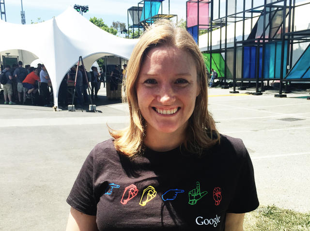
"Accessibility is a basic human right," Eve Andersson tells me, sitting on a lawn at the Shoreline Amphitheater during this year's Google I/0 developer conference. "It benefits everyone."

Soft spoken and ginger-haired, Andersson is the head of Google's accessibility efforts—the gaggle of services that Google bakes into its products to allow them to be just as usable by people with disabilities as they are by the general public. Under Andersson's leadership, Google has made Android completely usable by voice, teamed up with outside vendors to give Android eye-tracking capabilities, and launched the Google Impact Challenge, a $20 million fund to generate ideas on how to make the world more accessible to the billion-odd individuals in the world living with disabilities.

courtesy the author

According to Andersson, accessibility is part of Google's core mission to catalog the world's information and make it available to everyone. As you speak to her, a point she hammers home over and over again is that inclusive design means more than just hacking an app or product so that people with disabilities can use it. It's something that benefits literally everyone.

I ask Andersson for an example. We're sitting on the grass in a sunny spot, so she pulls out her phone, and shows me an app. Even though the sun is shining directly overhead, I can still read the screen. "This is an app that follows Android's accessibility guidelines for contrast," she says. And while those guidelines were established to help those with limited vision see what's on their screen more easily, it has a trickle-down effect to everyone who wants to use their smartphone in the sun.

In a way, Andersson argues, the accessibility problems of today are the mainstream breakthroughs of tomorrow. Autocomplete and voice control are two technologies we take for granted now that started as features aimed at helping disabled users use computers, for example. So what are the accessibility problems Google has its eyes on now, and what mainstream breakthroughs could they lead to tomorrow?

Microsoft Seeing AIMicrosoft

Teaching AIs How To Notice, Not Just See

Like Microsoft, which recently announced a computer vision-based accessibility project called Seeing AI, Google's interested in how to convey visual information to blind users through computer vision and natural language processing. And like Microsoft, Google is dealing with the same problems: How do you communicate that information without just reading out loud an endless stream-of-conscious list of what a computer sees around itself—regardless of how trivial they may or may not be?

Thanks to Knowledge Graph and machine learning—the same principles that Google uses to let you search photos by content (like photos of dogs, or photos of people hugging)—Andersson tells me that Google is already good enough at identifying objects to decode them from a video stream in real time. So a blind user wearing a Google Glass-like wearable, or a body cam hooked up to a smartphone, could get real-world updates on what can be seen around them.

But again, the big accessibility problem that needs to be solved here is one of priority. How does a computer decide what's important? We're constantly seeing all sorts of objects we're not consciously aware of until some switch flips in our heads that tells us they're important. We might not notice the traffic driving by until one of those cars jumps the curb and starts speeding toward us, or we might not notice any of the faces of the people in a crowd except that of a close friend's. In other words, our brains have a subconscious filter, prioritizing what we notice from the infinitely larger pool of what we see.

Right now, "no one has solved the importance problem," Andersson says. To solve it means figuring out a way to teach computers to not only recognize objects but to prioritize them according to rules about safety, motion, and even user preferences. "Not all blind people are the same," Andersson points out. "Some people want to know what everyone around them is wearing, while others might want to know what all the signs around them say."

As Google develops ever-more-powerful AI, a time may come when computer vision replaces human sight. That day isn't here yet, but Andersson points out that any work done on computer vision for accessibility projects will have a clear impact upon the field of robotics, and vice versa. The robots of the future might be able to "see" because of the accessibility work done in computer vision for blind people today.

Flickr user KittyKaht

Non-Language Processing

Much has been made recently of Google's advances in natural language processing, or Google's ability to understand and transcribe human speech. Google's accessibility efforts lean heavily upon natural language processing, particularly its latest innovation, Voice Access. But Andersson says computers need to understand more than just speech. Forget natural language processing: computers need non-language processing.

"Let's say you are hearing-impaired, and a siren is coming your way," says Andersson. "Wouldn't you want to know about it?" Or let's say you're at a house party, and an entire room of people is laughing. A person with normal hearing would probably walk into that room because it's clear there's something fun happening there; a hearing-impaired person would be left in the dark. Our ability to process and understand sounds that aren't speech inform a thousand little decisions throughout our day, from whether or not we walk out the door in the morning with an umbrella, to whether or not we get a rocket pop when the ice-cream truck drives by on a hot summer day. If you were hearing-impaired, wouldn't you want access to that stream of information?

There's no technical reason machine learning can't be turned on the task of understanding more than just speech, says Andersson. But machine-learning neural networks, like the ones driving Google's computer vision efforts, depend on vast data sets for training. For example, for Google Photos to learn what it was looking at in a particular photograph, it had to train on a massive database of millions of images, each of which had been individually tagged and captioned by researchers. A similar data set was used for Google's natural language processing efforts, but Andersson says there's just no comparable data set that currently exists to teach neural networks how to decode non-speech audio.

Andersson wouldn't say if Google was currently trying to build such a database. But the usefulness of non-language processing goes way beyond accessibility. For example, YouTube can already auto-caption the speech in a video; mastering non-language processing could help it caption the sound effects, too.

Taking Navigation Beyond Google Maps

Sighted users are so used to taking directions from computers that many people (like me) can barely find their way around without first plugging an address into Waze. But moving sighted individuals from point A to point B, across well-plotted roads and highways, is navigation on macro scale. Things get much more complicated when you're trying to direct a blind person down a busy city street, or from one store to another inside a shopping mall. Now, you're directing people on a macro scale, but in an environment that is not as well understood or documented as roads are.

Google's already working on technology to help address this problem, says Andersson. For example, Google's Advanced Technology and Projects Group (or ATAP) has Project Tango, a platform which uses computer vision to understand your position within a three-dimensional space. Before Project Tango, Google could detect a user's position in the world using all sorts of technologies—GPS, Wi-Fi triangulation, and beacons, among them—but none of them were precise enough for reliable accessibility use. For example, your smartphone's GPS might place you 30 feet or more away from where you actually are. Not a big deal if you're driving to the movies in your car, but a huge problem if you're a blind person trying to find a bathroom at the airport.

But while Project Tango is an important step in the right direction for using computer vision as a navigation tool, more needs to be done, says Andersson. Indoors, Google needs to collect a lot more data about internal spaces. And everywhere, a lot of the problems that still need answering are UX problems. For example, let's say you need to direct a blind person to walk 50 feet in a straight line: How do you communicate to him or her what a foot is? Or think of this another way. You know how your GPS will tell you when you're driving to "turn left in 1,000 feet?" Even when you can see, it's hard to estimate how far you've gone. Now imagine doing it with your eyes closed.

But these problems are all solvable. And when they are, like most accessibility advancements, they will have obvious benefits even to those without disabilities. After all, how often have you needed precise directions to find your car in a packed airport parking lot? "I'm passionate about accessibility, not just because I believe in a level playing field," says Andersson. "But because [inclusive design] makes life more livable for everyone."

Inside The Design Of Google's First Smart Jacket

$
0
0

Last year, Google announced Project Jacquard: an intriguing plan to turn all of your clothes into touchscreen controllers, partnering with Levi's to incorporate the technology into its denim products.

Now, a year later, and Levi's and Google have announced the first retail garment with Project Jacquard inside: the Levi's Commuter x Jacquard, a trucker jacket with a multitouch sleeve that lets you control your Android smartphone—without ever pulling it out of your pocket.


Why A Jacket?

During an ATAP presentation at Google I/O on Friday, interaction designer Ivan Poupyrev and Levi's VP of Innovation, Paul Dillinger, took the stage to show off what the Commuter x Jacquard could do. The jacket has a patch on the sleeve that serves as the interface between you and your phone. It's aimed primarily at bike commuters; a cyclist riding down the street could tap the sleeve of their jacket to get an ETA on how long it will take for them to reach work, swipe the cuff to cycle songs on Spotify, double tap to accept an incoming call, or triple tap to dismiss it.

Last year when I spoke to Poupyrev and Dillinger about the Jacquard-Levi's partnership, both spoke in loose terms about what they intended to do—except to say that Google had chosen Levi's as an initial partner for Jacquard because "if you can make Jacquard work with denim, you can do it with anything." This is because denim goes through a notoriously tortuous manufacturing process, which involves the material being literally blasted with fire at one stage. So the first question I asked them this year was why they decided to make a jacket—instead of a pair of jeans or some other product.

The decision to make a jacket, says Dillinger, ultimately came from a desire to make a garment which was useful all the time. "How many jeans do you have in your closet, compared to how many jackets?" he asks. "In our research, we discovered that 70% of our customers have at least one jacket they wear more than three days a week." He points out that there aren't many garments that we find personally or socially acceptable to wear more than half of our waking lives without changing.


Developing UX Standards For Fashion

So in appearance, the Levi's Commuter x Jacquard is a fairly standard denim trucker jacket, with Project Jacquard woven into the wrist. The controller, which connects via Bluetooth to your smartphone, is a flexible rubber dongle. But it doesn't look like one: it looks like a cuff. It connects to the Project Jacquard patch by snapping on like a button near the sleeve, then wrapping around the cuff, like the fabric loop attached to the buttons on the cuff of a classic trench coat. "We wanted the controller to function within the existing vocabulary of fashion," Dillinger tells me. The controller plugs into a standard USB port to juice, and can go days without a charge.

Another way in which Jacquard has been adapted to fit within the existing vocabulary of denim is the way the touch panel is woven into the garment. Poupyrev says that one of the UX problems they've wrestled with in Jacquard is how visible to make the touch panel. Make it too prominent, and it distracts from the integrity of a garment; make it invisible, and users don't know where to touch. In the case of the jacket, Levi's and Google came up with a beautiful compromise that makes the Jacquard panel visible but is still authentic to the way denim is made.

In denim manufacturing, there's a natural weaving flaw called a missed pick in the weft, which represents itself as a visible seam in the material: a dark line, representing a literal gap where a line of thread is missing in the piece of cloth. It's totally natural, and since it's a problem that mostly happens on denim that is hand woven on older machines, missed picks are strongly associated with vintage denim.

With the Commuter jacket, Levi's integrated Jacquard by weaving the conductive threads of the technology into a grid of purposely missed weft picks. So, instead of looking high-tech, the Jacquard patch on the jacket looks charmingly imperfect, and desirably bespoke. "I'm just amazed at the poetry of that solution," says Poupyrev. By introducing this weaving error on purpose, Levi's gave the Commuter jacket an authenticity amongst denim lovers that it might otherwise have lacked.

Eventually, says Poupyrev, Google wants to find ways to work with other garment makers to integrate Jacquard into products. "The whole point of Jacquard is to work within the confines of existing production techniques to make fabric smarter," he says. "So the trick for every kind of material is to find an implementation of Jacquard that does not feel like an imposition upon [each fabric or garment] maker's craft." So whether Jacquard comes to men's suits, silk scarves, Victoria's Secret bras, or high-tech Speedos next, it needs to do so in a way that feels authentic to the material.

In the meantime, Project Jacquard will be exclusive to the Levi's Commuter x Jacquard. It will launch in beta in autumn this year, and start shipping in 2017—at a price that Levi's says shouldn't prompt consumers used to purchasing high-performance denim jackets to run screaming for the hills.

All Images: courtesy Levi's Commuter x Jacquard

Notifications Are Broken. Here's How Google Plans To Fix Them

$
0
0

Notifications suck. They're constantly disrupting us with pointless, ill-timed updates we don't need. True, sometimes they give us pleasure—like when they alert us of messages from real people. And sometimes they save our bacon, by reminding us when a deadline is about to slip by. But for the most part, notifications are broken—a direct pipeline of spam flowing from a million app developers right to the top of our smartphone screens.

During a frank session at the 2016 I/O developer conference, Google researchers Julie Aranda, Noor Ali-Hasan, and Safia Baig openly admitted that it was time for notifications to get a major design overhaul. "We need to start a movement to fix notifications," said Aranda, a senior UX researcher within Google.

As part of their research into the problem, Aranda and her colleagues conducted a UX study of 18 New Yorkers, to see how they interacted with notifications on their smartphones, what they hated about them, and what could be done to fix notifications in future versions of Android.

According to Google's research, the major problem with notifications is that developers and users want different things from them. Users primarily want a few things from notifications. First and foremost, they want to get notifications from people. "Notifications from other people make you feel your existence is important," said one of their research subjects, Rachael. And some people are more important than others, which is why notifications from people like your spouse, your mom, or your best friend are more important than a direct message on Twitter, or a group text from the people in your bowling league. In addition, users want notifications that help them stay on top of their life—a reminder of an upcoming deadline or doctor's appointment, for example.

But developers want something different from notifications. First and foremost, they design their notifications to fulfill whatever contract it is that they feel that they have with their users. So if you've designed an exercise app, you might alert someone when they haven't worked out that day; if you are a game developer, you might tell them when someone beat their high score. Yet according to Google, research suggests that the majority of users actively resent such notifications. And that's doubly true for the other kind of notifications developers want to send—notifications that essentially serve no function except to remind users that their app is installed on a user's phone. Google calls these "Crying Wolf" notifications and says they're the absolute nadir of notification design.

This disconnect between what users and developers want is so severe that users go through extreme measures to get away from notifications. Google said that it's seeing more and more users foregoing installing potentially notification-spamming apps on their phones when they can access the same service through a website—where notifications will never be an annoyance. And this actually explains a lot about Google's interest in fixing the notifications problem, because people who aren't downloading Android apps aren't locked into the platform, and aren't spending money on Google Play.

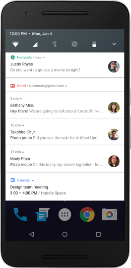
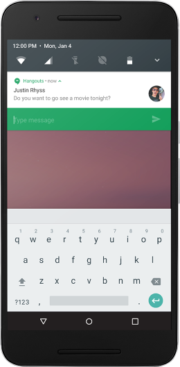
So what's Google doing to fix notifications? In the forthcoming Android N update, the company is introducing a feature that highlights notifications from anyone on a user's VIP list in a different color and places them at the top of the stack. They've also added inline replies to notifications to make them more quickly actionable. And while Google says it's only just started to ideate ways to improve notifications in Android O and beyond, comments made by Aranda, Ali-Hasan, and Baig indicated that there could be a number of changes to notifications made in the near future, including the ability of users to prioritize notifications, assign LED light patterns to important notifications, and even apply machine learning to keep unwanted notifications from constantly reappearing on a user's smartphone.

Such changes to Android's notification system are at least a year away.

In the meantime, Google is highlighting what it calls the principles of good notifications for developers: A well-designed notification will be relevant to their users, they'll be actionable, they'll be worth the time of reading, and they'll have a legitimate reason to interrupt users.

One surprising thing revealed by Google's research? Aranda says they found that people tended to open games, social networks, and news apps so often that notifications actually tended to actually drive users away from the apps, not vice versa. So maybe the most important principle of good notifications is this: Your app probably doesn't need them at all.

All Images: via Google

Google's Project Ara Is Challenging The Very Notion Of What A Smartphone Can Be

$
0
0

Google's Project Ara has had an arduous road to market. It began in 2013 as a pie-in-the-sky concept: a Lego-like system for building smartphones called called Phonebloks. Phonebloks went viral, and soon, Google-owned Motorola announced that it was going to try to turn the project into a reality—under the codename Project Ara.

But the Google endorsement, along with the high production values of the original Phonebloks concept video, made modular smartphones look as though they're right around the corner. The truth is, modular smartphones have always been an insanely tricky problem—one which Phonebloks'own creator told us, three years ago, he doubted could be realized within the next 10 years.

That makes the work Google has done turning Project Ara into a reality all the more impressive. Under Google, Project Ara will ship dev kits later this year, and is looking to ship the first Project Ara smartphone to consumers in 2017: about half the time Phonebloks' creator originally thought it would take to bring a modular smartphone to market.

Yet at this year's Google I/O developer conference, the Project Ara team told me they have realigned the concept from an upgradeable consumer smartphone into a modular computing platform that challenges the very notion of what a smartphone can be.

The original promise of Project Ara was upgradeability. Instead of having to switch out your smartphone every couple of years, imagine if you could just switch out the parts that were important to you: a faster CPU, a better camera, or more memory. But over time, Google has shied away from promising the ability to upgrade all the components of your smartphone. In the latest model that the Ara team showed me, the core components on the smartphone—the screen, the modem, the CPU, and the memory—aren't removable at all. So instead of an upgradeable smartphone, Project Ara has shifted into a smartphone with modular expansion slots, for things like speakers, cameras, secondary e-ink displays, and more. You'd plug and unplug these modules on a daily basis as you need them, and while they'd soup up your smartphone's capabilities, none would be crucial to the operation of your smartphone.

According to Project Ara's Blaise Bertrand, there are a few reasons why Google decided to scale back from the original promise of total upgradeability. First, there was the concern that people would accidentally lose or leave their device's core components at home, rendering the whole smartphone inoperable. (The fact that switching out core components requires system reboots, and can cause kernel panics, doesn't help either.)

But the other reason, Bertrand says, has to do with the fact that we're edging up against Moore's Law. Computer upgrade cycles are getting slower, which means that what people increasingly want from their smartphones isn't so much more speed as it is more capability. "It's an interesting new paradigm," he says to me, holding up the Project Ara prototype and flipping it back and forth between the screen-side and the back, where the modules plug in. "The phone side, or the module side. What's more important to a smartphone in 2016?"

So Project Ara has realigned itself to challenge our concept of what a smartphone actually is. "It's hard to convince a major smartphone maker to bet their next flagship on fringe new features," says Project Ara chief Richard Woolridge. But those "fringe new features" might actually be features that millions of people could use. Take diabetes, for example. Twenty-nine million people in America alone have diabetes, and a sizable portion of them have to check their glucose levels on a daily basis. A Project Ara smartphone could do this for them for just the cost of an inexpensive, third-party snap-on module, but what are the chances that, say, Samsung will announce the Galaxy S8 Type II Edition anytime soon? Slim to none.

Accessibility is another exciting way Project Ara could make a sizable difference to the non-nerd contingent. Blind users could snap a braille display on the back of their smartphones to be able to read what's on the screen, no matter where they are. Android already supports third-party physical switches (like buttons for "select" or "back"), so that mobile devices can be navigated by people with poor motor control. Project Ara could embed those buttons right into the device. These kinds of features, Woolridge points out, would never make it into a conventional smartphone, yet they are absolutely critical for the 1 billion people in the world who experience some form of disability.

But even for the 6.125 billion humans without a disability, the promise of Project Ara is to change the definition of smartphones, tablets, and other computing devices. Do you love listening to music outdoors? Jam six speaker modules on the back of your smartphone, and you can suddenly out-blast any boombox. Are you a gamer? Project Ara could give your smartphone built-in buttons and a D-pad. Shutterbug? Snap four cameras to your smartphone, and let Android stitch them together into an SLR-quality image.

But those are just conventional ideas. Why couldn't a smartphone, for example, have an embedded pillbox, a built-in compact, a high-powered microscope, a pressure-sensitive Wacom tablet, or even something as crazy six robot spider legs? Project Ara opens up the door to all of those things.

True, Ara has distanced itself—mostly out of necessity—from the notion that every smartphone can be as upgradeable as a desktop PC. But that idea was never all that interesting anyway. Far more interesting is Project Ara's new scope: making the black mirrors in our pockets exciting again. And after that? The ultimate vision for Project Ara is you might pop one of its modules out of your smartphone, and into your car dash, or your smart refrigerator, or even a watch band. Smartphones, says Bertrand, are just the beginning. "If you can make modular computing work on a smartphone, you can make it work anywhere."

Controlling A Smart Home Can Be As Easy As Tossing Keys In A Bowl

$
0
0

The smart home of the future will likely be controlled with your voice, which is why companies like Google and Amazon are putting so much effort into getting their ears into your living room. But voice control feels impersonal. It's disconnected from the physicality of the objects with which we have intimate connections in our day-to-day lives.

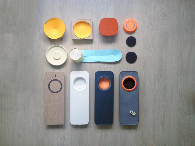
Memodo is a new take on how the smart home of the future could be controlled. Instead of using your voice to dim the lights and Netflix-and-chill, you place physical totems representing those actions down in a specific place. So, for example, throwing your keys into the key bowl when you get home could kick up the jams, or turn on the A/C.

The heart of Memodo is a reader-bowl. It looks low tech, but the inner walls of the bowl actually include three low-res, off-the-shelf computer cams, which can detect the shape and color of the objects placed inside it. These objects are called totems, and can be anything that fit in the bowl: keys, dice, coins, shells, small toys, and so on.

Totems don't do anything, though, unless Memodo is trained to recognize them. When you place a new totem in the bowl, Memodo goes into recording mode, detecting the next few actions and changes you make in your smart home. During this period, you can set you environment however you want—turn your phone to Do Not Disturb mode, dim the lights, raise the heat, fire up Spotify, and so on. After you do this two or three times, Memodo will remember what the totem means, and perform those actions next time you place it in the bowl.

So why are totems a better way of interacting with a smart home than voice control, or remote apps on your smartphone? "People are drawn to real things they can touch or feel," says Memodo creator Gábor Bálint, who proposed the project as part of his master's thesis at Moholy-Nagy University of Arts and Design in Hungary. "They will always feel more emotional attachment to physical representations of digital commands than to screens ... Totems allow for gesture-like, almost ritual interaction. You just take one and activate it."

Memodo was born of the understanding that when people come home, they don't really want to perform actions. They want to invoke states. "I call them 'home-states' for lack of a better expression," says Bálint. "You don't want to turn a light off, you want to go to sleep. Homes have a couple of these states that all come with a list of actions you need to do. Getting ready for work, or sitting down for dinner are all modern rituals that every home experiences. I wanted to take these 'states' and represent them in a tangible way."

Right now, Bálint says, every IoT device comes with its own smartphone app, because device makers are rushing to market as fast as possible without thinking deeply about how the devices are controlled. But that's a mistake. "A user shouldn't be drowning in a sea of apps to control their home," Bálint says. "Nobody wants that, not even IoT companies."

Memodo is just a concept for now. And to make it a real product, a lot more needs to be done. Tech isn't the problem. Memodo can easily be built with today's existing hardware, but it all comes down to what Bálint calls "the fundamental problem of IoT"—compatibility. "A lot of standardization needs to happen in order to be able to talk to everything in your home. I know a lot of people are working on that, and there are some very promising startups creating all kinds of smart hubs."

But there's no universal language for the IoT yet: a set of commonly agreed standards, like HTML or Wi-Fi, that allows all IoT devices to talk to one another. Until there is, Memodo will remain a tantalizing concept for a "parallel future" of the Internet of Things: one in which grandmothers put their grandchildren's birthstones in a bowl to call them on Skype, or kids use an Optimus Prime toy to turn on a Transformers cartoon.

What Architects Make When They Play With Lego

$
0
0

Many kids who grow up to be architects get their start with Lego, but how do architects play with Lego when they're not kids any more? To find out, the Lego Store in New York's Flatiron District, in collaboration with Architizer, recently held an event. There, they teamed architects from BIG, SHoP, HWKN, and Bernheimer Architects with students from Manhattan's Urban Assembly School of Design and Construction to create a new New York out of monochrome Lego blocks, unbounded by pesky budgets and zoning laws.

The scale of the projects that came out of the event ranged from "mere" skyscrapers to entire cityscapes. With the help of Lego designer Lars Hyldig, Alex Stewart from Bernheimer Architects constructed a thin tower that cantilevered and fold into itself, creating multiple levels of elevated public spaces, terraces, and gardens. But HWKN founder Mark Kushner wasn't satisfied with a single building, and instead, directed his students to build an entire cityscape, with each remarkably shaped building connected through a complex web of sky rails.

Kushner says this cityscape was, in part, inspired by a great Lego tragedy of his youth. "When I was 13, I built a very intricate Lego city that suffered a huge tragedy when it was accidentally hit with a vacuum cleaner," he tells me. "As I rebuilt the buildings I created memorials with plaques that I printed out on my dot matrix printer commemorating The Great Vacuum Incident of 1988. Legos didn't make me love architecture, but they gave my love of architecture a place to develop."

Stewart also says that playing with Lego as a child was a huge influence on his eventual career path. "Growing up, my two brothers and I had a massive collection of Lego blocks that we used to construct—and dismantle—whole imaginary worlds," he says. "I think the creativity that took, and the craft that made it happen, directly contributed to my career as a designer."

But is playing with Lego really all that similar to being a pro architect? Stewart says it's not as different as you might think, paralleling real-world design and construction quite closely. "For both, you're dealing with factors like structural integrity, material sourcing, and unit aggregation, as we're limited to blocks, planks, tiles, and so on," he says. There's even an analog to financing. "The same way we consider clients and their budgets as professional designers, I considered the contents of my piggy bank when choosing which Lego set to purchase and build. In both cases, compromise is a valuable lesson."

Still, there were some at the event who felt, if anything, that becoming professional architects had somehow made them worse at Lego. "If anything, being an adult and knowing realistic limits on what can and cannot be realized can actually limit your creativity," Kushner says. So consider the trade-off: If you want to become an architect, it might come at the expense of your Lego skills.

Photos: Dan Keinan

related video: the history of lego in 3 minutes


Look Closer! This Spider Bot Is Actually A Person Walking

$
0
0

At first, this kinetic sculpture looks like 15 biomechanical insect legs twitching in mid-air, each one tipped by a small LED light. But watch long enough, and those lights synchronize. Soon, you don't see the legs at all. All you see is the negative space between those lights: an invisible man, ambling along with a long-limbed gait, throwing his arms around as he strides.

Study In 15 Points / 1 is the first of a series of kinetic sculptures by Random International, the artistic collective behind Rain Room, an indoor gallery where it rains everywhere except where you're standing. Compared to Rain Room, Study for Fifteen Points has a decidedly smaller scope: it's an experiment in trying to determine the minimal amount of information necessary for an animated form to be recognized as human.

"We only started to explore this space and are fascinated in the space between the biological and the mechanistic motion, when the machine becomes human," Random International's Hannes Koch told The Creator's Project. "When arranged and animated in order, the points of light represent the human anatomy ... Instinctively, the brain is able to stitch the disparate points together and recognize them as one human form."

Right now, Study for Fifteen Points / I stands only around two feet tall, but it will eventually come to New York's Pace Gallery this fall as a human-sized sculpture. Future iterations of the project will try to animate a human doing things besides walking, although Random International hasn't yet announced the exact motions these future sculptures will make: jumping rope, perhaps, or riding a bike?

You can see more of Random International's work here.

Tribe Mixes The Best Of Text And Video Chat

$
0
0

Although it's the most dominant form of communication in the mobile age, text messaging isn't particularly convenient. We put up with typing on our tiny, error-prone keyboards because it beats the alternative: intrusive phone or video calls that can neither be put off nor segmented into bite-sized messages like text can.

Tribe is a messaging app for iOS and Android that's the best of both text and video messaging. It has all the immediacy of FaceTime, with the asynchronous, take-it-when-you-want-it quality of text messaging. And because it works like a face cam walkie-talkie for your smartphone, it's easier to use than both. As one Twitter user colorfully noted, it's as if Snapchat and Periscope made a baby.

To start recording a short video message to a friend in Tribe, you press your finger on a contact; to send, you take your finger off the screen. It goes into their Tribe inbox, and they can then watch it when they have a moment. The contact screen in Tribe takes some tricks from Windows' Metro UI: it's a tile-based grid of your most common contacts, with a little digital compact mirror in the lower corner of the screen, showing your webcam view. The most recent messages from your Tribe show as animated previews, which you can tap to view. By default, Tribe wants you to send short video messages, but you can also send audio only messages (you turn off the webcam by tapping on the digital compact mirror), or even self-destructing text messages which disappear after 24 hours.

What sets Tribe apart from other messaging apps is how it feels utterly native to mobile, in a way that iMessage or WhatsApp doesn't. You hold down on a contact's tile to send a message; you tap a contact to see her latest incoming Tribe message. To search for a contact, you drag down from the top of the Tribe home screen, which scrolls through your address book automatically. And so on. Nearly everything in Tribe has been designed so that the app can be used with one hand. Even adding a new contact is as easy as entering your smartphone's security code, thanks to a fantastic system in which contacts share pins, not usernames.

That was by intent. "We built Tribe because we thought that mobile messaging started as a copycat of desktop messaging apps," says Tribe CEO Cyril Paglino. That was great initially, because you could reach your contacts from everywhere, but it also meant that mobile messaging apps inherited the UIs of the desktop apps that preceded them, just in a compromised form. Tribe was created with the idea of approaching messaging UIs from a truly mobile-first perspective.

It's an approach that seems to be paying off. Millions of messages have been sent using Tribe since it launched in 2015, and momentum is building: for the past few months, the app's user base has consistently grown by 10% week-over-week. Paglino says new features are in the works, too, but only if the team can figure out how to integrate them while staying true to the simplicity at the core of the Tribe design ethos.

"Even though they start simple, cool products tend to become complex over time," say Paglino, introducing cognitive load and driving users away. That's a mistake Tribe is eager to avoid. No matter how powerful it becomes, Tribe wants to be the simplest mobile messenger out there, forever. Download Tribe here.

A Universal Interface That You Control By Doodling

$
0
0

Right now, the Internet of Things is controlled by a thousand little apps that mostly live in your smartphone, each with its own UI. But what would a universal UI for the IoT look like? In the mind of interaction designer Marc Exposito, it looks like a children's drawing on a magic piece of digital paper that can control the real world around you.

According to Exposito, who completed the project as part of his final bachelor's thesis in La Salle Campus Barcelona's Seamless Interaction Group, DrawIt was created to help reduce the "mental load" of the Internet of Things—which forces users to learn a new interface for every single smart device they add to a home. Exposito thought that the ideal interface for the Internet of Things would allow people to more intuitively interact with their smart devices, and what's more intuitive than drawing? "Drawing is a natural way to express ourselves as human beings," he says.

DrawIt works by representing all of your IoT devices—your Philips Hue lamp, your Nest thermostat, your Bluetooth speaker, and so on—as a simple shape, like a circle or a triangle. Loading up the app for the first time, DrawIt looks like any other tablet-based doodling app. But when you draw something in DrawIt, it controls one of the smart objects in your home, depending on your artistic flourishes.

For example, by drawing a triangle and then coloring it in, you could turn on an LED light and then shift the mood lighting to purple. How does DrawIt know that a triangle represents the light? You train it by pointing your tablet's camera at the smart object you want to control, and then drawing the shape you want to represent it.

But in addition to just controlling one device at a time, DrawIt can also be used to link devices together. Say you have a Bluetooth speaker and an LED light, represented by a circle and a square. In DrawIt, you can draw a line between those two shapes to connect them—so that when you raise the volume on the speaker (which you do by tapping the circle, then pinching it out to make it physically bigger) the light from your smart lamp gets brighter. Conceptually, at least, you can network all your home's smart objects together in this way, controlling them all simultaneously by constantly elaborating on a Rube-Goldberg-esque drawing.

Like Methodo, another universal controller for the Internet of Things, there's nothing technologically impossible about DrawIt. It remains a concept right now simply because there's no standard language for the Internet of Things (like HTML, or Wi-Fi) that allows a single set of commands to control all devices.

But if the Internet of Things is ever going to fulfill its promise and make our homes smart, that standard language will eventually have to evolve. And then, concepts like DrawIt won't seem so far-fetched or futuristic. They'll simply be one of many ways in which we can control our homes.

The Extreme Couture Of London's Underground Club Scene

$
0
0

A bedouin bedecked in nothing but newsprint. An enantiomorph, shimmering in the dark like a human negative. An S&M demon with a vulva for a face. A bearded woman wearing a Technicolor dream coat. A living representation of René Magritte's Son of Man.

The fantastic individuals Damien Frost photographs for his series Night Flowers don't look like they belong to 21st-century London. Instead, they'd look more at home in the dreamy London of writers like Neil Gaiman, China Miéville, Clive Barker, and Michael Moorcock. Yet these are real people in some of the fringiest-fringes of London's club scene, collected by Frost in a new book from Merrell Publishers called Night Flowers: from avant-drag to extreme haute-couture.

What's a Night Flower? Frost says he borrowed the term from drag performer Maxi More as a "poetic way to describe the wild array of people that constitute the more colorful elements of the London alternative club, queer, performance, and arts scene." It's not a commonly used term, he admits, but he likes the way it describes the "loose-knit society of drag queens, drag kings, club kids, alternative-queer, transgender, goths, fetishists, artists, burlesque and cabaret performers, and gender illusionists who bloom at night and burn bright amongst the neon lights of late-night London."

In his day job, Frost works in Soho, an area in London's West End long established as the city's entertainment district. It's an area that was "once known for its neon and seedy nightlife," Frost says, but which has fallen prey to gentrification in recent years. Still, pockets of the old Soho remain, and in time, Frost found himself staying out later and later at night, drawn to the colorful characters who can only be found after midnight—and which he would eventually make the subject of his art.

It seems unbelievable that there are people walking around London at night in these outfits, but Frost swears that each of his Night Flowers is shown exactly as he originally encountered them, in clubs, on dance floors, or waiting around in hallways. These looks aren't being recreated after the fact, either: Frost shoots them then and there, against the nearest dark wall. Why do the Night Flowers dress this way? Primarily, it's an extreme form of self-expression: a way of experimenting with one's look even as they also explore their sexuality and identity in a (mostly) liberal-minded city.

At the same time, many of Frost's Night Flowers are professionals. "There's many who are fashion designers and makeup artists who will experiment with looks and clothing in the club scene and kind of road-test ideas," Frost explains. "A couple of years ago some outfits Lady Gaga made headlines for wearing in Paris were first worn by some drag performers in London when the designer fitted them all out in it for a party. So while it may seem quite far fetched to see it on the streets or in clubs at night it could just as easily turn up in a movie or fashion magazine months down the line."

Night Flowers may look otherworldly, but really? They're just ahead of the fashion curve.

All Photos: Damien Frost

Nendo Designed A Whole Department Store, And It's Bonkers

$
0
0

What do you get when you ask the insanely prolific Japanese design firm Nendo to redesign a department store? The new Siam Discovery, a five-story retail complex in Bangkok that Nendo has turned into a multiverse of inventive themed spaces, each more design porn-y than the last.

The breadth of invention in the new Siam Discovery is astounding. There's a women's footwear department that looks like a set from the end of 2001: A Space Odyssey, in which countless circular marble plinths are arrayed in a white-and-gray showroom (on which the occasional high heel is displayed, of course). Men's footwear is displayed in a similar room that uses angular boxes of maple and oak as stands. But these seem to defy gravity, as if they're floating up to the ceiling, because the ceiling is also embedded with these boxes. There's a showroom made up of white wireframes, and another which looks like a laboratory, filled with beakers, flasks, and test tubes.

If it sounds all over the place, it's because it is. Still, there was method to Nendo's madness. The original Siam Discovery space was deep, dark, and unwelcoming, with a narrow façade that resulted in a poor customer flow. Nendo's new design opened up Siam Discovery by turning the first floor of the building into a long, open canyon of circular atriums, which draw customers deeper into the store, and up the escalator to other floors. Meanwhile, a gallery of 220 frame-shaped boxes containing both video monitors and store merchandise serves as a store directory on this first floor, giving visitors an often real-time view of what awaits on other floors.

It's hard to summarize a project like this, but we'll try: if you could walk around in the brain of Oki Sato himself, we think it would probably be a lot like this. If you're ever in Thailand, you can visit Siam Discovery here.

All Photos: via Nendo

Viewing all 2739 articles
Browse latest View live