Quantcast
Channel: Fast Company
Viewing all 2739 articles
Browse latest View live

How Board Games Became Fun

$
0
0

A new exhibit examines how board games transformed from upper class educational tools to fun pursuits for everyone.

Board games are hotter than ever. In the past four years, U.S. board games sales have risen, on average, between 25% and 40%, and there are more people designing and playing board games than ever before.

It's easy to assume that board games were always fun and popular. But that's not true, as Catherine Howell, curator and collections at the V&A Museum of Childhood in London, explains. The museum is holding an exhibition on board games called Game Plan. And as Howell tells it, board games only became mainstream in the past 125 years.

Board Games As Morality Plays
The first modern board game to hit England was probably The Game of the Goose, a prototypical racing game—like Candy Land—in which players roll dice to try to reach the last square on the board before their opponents can. Like many contemporary board games, The Game of the Goose had themes, characters, and a loose plot—help the titular goose navigate the countryside without being served for dinner. Since it was an incredibly simple game without much strategy, it used dice to add replayability. Records show that The Game of the Goose was played in London as far back as 1597.

It wasn't until the 19th century, though, that The Game of the Goose became really popular, and arguably kicked off the modern era of board game design. Before then, the game was usually only played on special occasions, like Christmastime, largely because it was seen as frivolous. Starting in the early 19th century, though, game makers started adapting The Game of the Goose and marketing it as an educational game for children to upper class families. These educational adaptations often had prurient names like The Cottage of Content or The Mirror of Truth, and were designed so that when a child landed on a square, she had to recite a fact about manners and morality.

"This is the Georgian era, a time which was probably the first time that children were looked upon as people, worthy of their own arts and entertainment," explains Howell, saying that the rising popularity of children's board games in early 19th century also coincided with the advent of children's literature. For the first time, an entire generation of children—or at least well-off children—were being raised with board games in their homes.

These boards games were a far cry from the cheaply printed board games kids play today. The board itself was usually printed, sewn to linen, then colored by hand, like the maps of the era; the pieces themselves, and even the die, were usually hand carved. Needless to say, these games were expensive, and usually only purchased by the upper classes. "It was the difference between buying a cheap cell phone and an iPhone," says Howell, explaining how much more expensive these games were from a Monopoly set today.

Soon, other board games were being adapted for kids, usually by adding morality lessons that made them plausibly less frivolous. A great example on display at Game Plan is Snakes and Ladders (released by Milton Bradley as Chutes and Ladders in the United States). In India, where the game originated, Snakes and Ladders was known as Moksha Patam, and essentially functioned as an interactive visualization of the Hindu philosophy of karma: landing on a ladder results in you reincarnating on a higher plane of existence, while landing on a snake results in you sinking down a level. By the time it reached England in the late 19th century, though, the game had lost its Hindi appeal, and become another Victorian morality play, with squares devoted to anger, greed, sloth, and other vices.

All of these games, though, were exclusively aimed at upper classes. Not only could no one else afford them, and the working classes simply didn't have time to play them.

The Invention Of Leisure
But things changed, as the effects of the Industrial Revolution became felt throughout England and the rest of the world. By the late 19th century, board games had undergone an explosion in popularity. Part of that was due to sinking manufacturing costs—board games no longer needed to be made individually by hand—but equally important, says Howell, was the rise of leisure time. The practical result of industrialization was that people simply had less work to do, and more hours in the day to follow hobbies and leisurely pursuits. Consequently, by the turn of the 20th century, most board games had dropped their moralizing. They suddenly became unapologetic about competition and fun, not shaping the minds of tomorrow's youth.

Of course, because we've lived through 125-plus years of board game ubiquity, nothing seems more natural than for board games to be cheap, enjoyable fun for everyone. In fact, most of us can probably rattle off a dozen or more titles we've personally played, and even more we've heard about, ranging from Monopoly to Secret Hitler. But throughout history, games weren't for everyone. Until the Industrial Revolution changed anything, they were only for a lucky few who had two incredibly rare resources at their disposal: money and time.

Game Plan: Board Games Rediscovered will be on exhibition through April 2017 at the V&A Museum of Childhood.


Who's Behind That Anti-Trump Art?

$
0
0

Meet the artists and designers planting anti-Trump propaganda in the streets—and one who's for Trump.

With Election Day less than two weeks away, GOP presidential nominee Donald Trump has said he will only accept the election result if he wins. The likelihood of Trump winning, though, looks increasingly unlikely day by day, leading some of his supporters to suggest that they'll take the fight into the streets if Trump loses.

That's horrifying, but the truth is, artists and designers have already been fighting in the streets against (and sometimes even for) Trump for months. Here are seven of our favorite subversive street-level design hits this election season.

Trump Swastika Posters
Inspired by Pentagram's work for the Hillary Clinton campaign, graphic design professors Mark Fox and Angie Wang from the California College of Arts designed Trump his own logo. It's made up of four rotated, interlocking 14-karat Ts—each one representing a different supposed aspects of the Trump brand, including strength, success, wealth, and impolitic "tell it like it is" speech—that are positioned to create a Nazi swastika in the negative space. Fox and Wang distributed this poster throughout San Francisco's Mission District, where the designers say it spurred some confused responses from onlookers who couldn't actually be sure that a poster containing a swastika was actually meant to be anti-Trump.

No Trump Anytime Parking Signs
These signs, which have been spotted in major American cities such Los Angeles, London, Miami, New York and Chicago, are the creation of Plastic Jesus, an L.A.-based street artist who apparently missed the memo that Donald Trump exclusively double parks in handicapped-only spaces.

Building A Wall Around Trump's Hollywood Star
Another Plastic Jesus joint, this 6-inch tall concrete wall was erected around Donald Trump's star on the Hollywood Walk of Fame one afternoon in July as satirical commentary on his plan to erect a 2,000-mile long wall on America's southern border. It came complete with miniature flags and "Keep Out" signs, as well as graffiti on the side that read: "Stop Making Stupid People Famous." Most onlookers found the tiny wall hilarious, with the curious exception of an Edward Scissorhands character actor who reportedly became furious that the tiny wall was stealing his attention. And Trump says his wall is meant to save American jobs!

Undocumented Democrats Say Dump Trump Signs
This one's probably the most subversive of all, really: pro Donald Trump street art! These "Undocumented Democrats Say Dump Trump" posters were put up around Los Angeles in July last year by conservative street artist (bet those are three words you never thought you'd see in a row) Sabo, whose previously produced photomontages for Breitbart of Nancy Pelosi twerking, a greased-up Joe Biden flexing his muscles, and a curiously busty Mark Zuckerberg flashing his nipples.

The Emperor Has No Balls
Probably the most famous guerilla protest art against the GOP nominees: These nude cartoon statues portray Trump as a flabby, veiny man with an orangutang's butt, a micropenis and no testicles. Erected in cities such as Cleveland, Los Angeles, New York City, San Francisco, and Seattle back in August, the statues were commissioned from artist Joshua Moore by anarchist collective Indecline. A spokesperson for Indecline told the Washington Post: "Like it or not, Trump is a larger-than-life figure in world culture at the moment. Looking back in history, that's how those figures were memorialised and idolised in their time – with statues."

Loser Light Art
Donald Trump's brand is built upon the idea that he is a winner; anyone who opposes him is therefore a loser. Back in March, artist Vicki da Silva decided to flip the narrative. By using a lamp and a camera set for a long-exposure to perform a piece of street art right in front of New York's 40 Washington Street, da Silva was able to record herself branding Trump Tower with the word "Loser" in big neon calligraphy. "Since Trump has a nasty habit of calling people losers, it was my way of putting it back on him using his name and logo," she told the Huffington Post.

Americans Abroad Vote Bus
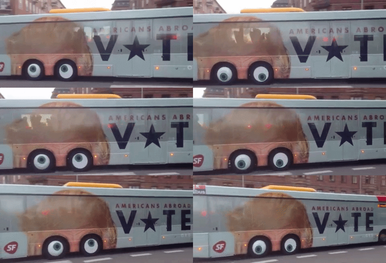
This one's from across the pond, but we have to post if for the GIF alone. In the Danish capital of Copenhagen, a city bus has been modified to encourage Americans living abroad to vote. The side of the bus has been covered with a vinyl sticker, so that the wheels—which have been modified to look like a big pair of googly eyes— are constantly rolling around idiotically in Donald Trump's head. The ad, commissioned by Denmark's Social People's Party, was created by the ad agency Uncle Grey. Check it out here.

What Designers Buy At Ikea

$
0
0

Furniture designers from Design Within Reach, Lunar, Dror, and more tell us what they buy when they go to Ikea.

Through its sheer ubiquity, Ikea furniture is often categorized as a design staple, not a design luxury. In fact, if you're anything like most people, you probably think Ikea furniture is for dorm rooms and studio apartments, not designer homes and penthouses. Right?

Wrong. Ikea sells plenty of shovelware particleboard crap, but the company also has loads of genuinely great products, which anyone with a discerning eye would be proud to keep in her home.

To help us find these pieces, we asked a handful of furniture designers what their favorite Ikea designs are.

Malm Series - $30 to $559
"I think I have had a piece from this series in every place I have lived since I was in my twenties," says Jason Miller, founder of Roll & Hill, the Brooklyn-based lighting fixture collective. "They are simple well-constructed cabinets that are extremely practical solutions for storage areas or kids' rooms and have the added benefit of being attractive enough to use in more prominent areas. Currently, I have one in my daughter's room and my closet."

Sektion kitchen system - $5 to $204
Released in early 2015, Ikea's Sektion system of kitchen cabinets hasn't been around for long, but they've made a hell of an impression on designers.

"Since I'm an architect, I have used the Ikea kitchen system many times as a base for customizing interiors with storage and more," says Jason Wagell, designer at Design Within Reach "I use the cabinets and cut them down in width and height and order or build new doors where needed to ensure a perfect fit." Sandy Chilewich, founder and creative director of the textiles company Chilewich, concurs. She likes Ikea cabinet systems, including Sektion, because "they can be incorporated into a minimal, clean environment and work really well at a fraction of the cost of more luxe brands. Especially in high-gloss white."

John Edson, president of the global design firm Lunar, believes the Sektion cabinet system embodies basic principles of good design. "Ikea kitchen cabinets are the pinnacle of the Ikea promise," he says, praising the full-extension drawers, doors that don't slam, and the family of accessories that make building a kitchen low-effort, no matter what space you're working with. "There is a growing industry that creates doors and end panels to extend the personal expression possible with the cabinets," he says. "These cabinets are a platform that embody the essence of design for everyone."

Bekväm Stool - $20
This $20 stool is about as simple a piece of furniture as you get at Ikea, which is why it appeals to David Weeks, furniture designer and founder of David Weeks Studio. "Ikea, to me, is your jeans and T-shirt kind of stool. You get the basics there, and you know you can always find them. This stool is simple, well-designed, and inexpensive: the trifecta of qualities [people should look for in] a basic piece of furniture."

Svärtan Collection - $3 to $99
Dan Harden, president and CEO of Whipsaw, says that he doesn't often buy Ikea furniture, because "everything I got there fell apart" (familiar!). Not exactly the best start to a question about Ikea's best designs, but Harden says that even so, he admires Ikea's materials-first product lines, like the Svartan collection, a line of houseware products like bowls, rugs, and more inspired by the materials, patinas, and textures of India. "My rule of thumb for Ikea is to buy materials, not mechanisms," he says. "Ikea tends to save costs on things like hinges, fasteners, and electronics... they're under-engineered to be extremely low cost. At these crazy low prices, something's gotta give!" But material-centric products like the Svartan Collection still count as well-designed products in Harden's books. Buying furniture at Ikea, though? "I recommend additional screws or nails!" Harden says.

Sniglar Crib - $80
Not all of Ikea's best products are aimed at adults. Dror Benshetrit, founder of the eponymous New York design studio Dror, thinks you can't do better than to buy an Ikea Sniglar crib to initiate your child into a lifelong love of design. "I have two young children, Noï, 4, and Oht, 1, both of whom started out in this pared-down beech crib," he says. "As their first nest, their first resting place, I love that it's free of distraction, that it's a blank canvas for their first dreams and thoughts." He particularly likes the fact that a Sniglar crib can grow along with your child: one side is fully removable, allowing a child to get into bed by themselves when they are old enough to do so.

Janinge Armchair - $59
This $59 armchair, designed for Ikea by Stockholm studio Form Us With Love, has a lot of fans, and for good reason, says furniture designer Joe Doucet, president and chief creative officer of Joe Doucet and Partners. It's the rare chair that is cheap, beautiful, and comfortable.

"I'm often asked what is the most challenging thing to design. The answer of a comfortable chair surprises most people. To do it with economy and elegance, as is the case with the Janinge, is such a a rarity as to occur once every 10 or so years. You will find these in our studio along with my endorsement for it being the best design of 2015. "

Björkö Table - $99 to $179
An oldie, but goodie: The Björkö table, originally released in 1999, can't be found in any modern Ikea catalogs—it was discontinued over a decade ago—but for the greater part of the last two decades, it has been one of Jens Martin Skibsted's favorite pieces of living room furniture. "I've had this white Ikea table for approximately two decades," says the founder of Skibsted ID. "It's super sturdy and simple. I've demounted and reassembled it as a sofa table for my past four residences. (It has a little brother too that's roughly a third of the size. That one is under my printer.)"

An Ikea table that lasts two decades? That's not just good design. It's a miracle.

You Can Now ¯\_(ツ)_/¯ And ROFL Using Emoji

$
0
0

Our pictogram language is rapidly evolving.

Future linguists will no doubt be shocked that human beings ever communicated with anything as pedestrian as written words. By then, English will have been entirely replaced with an advanced pictographic language—emoji, of course—capable of encoding any object, emotion, concept, or thought in a pithy cartoon sticker.

We aren't there yet, but we just took another baby step closer. Next month, iOS users—which accounts for roughly a billion devices around the planet—will be able to use emoji to convey everything from a a bored shrug to a cute, cuddly owl, when the iOS 10.2 update hits iPhones and iPads.

Now available as a developer-only beta, iOS 10.2 contains 72 new emoji approved back in June as part of the Unicode 9.0 standard. These include an avocado, a kiwi fruit, a shrugging person (¯\_(ツ)_/¯), an owl, a fox, a duck, a gorilla, a rhino, a call me hand, a selfie hand, a prince (but, sadly, not the Prince), Mother Christmas (whoever that is), a pregnant woman (but sadly, despite emoji's attempts to diversify, no pregnant man), a literally terrifyingclown face perfect for this creepy clown season, an emoji indicating that the sender is in the middle of that most timeless of activities, a full-body ROFL, and many, many more.

Also worth mentioning? Apple users are now getting the diversified emoji professions previously announced by Unicode, which aim to help end emoji's sexism problems by making sure there's a female equivalent for any male figure in the standard.

Emojipedia, the go-to resource for all things emoji, expects that based upon past iOS beta releases these emoji will be available on iPhones and iPads everywhere by the end of November, with macOS presumably to get them shortly thereafter (I can't wait to see a creepy clown line-up on my MacBook Pro's touchbar). It's worth noting, though, that Apple is late to getting these emoji, with Twitter, Microsoft, and Google already rolling them out. Still, given the widespread popularity of iOS, it's likely that iOS 10.2 will be the first time most people will really see them.

And what's next? Next year we'll get Unicode 10.0, which so far seems largely devoted to making sure you can tell people what Chinese takeout you want to order through emoji. That list of new emoji will likely get fleshed out over time, though. Come to think of it, I'd love a Korean BBQ emoji.

Could Flax Be The New Plywood?

$
0
0

Christien Meinderstma's Flax Chair is an elegant, sophisticated chair designed out of a material that is like plywood made from linen.

In early 2010, Dutch designer Christien Meindertsma became interested in flax. So she approached a local farmer, Gert-Jan van Dongen, and asked him to sow flax seeds on a farm in his field. By the summer, van Dongen had grown an entire field of flax, which Meinderstma harvested with the intention of using as a design material.

Six years later, the resulting Flax Chair has won two Dutch Design Awards (DDAs)—not just because it looks good, but because in creating it, Meinderstma was able to invent an entirely new sustainable material.

Although perhaps best known as a food crop, flax has long been used to make textiles, including linen. Linen has been used in furniture design as an upholstery fabric, but Meinderstma's Flax Chair isn't merely some linen canopy chair. Rather, the designer combined flax with a biodegradeable plastic made from lactic acid. The resulting material can be used to make rigid chairs that hold a person's weight without a frame, almost like a cross between linen and fiber board.

Meindertsma created the Flax Chair for Label/Breed, a Dutch design house that specializes in teaming industrial and material designers to collaborate on new types of products. It can be constructed from a single 2-foot-by-3-foot sheet of flax composite, without any material left over.

In addition to winning the 2016 Product Design award, Meindertsma also won the Future Award, the Dutch Design Awards' equivalent of Grand Prize.

You can preorder a Flax Chair for around $540 through Label/Breed here.

How A Small Studio Went From Designing Vases To Designing Islands

$
0
0

Dror Benshetrit of Dror explains how his 12-person studio manages to keep innovating while staying small.

Founded in 2003 by Israeli-born designer Dror Benshetrit, Dror is a relatively small studio. With only a dozen employees alongside its founder, it operates out of an eighth-floor WeWork space.

Despite its streamlined size, Dror's portfolio is incredibly diverse. Over the last 13 years, Benshetrit has expanded his practice from furniture to retail to architecture, designing everything from vases and chairs to island retreats and cruise-ship terminals. Perhaps best known for his ruffled Peacock Chair, which Rihanna used as a throne in her video for S&M, Dror's work has been acquired by museums around the world, including New York's Metropolitan Museum of Art, and clients range from Louis Vuitton to Target.

At a visit to his lower Manhattan studio yesterday as part of the Fast Company Innovation Festival, the Israeli-born designer told attendees the four biggest lessons that have guided his practice over the past decade, and allowed him to find bigger ideas and take on bigger projects than would be traditional for a studio his size.

Learn To Flip Your Fears

Design is an exercise in positively impacting the world around you. But fear drives many of our actions in life, both personally and professionally. It can also prevent us from trying new things. How do you turn fear into a motivator for design? Benshetrit says by embracing it and turning the fear into something more beautiful.

This approach has been key to Dror's success, harkening back to the studio's first product, the Vase of Phases. Created in 2003 for the acclaimed German porcelain company Rosenthal AG, the Vase of Phases looks for all intents and purposes like a vase free-framed in the middle of exploding, embracing the very fragility that is most people's worst fears about what could happen to something they love made out of porcelain, and turning it into something beautiful.

The Vase of Phases quickly became a company best seller. Because it was inspired by a universal fear of the fragility of beautiful things, Dror says everyone related to it. "Children loved it because it was funny, while adults liked it because it was subversive," he says. Rosenthal loved it too: after 150 years, they were finally owning their product's ultimate vulnerability.

Fears, in design, aren't necessarily something to be avoided, says Dror. They're something to be flipped and turned into assets.

Think Holistically To Find Bigger Ideas

"The most important thing we as designers can do is create connections between people and their environments," says Benshetrit. Creating these connections, though, requires thinking holistically, and finding the bigger idea that is sometimes hiding behind the smaller one.

One example of Dror's approach is the Pick Chair. When approached to design a folding chair, Benshetrit started by identifying why we have them in the first place: to accommodate more guests in our homes or offices. And when they're not in use, we hide them away. "It's crazy," says Benshetrit. "We clean our apartment for guests, make sure it's beautiful, and then bring out the ugliest chairs imaginable, things we don't want anyone to see."

Thinking about this contradiction lead Dror to realize that the key to designing the ultimate folding chair wasn't necessarily to make it as small in its collapsed form as possible. It's to make it as beautiful when it's not in use as it is functional when it is. His solution was to design a folded chair that, when not in use, could be hung on the wall as a quadriptych.

A great example of how thinking holistically turns a small idea—designing a better folding chair—into a bigger idea that is more powerful: the folding chair as a piece of art.

Bring Fresh Eyes To Big Design Challenges

When Dror was approached to help design Nurai Island, a 1.3-million-square-foot tropical isle off of Abu Dhabi, Benshetrit says his first response was incredulity. The client wanted Dror to design a luxury vacation island for the sort of customers who might own five or six homes around the world. "When I got the call, I laughed," Benshetrit remembers. "I told them flat out: I don't know how to build this!"

But Dror didn't need to be an architecture firm to come up with the idea that would end up driving nearly every aspect of the $500 million project. "I asked myself, if money is no issue, why would a rich person buy a house in an island development? Why not just buy your own island? It's because people want to be part of a community, just as much as they want privacy."

To give Nurai Island dwellers the best of both worlds, Dror imagined the roofs of the complex to be entirely covered with a green vegetative carpet. From their balconies, residents appear to be alone on the island, seeing nothing but beautiful ocean views and lush canopy; on ground level, though, they can take part in the Island community.

The Nurai Island project resulted in nearly $1 billion worth of real estate sales, and opened a door of possibilities into architecture for Dror. The lesson, says Benshetrit? There's a strong temptation to any designer at a given point in his or her career to specialize: to only take on one sort of job, or one type of client. That's an instinct that Benshetrit says should be resisted if you want your designs to remain innovative and fresh. Great design is more often than not an alchemy that only happens under fresh eyes.

Collaborate Effectively To Achieve Big Things

At the end of his Fast Company Innovation Festival session, Benshetrit shared for the first time Dror's next project: a 4,000-foot boardwalk in Istanbul, which combines the functions of a terminal for the thousands of people who board and unboard Bosphorous cruise ships with a friendly tourist space filled with retail stores and restaurants.

Designing a terminal for cruise ships is like designing an airport, says Benshetrit, only harder. This port in particular needed to be able to load or unload as many as five or six ships at once, each of which could have thousands of passengers. In addition to the simple problem of loading and unloading passengers, you need to find space for immigration, customs, and all the facilities cruise ships need, like offloading garbage or bringing supplies on board.

Dror had an idea: what if they created the world's first underwater cruise ship terminal? The boardwalk's port functions would be tucked underground when not used. When a ship came in, sections on the board walk would be hydraulically raised, to allow passengers to embark and disembark underground without disturbing the boardwalk's day-to-day tourist trade . . . let alone be a visual blight upon it by obscuring the sea front.

After pitching the idea, Benshetrit says he returned to New York in despair: the client had flat out told him not to think about it because his practice was too small. But Dror ultimately won the contract by teaming up with Gensler, the design and architecture firm, whose size and know-how brought the commission within reach.

The lesson? If an idea is big enough, it doesn't matter how small your studio, as long as you find friends who believe in it as much as you do.

Here's How The Military Envisions Tomorrow's Dystopian Megacities

$
0
0

A leaked video proves the Pentagon's terrified of what the rise of megacities means for urban warfare.

"The future is urban."

So starts a Pentagon video, recently unearthed by The Intercept, that describes the near future of cities. If the video is anything to go on, the military expects that near future to be nothing short of a nightmare, with as much in common with 1984 and Blade Runner as it has with Snowcrash and Children of Men. It envisions the dystopian rise of megacities, chaotic, ultra-compressed hives of humanity that make the powder keg neighborhoods of post-war Iraq and Afghanistan look like Peyton Place.

According to The Intercept, which attained the video in response to a Freedom of Information Act request, it was used by the Pentagon's Joint Special Operations University to teach students about the sort of skills next generation armed forces will need to deal with tomorrow's megacities. These are "complex structures that defy both our understanding of city planning and military doctrine," the narrator gloomily intones over stock imagery of the world gone mad.

According to the Pentagon video, urban areas will grow by 1.4 billion people by 2030, nearly all within the developing world. 60% of the population of these cities will be under 18, living in spaces that "extend from the high-rise to the ground-level cottage to subterranean labyrinths, each defined by its own social codes and rule of law." Add in a massive gap between rich and poor, rampant unemployment, shantytowns stacked up against skyscrapers, and climate change, and these megacities have the potential to become very dangerous, very fast.

Why does this worry the Pentagon? The video points out that since the days of Sun Tsu, militaries have been taught to avoid fighting in cities and instead establish a cordon. Cities are simply too compressed, too chaotic, and too dangerous to occupy effectively. In Iraq and Afghanistan, the military has established new counter-insurgency doctrines for urban environments, but even these, the narrator warns, will be powerless in environments where an insurgency by 1% of a city's population means dealing with 100,000 enemies or more.

So how does the Pentagon intend to deal with such threats? It sounds like it doesn't have a frickin' clue. "This is the world of our future," the narrator says at one point in the video. "It is one we're not prepared to effectively operate within, and it is unavoidable."

Is it, though? That's the question.

Certainly, megacities aren't just coming, they're here already: there are 35 cities on the planet already with populations of 10 million or more. But population growth and the sort of hellish urban environments the Pentagon describes in this video do not necessarily go hand-in-hand; there's a world of difference between Tokyo, a safe megacity with a population of 38 million, and Karachi, a 24 million population megacity in Pakistan with an incredibly high crime rate.

A lot of that discrepancy can be chalked up to sociopolitical factors, but it's also true that there are many effective urban design techniques that can be employed to lower crime. For example, much of the social upheaval the Pentagon is predicting is based upon an explosive combination of overpopulation and inequality, a problem that can be lessened through smart housing policies and design and the creation of inclusive community spaces. Design can potentially make a difference and improve the lives of the influx of people who will soon populate these cities, avoiding the dystopia portrayed in this video. The question is whether it will be put into practice.

Either way, the military envisions itself needing to operate within these megacities; what remains to be seen is whether the environments of the future help or hinder them when they do.

Scientific Proof That It's Never Too Late To Make It Big

$
0
0

By visualizing thousands of academic citations, Kim Albrecht discovered that success happens totally randomly within a person's life.

Almost everyone who aspires to any sort of greatness in their field has asked, at one point or another, is it too late? Has success passed me by?

If that sounds familiar, a new interactive site by master data visualizer Kim Albrecht might give you hope when it comes to your career aspirations. Success, it seems, can come at any age; it's no more likely to happen when you're 20 than when you're 70—at least when it comes to a career in science. But those wishing to extrapolate these results to other fields might want to read the fine print.

For the data viz, which accompanies a new study in Science called Quantifying the evolution of individual scientific impact, Albrecht used a database full of every paper published by the Physical Review journal family from 1893 to 2000, Google Scholar (Google's search engine for scientific articles), and Web of Science, a comprehensive data site that allows academics to find and explore citations. From this data, Albrecht was able to find how many times every scientist in these databases had been cited by his or her peers. By finding which paper of each scientist had been cited the most, Albrecht could identify the precise moment in which they had their big break—at least comparatively.

The authors set out to discover whether or not there was a pattern for scientific success. But it turns out there is no pattern: No matter what field of science you're in, the likelihood of one of your papers becoming widely cited is totally random. It could happen at the beginning of your career, the middle of your career, or the end of your career. There's just no way to predict where on that timeline success is going to fall.

For designers, musicians, writers, performers, and other creatives who have been plugging away for years, waiting for their big break, this is probably heartening. Still, it's worth reading the fine print, which is that scientific "success" is probably not what most of us would consider success. Let's put it this way: Half of all academic papers are never read by anyone besides their authors and their editors. So if half of your scientific papers are never read, and then one is cited three or four times? Sure, that's a big step up—but it's not the scientific equivalent of winning an Oscar. It's a Webby at best.

Check out the visualization here or read the paper in Sciencehere.


This Video Of The World's Most Unsatisfying Things Is Strangely Satisfying To Watch

$
0
0

They're also all design innovations just waiting to happen!

A piece of jellied toast lying face down on the floor. A frying egg yolk drifting lazily to one side of the white, then dividing into a runny mess. A downloading progress bar stuck at 99%. These are the gnat-like irritants that float in humanity's collective karmic ointment. A new video focuses on them in hypnotic detail.

Set to the mournful lament of Samuel Barber's "Adagio for Strings"—the go-to classical piece for musically enunciating tragedy—the video is called The Most Unsatisfying Things in the World, and was produced by motion design studio Parallel as a way of highlighting many of the petit disappointments of life.

Such as? A free-throw basketball indecisively circling the hoop's rim, then impotently flopping off. A stainless steel spoon drowning in a bowl of alphabet soup. A fuse sputtering out mere millimeters from where it would have exploded a firecracker. A soda can being stuck in limbo between the glass and coil of a typical vending machine.

And so on. Situations as irritating to write down as they are to witness, The Most Unsatisfying Things in the World is a paean to life's smallest letdowns; a poetical animated tribute that anyone can relate to o the death-by-a-thousand-cuts frustrations of modern life. But more importantly? From a design perspective, each one of these existential flyspecks is a potential million dollars to be made, if only it could be solved.

Even for spectators, there's something bizarrely satisfying about watching others acknowledge unsatisfying things. No wonder the video has sparked a contest from Parallel, inviting fellow animators and filmmakers to catalog their own diminutive dissatisfactions in the order of space and time. For example, that ropy coil of hidden nose hair that unfurls itself moments from the deepest recesses of your nostril, no matter how much time you spend grooming in the weeks and months leading up to an important date. Not that I'd know anything about such things.

You can find out more about the Unsatisfying Challenge, and contribute to it, by clicking here.

The 13 Best Magazine Covers Of This Hellish Election

$
0
0

No matter who you're voting for, there's been some fantastic graphic design this year.

We certainly wouldn't want to editorialize either way, but by the end of today, the American people will have put one of two individuals in charge of the most powerful country on earth.

On the one hand, there's Hillary Clinton, who could become the first female president in U.S. history. On the other, the Republican candidate, Donald J. Trump, who—if he wins—will mark another U.S. presidential first: the first translucent sack of asbestos shavings, off-brand bronze toner, and microwaved Silly Putty to be elected to the land's highest office.

Like we said, we won't editorialize on who we'd prefer to win the presidency. Unless you're a red-capped goon reading a printout of this article inside a blood-spattered white van come January 21, 2017, in which case: Go Trump! Otherwise, we'd just like to point out that plenty of other publications have editorialized upon this election season . . . and in doing so, created some of the most memorable cover designs of the year.

As this nation hits the polls today, and as we all scream silently into our collective brown paper panic bags, let's take what may be our last chance to admire some of the 2016 election's best magazine covers.

[Image: via Bloomberg Businessweek]

Bloomberg Businessweek, April 2015
Under creative director Rob Vargas, Bloomberg Businessweek's cover designs have tended toward a fun, colorful aesthetic influenced by internet memes. For this April 2015 issue on the Clinton campaign's earliest days, though, Businessweek borrowed the design language of manufacturing safety signs to highlight what it saw at the time as the likelihood of the Clinton camp fracturing under the strain of another presidential run.

[Image: via Private Eye Magazine]

Private Eye, October 27, 2016
Breaking down the differences between 2008 and 2016 in just a couple words, the cover of the British satirical magazine Private Eye's latest issue perfectly adapts Shepard Fairey's famous Obama poster to Donald Trump, shifting two letters to change "Hope" to "Grope."

[Illustration: Edel Rodriguez via Time Magazine]

Time, August 22 and October 24, 2016
My guess is that this cover by Edel Rodriguez will end up being the most iconic of the 2016 election. The original, released while Donald Trump was busy attacking the Khan family, is already perfectly executed, but the sequel—released when Trump's Access Hollywood tapes forced the candidate to answer rampant charges of sexual assault and harassment, which he did with his customary tack, dignity, and aplomb—can only be described as a mic drop. "Time magazine out."

[Image: via New York Magazine]

New York, February 22, 2016
This strangely prescient cover, created from a photograph by Bobby Doherty, accurately predicted the reality of this year's election—that women, at the end of the day, would be the ones who would either put or keep Trump out of the presidency—with one simple, stirring image: a well-manicured finger stabbing to the sky.

[Image: via New York Magazine]

New York Magazine, October 31st, 2016
Barbara Kruger's powerful "Loser" cover for New York magazine could (god help us) end up being this election's "Dewey Defeats Truman!" but it's still an amazing design, reducing Trump down to his basest, ugliest, and most primal qualities.

[Image: via New York Daily News]

New York Daily News, June 17, 2015
Tell us how you guys really feel! Unveiled after Donald Trump first launched his presidential bid, no one would mistake this New York Daily News cover as being sophisticated or subtle. But it is unforgettable . . . a great example of how well even the dumbest idea can work, when you go all in on the concept.

[Image: via Esquire]

Esquire, February, 2016
Nigel Parry's cover for the February issue of Esquire brands Donald Trump as America's hater-in-chief and "the unlikely face of American anger." Part of what I think works so well about it is how Trump's eyes are seemingly drawn to the headline itself. He's angry about it, but he's not going to deal with it now, instead choosing to file it away in some pocket of RAM in his brain devoted entirely to the pursuit of long-term vengeances.

[Image: via Mad Magazine]

Mad Magazine, October 2015
America's preeminent satirical magazine for 12-year-olds definitely isn't going to skimp on parodying a candidate as bombastic and mockable as Donald Trump—this one, in particular, is amazing—but I also love its October 2015 treatment on the Clinton campaign, featuring Hillary as Imperator Furiosa and a muzzled Bill Clinton as Mad Max. But where's Immortan Don?

[Image: via The New York Times Magazine]

New York Times Magazine, January 2014
We might be cheating a little bit here. This cover to the New York Times Magazine dates back to January 2014, when another Hillary run at the presidency was still just a glimmer in everyone's eye. The content of the article, though, speculates on what such a run would look like, while the image itself—Hillary's smiling head blown up into a fleshy faceball—is totally unforgettable.

[Image: via Time Magazine]

Time, August 2016
This matryoshka-like cover, for a cover article entitled In Search of Hillary, shows the many faces of Hillary Clinton. It peels Hillary back like an onion, visualizing all the people she's been in her life: a student, a lawyer, a first lady, a senator, a secretary of state, and now—potentially—a president. But by giving Hillary only one face, it makes an important point: This is a leader who has been, at her core, the same person from the very beginning.

[Image: via Politico]

Politico, August 12, 2016
Could any cover better summarize the Gary Johnson campaign? The choice of photograph here is key: It seems to have been taken from under a table, a first-person view of an unlikely candidate from a literal underdog.

[Image: via Reason]

Reason, August/September 2016
The most effective covers this election season have tended to be simple and stark. That's certainly the case in Reason's Trumpland cover, a twist on Donald Trump's earthy, ubiquitous "Make America Great Again" trucker caps. It manages, somehow, to say everything about the voters who support Trump—not so much those who have actually been left behind by the system.

[Image: via The New Yorker]

New Yorker, November 14, 2016
Barry Blitt has done the majority of New Yorker's amazing covers this election season, but the one slated to run next week is particularly brilliant, because let's face it: No matter who wins, it's going to sum up the experience of a full half of us.

related video: Our Top Seven Celebrity Voting Ads

How The American Museum Of Natural History Is Spotlighting Its Huge Unseen Collection

$
0
0

The museum "has a critical mass of material to draw upon to build this virtual world," says filmmaker Erin Chapman.

Founded in 1869, the American Museum of Natural History isn't merely one of the country's oldest museums. With more than 33 million specimens, it's also one of the biggest. Yet just 1% of those specimens are actually visible to the public in meatspace. So getting the 32 million other specimens out of the museum's cavernous backrooms and in front of the public at large is an ongoing challenge for the museum—a challenge which the museum is increasingly turning to technology to solve.

The latest tech in the AMNH's curatorial tool belt? VR video, courtesy of YouTube, Google Cardboard, and other VR systems. The museum has just released its first 360-degree video as part of its ongoing series dedicated to explaining the collection behind its collection, Shelf Life. It could very well be the best 360-degree video we've seen yet, showing how the medium can be used to literally transport people back in time as part of an educational tool.

Roy Chapman Andrews (left) and paleontologist Walter Granger pose with a fossil rib and humerus on a Gobi expedition.Photo: © AMNH Library/LS3-26

The video focuses on the expeditions of legendary AMNH paleontologist Roy Chapman Andrews, the literal Indiana Jones (no really! He inspired the character!) of dinosaur hunters, from roughly 1922-1930 in the Gobi Dessert. While there, Andrews and his team discovered the famous Flaming Cliffs, a beautiful area of Mongolia's Ömnögovi province that also just happens to be a major burial ground of dinosaur and early mammal fossils. In this area, Andrews discovered the first dinosaur eggs, along with at least a dozen other dinosaur fossils and heaps of early mammals.

These expeditions were incredibly important to paleontology as we know it today. As the sponsors of the exhibition, the AMNH is sitting upon treasure troves of material relating to Andrews's finds in the Gobi Desert, with no real way of displaying them. But the Shelf Life video uses them well, pasting together hundreds of panoramic photographs, film clips, and archival photos to literallly stitch together an exciting moment in paleontological history, and transports viewers into it.

The Gobi video was produced by Erin Chapman, a longtime natural history nut with a film school degree who heads up the AMNH's video efforts. Although 360-degree video was a new medium for both Chapman and the AMNH, she says that Andrews's Gobi expeditions met the museum's two criteria for what would make an excellent immersive video. "One, the museum has a critical mass of material to draw upon to build this virtual world," she told me. "And two, it's just a genuinely exciting story, making it a perfect subject for an immersive new medium."

Even so, a 360-degree video provided new challenges for the AMNH's video crew. For example, in a panoramic video, how do you guarantee that a viewer is looking where you want them to look? Chapman says that they wrestled with this issue at first, but ultimately realized that the trick was to make sure that a viewer could look anywhere without necessarily missing an important detail, with relevant details spaced around the entire field of view. Likewise, cutting between scenes needed to be handled in a more organic way than the simple cuts filmmakers favor. "360-degree video isn't like straightforward video. You have to handle it more like a stage production," she says, taking into account that a viewer can look anywhere at any time.

The final Gobi Dessert video is a fantastic look back in scientific time, recreating an on-the-ground perspective of one of the most important paleontological moments of the 20th century. But impressive as it is, it's just the start. From here, Chapman says, the AMNH will keep exploring 360-degree video, with the ultimate goal of dipping the museum's toe into virtual reality's waters. "I honestly feel like there are endless stories from our collection we could tell this way," she says. With 33 million objects, every specimen at the AMNH tells a story—and inside of it is a historical panorama, just waiting to be unlocked.

A Synthetic Fingertip For Unlocking Your Phone In Gloves

$
0
0

Of course, that also means anyone wearing your glove can unlock your iPhone. Caveat emptor!

Finger-chilling winters and modern smartphone screens don't mix. Capacitive touch-screen phones can only detect skin-to-glass contact, which is why every year, the market is flooded with touch-screen-compatible gloves—woven with a special kind of capacitive thread that tricks touch screens into thinking a finger is naked.

But with the rising ubiquity smartphones with fingerprint sensors, a new cold-weather problem has revealed itself. Fingerprint sensors, like capacitive touch screens, won't work if you're wearing gloves. And on iPhones, at least, where TouchID is integrated into everything from logging in to buying apps, that's a surprisingly irritating limitation.

Tony Yu thinks the solution is Taps, a bizarre new accessory that is essentially a tiny synthetic fingerprint you can stick to any glove, tricking your smartphone into thinking it's one of your real fingers.

Like touch screens and trackpads, the fingerprint sensors in smartphones like the iPhone and Google Pixel measure capacitance. When it comes to touch screens, a uniform electromagnetic field is created on the surface of a grid. When a finger touches the grid, a computer can tell where it is according to how much that electromagnetic field deforms, and where. For capacitive touch screens and trackpads, this grid is actually pretty low-res, which is why most touch screens can't read more than, say, 10 fingers at once: a computer's only trying to figure out where a finger is and how it's moving, not what it looks like.

On fingerprint sensors, though, you've got a much higher resolution packed into a much smaller area, so that the sensor can actually detect where the individual raised ridges of your fingerprint are touching the glass.

The similarity between the technology of fingerprint sensors and touch screens is why it's likely we'll see fingerprint-sensing touch screens in the coming years. It's also why Yu—who in 2014 founded a company called Nanotips around technology that makes any glove touch-screen compatible—realized that there would be a growing market for gloves that were fingerprint sensor-compatible.

Taps isn't a high-tech solution to the problem, but it is effective. It's essentially a fingertip-sized sticker made of military-grade polyurethane that you stick to the end of your glove. It's capacitive, meaning a touchscreen thinks it's a finger, but thanks to a subtle, unique ripple pattern on the tip, a fingerprint sensor also recognizes it. To use Taps, you train it to recognize the pattern of this sticker as if it were any other finger on your hand; then, when it's cold outside, your glove works to unlock your smartphone, just as if it were a third thumb.

For convenience, it's a pretty great idea, but Taps also look like a security nightmare, because anyone who puts on your glove can unlock your device. But when I asked Yu about this, he said he doubted his product would make any smartphone functionally less secure. "Hackers are like cyber ninjas," he writes. "If they really wanted to get into your phone they have a number of better ways to get into your device without you noticing. Trojans, for example, or figuring out you're a lazy person and your access code is 0000 or 1234."

That seems pretty flip to me. I can't even imagine a less obtrusive way of hacking into someone's phone than stealing their glove, which people are used to losing literally all the time. That said, it's universally true that there's a tradeoff between convenience and security, and Taps is probably no better or worse in that regard than many other dumb things (like the aforementioned 0000 access code, or using the same password across all their accounts) people do to keep their information "secure." You just need to know what you're giving up for your convenience ahead of time. In this case, it's keeping all of your fingertips attached to your body.

Taps will be shipping next month, and can be preordered on Kickstarter for $8 here.

This Design Student Built A Gun That Weaponizes Tears

$
0
0

Yi-Fei Chen turned her frustrations into a literal weapon.

Ask any parent, any spouse, or any histrionic teenager, and they'll tell you: Tears can be used as weapons. Until now, though, those weapons were figurative, wounding the heart of onlookers without actually damaging the flesh.

Fuck that noise, said Taiwanese-born designer Yi-Fei Chen. Having a predilection for crying herself, the Design Academy Eindhoven graduate decided to weaponize her tears into a fearfully literal weapon. It's called the Tear Gun.

Recently on display at Dutch Design Week, which ran through October, the steampunky amalgam of brass and plastic works by collecting tears in a pouch worn with affixative tape beneath the eye. It then siphons these tears into the gun by tube, where they are individually frozen and turned into projectiles (that don't actually do any harm). These, in turn, can be fired at the person who made the Tear Gun's owner cry in the first place . . . if not an eye for an eye, than at least, a tear for a tear. Get two Tear Guns together, and you've got the makings of the world's first emo Super Soaker fight.

What inspired such a bizarre weapon? Speaking to Dezeen, Chen says she began work on the Tear Gun after her studies abroad became too much for her. "The difficulties living as a foreigner in another country lead to high pressures in the study environment," she told Dezeen's Alice Morby. The expectations heaped upon her at the Design Academy Eindhoven soon found her at the pointy end of several unachievable deadlines. Later, the Dean told her she was underprepared. A fellow student, angry on Chen's behalf, spoke up, defending her from the accusations.

Chen was so grateful, she immediately burst into tears. Yet even while crying with relief, Chen was ashamed of her reaction. The following weeks, which Chen spent wrestling with these conflicting feelings, were ultimately what made the Tear Gun a reality.

Best of all? After graduating, Chen apparently got to fire the Tear Gun at the head of the department head, Jan Boelen, who initially made her cry. Dezeen reports she took it well; it was like being hit with a small piece of hail. It didn't hurt much.

Lego Meets Velcro In This Clever Apple Watch Strap

$
0
0

Designed by Benjamin Hubert at Layer, Labb is made of a stylish new material that could also make belts, jewelry, and purses easier to fasten.

It's surprisingly hard to design a watch band that's perfect for everyone. Leather watchbands might feel good against the skin, but since they close like a belt, they can be hard to cinch just right. More sophisticated watches, like a Milanese loop, might use a magnetic clasping mechanism to get a just-right fit, but these clasps can pull at hairs, or even pinch skin.

Oddly, the humble Velcro watchband might be the best compromise between fit and comfort, but Velcro is the anti-fashion. A fashionable alternative might now be here, thanks to Layer's Benjamin Hubert, who has designed for Swiss watch startup Noomoon a new kind of self-gripping watch strap that works like a material design cross between Velcro and Lego—while looking cool and modern.

Called Labb, the strap is made from Swiss-made fluoroelastomer, a soft-to-the-touch plastic that is odorless, waterproof, resilient, and designed not to irritate the skin. The strap itself is patterned with an alternating grid of raised diamonds and diamond-shaped holes. When pressed together, the two parts of the watchband firmly and easily snap together, with a microscopic latching texture given to the segments to make sure they stay gripped, until you need to pull it off. The result is a colorful, stylish band without any moving parts that is as easy to put on and keep on as it is to take off.

Flop or not, the Apple Watch is probably the most highly visible watch on the planet right now, which is why—coupled with the ease-of-use of the Apple Watch band system—the Labb band is being released for that device first, with the proceeds being reinvested into making Labb for other watches. But that's not the only use for Layer's unique Lego-meets-Velcro fastening system: Hubert also says that it would be perfect for traditional wristwatches, jewelry, belts, purses, wallets, and even smartphone covers that could mount with your car dash.

Available in black, navy, olive, red, and white, you can preorder a Labb band on Kickstarter for $77 here.

11 Exciting New Materials Designers Should Watch

$
0
0

Flexible batteries, Velcro metal, colorful conductive inks, and more.

Andrew Dent, vice president of library and materials research at Material ConneXion, is like a sommelier. Presiding over the world's largest library of materials, his job is to listen to the requirements of his clients—a list which includes Armani, Chrysler, Calvin Klein, Hermann Miller, Disney, Nike, Toyota, and many, many more—and come up with an innovative material that suits their needs. His level of obsession in this field is such that he makes Apple's Jonathan Ive, a fellow Brit, seem like he's never done his homework.

During Fast Company's Innovation Festival earlier this month, we caught up with Dent during a tour of Material ConneXion's materials library, and asked him to identify a handful of the cutting-edge materials that he thought would be important to designers over the next few years.

Graphene Nanocoating
One hundred times stronger than steel, amazingly light, nearly transparent, and capable of efficient heat and electrical conductivity, graphene has applications in solar power, electronics, biomedicine, and more. But it's a relatively difficult material to work with and mass-manufacture in its purest forms. Graphene nanocoating allows other materials to be coated with the material, giving them most of graphene's best qualities cheaply and efficiently. One possible industrial design use is using graphene nanocoating to help make thinner, lighter, stronger smartphones with better battery life.


Karta-Pack (Cotton Fiber)
This 100% post-consumer material, which has the feel of cotton but the rigidity of plastic, is made from recycled cotton fibers, sourced from the likes of discarded jeans and T-shirts. In addition to helping recycle millions of articles of clothing per year, Karta-Pack feels fairly luxurious, making it an interesting choice for high-end packaging. Imagine unpackaging a gadget from what feels like rigid cotton. Dent also suggests that furniture designers could end up using Karta-Pack to create molded furniture designs that feel like fabric, even though they're strong enough to support a person's weight.

Colored Conductive Inks 
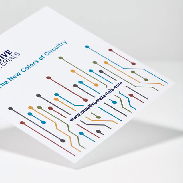
Although we've had inks that can conduct electricity for years now, these inks only come in two colors: silver and carbon. It gives conductive inks an aesthetic, says Dent, that has "no real beauty for non-engineers." A new breakthrough, however, has finally made it possible for conductive inks to come in any color you want. One potential use is in smart clothing and wearables. Imagine a jacket with an attractive design printed on the sleeve that also functioned, when you touched it, as a way of controlling your iPhone.

ReWall Ceiling Tiles
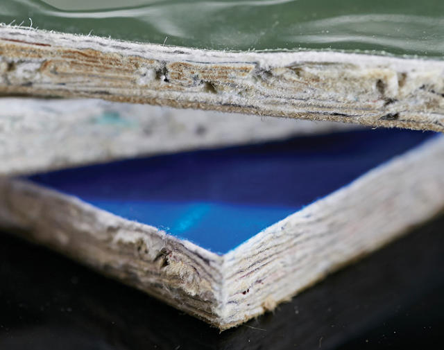
ReWall Ceiling Tiles are made from recycled beverage containers—a mixture of cardboard, plastic bottles, and aluminum—using a method similar to the way oriented strand board, a construction-industry staple, is made. The result is a material that has the same structural integrity as strand board and can be cut and screwed into like wood, but which has much better resistance to moisture, so it can be used as a ceiling tile. It can also be exposed to the elements.

ZrOC
The process of coating most decorative metal items, like your sink or your hubcaps, for improved hardness and scratched resistance is called physical vapor deposition, or PVD. ZrOC is a new coating technique in which a mixture of zirconium, oxygen, and carbon can be deposited on metal, plastic, wood, glass, or textiles. Depending on how those elements are mixed, you can get chrome in any color you choose, as opposed to the stock reflective silver. "It was actually invented for coating kitchen implements, but I can definitely see someone coating a smartphone or a smartwatch in ZrOC soon," says Dent.

Tethonite
3D-printed objects always look and feel inferior to objects made with traditional manufacturing processes and materials. Tethonite is different: It's a 3D-printed ceramic compound that, when fired and cured, looks identical to ceramic made by hand or industrial machines. Not only could Tethonite push the boundaries of the ceramic arts by making increasingly intricate designs possible; it also potentially has wide-ranging consumer applications. "Companies like Apple want to figure out new ways to use ceramics, because it's such an incredible material," says Dent. "It's so hard, subtle, and luminous, but unlike metal, ceramic is also brittle." It breaks, which is why you don't see it in many gadgets (although the Apple Watch Edition recently introduced a high-end ceramic model). Tethonite could let companies like Apple intimately combine the best qualities of metal and ceramics to create resilient new devices.

ThermalTech
A patented lightweight smart fabric made of 100% stainless steel mesh that is coated with a solar selective coating, ThermalTech could be a boon to makers of athletic gear. The fabric excels at absorbing heat in the form of ultraviolet light, then dispersing it throughout the entire material to dissipate. Imagine athletic gear that keeps you as warm as wool without the bulk and you've got an idea on why companies like Nike might be interested in ThermalTech. These companies, says Dent, "have already figured out materials to eliminate odors and sweats. Temperature regulation is the next holy grail."

Paptic
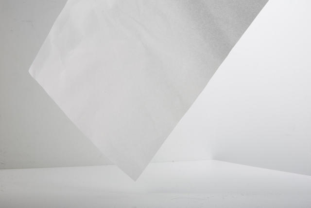
Blurring the line between paper and plastic, Paptic is a new material that is easy to print on, easy to recycle, and perfect for packaging. "It might not change the world," Dent admits, but he thinks we'll soon start seeing it everywhere, because while it feels and looks like paper, it's as strong and tear-proof as plastic.

RE>CRETE
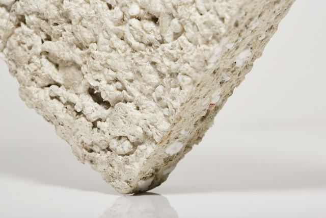
Concrete is a composite that is basically made up of a bunch of junk—mostly sand and gravel—bonded together with cement. RE>CRETE isn't that different, except instead of using sand and gravel, it contains shredded newspaper and junk mail, ground up packing Styrofoam, home electronics wire, credit cards and CDs, salvaged house paint, dryer lint, Portland cement, and fly ash. It's basically construction scale recycling: With RE>CRETE, tomorrow's buildings will be built with today's trash.

Flexible Battery
Imagine wearing an entire suit that was just one big lithium-ion battery. Jenax Inc. Flexible Battery could make that possible. "The difference here is that while normal batteries come in solid pieces, this battery is spun from fibers which make it more flexible," explains Dent. Flexible Batteries can apparently be flexed a couple of thousand times without affecting their performance, making them a perfect choice for tomorrow's smart clothing, e-textiles, wearables, and transforming or flexible gadgets.

Grip Metal
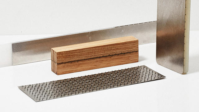
Think Velcro for metal, and you've got a good idea of what Grip Metal can do. It's a patented stamping process that allows two pieces of metal to stick together without being glued, welded, or bolted together. When stuck together, the two pieces become up to three times as strong as they were individually, making it a perfect material for furniture design, manufacturing, and construction.

All of these materials are available now, but they're not yet commonplace. Expect to see them in the months and years ahead. To hear Dent tell it, they are the new stars of the materials science scene.


The Future Of Healing Broken Bones Is Squishy

$
0
0

A 3D-printed elastic scaffolding might help us fix seriously broken bones.

The rigidity of bones is what allows us to walk upright, instead of slithering like a pile of goo on the floor: a homo sapiens blobfish. But that rigidity has a price. When it can't handle the strain anymore, a bone doesn't deform, it breaks. And when it does, you need a cast if it's a simple break—or even reconstructive surgery, if it's a bad one where pieces of skeleton have been obliterated.

When it comes to medically 3D-printed replacements, though, the future of skeletons isn't rigid. It's squishy. A new technique imagines that when we break bones badly in the future, we'll support them with a squishy 3D-printed scaffold. In bad breaks, this scaffold will let our bones mend themselves straight, but also give them some slight ability to bend without knocking the fracture out of alignment.

Created by a team at Northwestern University in Chicago, this new material, which its inventors called "hyperelastic bone," is made from an elastic polymer and hydro calcium minerals, like those found in human bones and teeth. Once embedded in the body, hyperelastic bone works as a bridge between actual bones, promoting blood flow between fractured segments . . . which, in turn, causes it to be ossified over time with newly formed bone.

The scaffolding is strong, too. Hyperelastic bone can support up to 150 pounds without breaking, and that's without a coating of newly-grown bone to make it stronger. It's also fast for doctors to print: A relatively simple 3D printer can print out a 42-square-inch segment of the stuff in just an hour. This makes it cheaper and more useful than other bone replacement and grafting materials doctors use, such as calcium phosphate, a ceramic-like material that is so brittle, it can be hard to get bone to grow on it.

Since implementing it requires an invasive procedure, hyperelastic bone isn't likely to be used for simple stress fractures. But for bad breaks, it could be revolutionary. Indeed, the researchers were able to help a rhesus macaque recover from a serious skull fracture in just eight weeks—all without any negative immune system responses.

It's just the latest example of how 3D printing is changing medicine—not only helping us heal bones faster, but targeting diseases like cancer. Hyperelastic bone isn't likely to make breaking a bone any less pleasant, true. But if you do end up with a bad break, at least you won't be forever doomed to set off alarms when you walk through airport security.

Lyft Kills The Glowstache

$
0
0

Its replacement, the Lyft Amp, aims to solve one of ride sharing's biggest pain points.

Thanks to the fluffy pink mustache bouncing happily on its drivers' dashboards, Lyft has always had a friendlier look that was sharply in contrast to the clubby brand aesthetic of its biggest competitor, Uber. Today, however, the mustache rides are coming to an end. Lyft is retiring its hirsute upper lip mascot in favor of something new and a tad more sophisticated, which the company hopes will become as iconic as the taxi sign.

It's not just a sign, though. Designed by Ammunition, the prolific industrial design practice headed up by the guy who hired Apple's Jonathan Ive, it's a multifunctional, two-sided LED display called the Lyft Amp, and it aims to solve the biggest pain point in the ride sharing experience.

Here's a common scenario for anyone calling a Lyft. Their car arrives, they get a message telling them which car to look for, and then they have a hard time finding it anyway—either because the car is nondescript, or because it's busy and there are many similar cars, or even numerous Lyfts waiting for passengers at once. To use Lyft regularly, then, means accidentally climbing into the wrong car at least once by mistake.

This problem is what Ethan Eyeler, head of ride experience at Lyft, calls the "pain point of the last 50 feet." The user experience of ordering a ride through the Lyft app is smooth; there are rarely any problems when a passenger is actually in the car. It's getting them from the app to the car that's the problem.

Here's where the new Amp comes in. In appearance, it's a small pill-shaped display that sits on a driver's dash. Like the Glowstache before it, it serves first and foremost as a way of identifying Lyft vehicles on the road, with a series of frosted LEDs on the front gently pulsing with the company's signature magenta-and-mulberry color scheme.

But it also functions as a hardware extension of Lyft's software. Thanks to the fact that it pairs to the app, the Amp's front-facing display can actually change its colors to signal to a passenger their ride is here. So instead of walking outside when your Lyft arrives and looking for, say, the silver Nissan Altima, a passenger's Lyft app will tell them to look for the car with the shining green symbol, or the blinking blue one. And if passengers see their Lyft waiting down the block or across the street from where they are, they can actually use their own smartphone to flag down the driver: Upon request, the Lyft app will turn a smartphone screen the same color as the Amp, so it can be used to signal a driver from a distance.

"The hardest thing to get right was the lighting quality," says Christopher Kuh, VP of industrial design. "We designed the Amp so there's a real fluidity to the lighting that gives the colors this light clouding effect." The result is that unlike a regular set of LEDs, the Lyft amp's light quality seems more organic. It has a dreamier, disco-like feel, says Kuh, akin to an effect you might see at an "Under The Sea"-themed homecoming dance. "We played with other ideas besides the amp," says Kuh, like a magic wand for the antenna and an infinite mirror for the license plate holder. "But ultimately, we decided on a dashboard device, because we realized we already owned this space."

Eyeler says the Amp's colorful LEDs will let Lyft do fun things in the future, like set off digital fireworks on the dash of every car at New Year's, or turn it into a red, white, and blue flag on Independence day. A World's Series win could be celebrated by having every Lyft Amp turn the color of the winning team. And inside every Lyft vehicle, the Amp serves a functional purpose as a small secondary display for drivers. It easily gives them their passenger's name, in addition to functioning as a more ambient mood-setting display.

The goal is for every Lyft vehicle to have an Amp, unlike the less-than-ubiquitous Glowstache. "The Glowstache was an additive element to our brand," says Eyeler, acknowledging that many customers never even saw a Glowstache in real life. "This will be our icon, every car will have one." The Amp will start rolling out to Lyft drivers in Las Vegas, Los Angeles, and San Francisco first, with other markets getting them as soon as possible afterwards. The Glowstache might have been beloved, but it was the icon of a younger company. Lyft and Ammunition hope the Amp will serve as a more sophisticated—but no less playful—emblem, while also solving a real problem for customers.

Taco Bell's New Logo Is The Worst

$
0
0

The minimalism trend in fast food has to stop.

Taco Bell, makers of all fast food loco or grande, is getting a new, streamlined logo, just in time to open a new Vegas Strip location. A new logo, ostensibly, designed to better fit into today's multimedia, multidiscipline branding requirements than the last logo, introduced in 1995. But even though it was done with help from Lippincott, it just makes me want to retch.

The old Taco Bell logo was hardly sophisticated, but goddammit: it was proudly '90s. The decade of Chester Cheetah, of Wayne's World, of Clinton Sax, of OK Soda, and leopard-print leggings. It had a defiantly Double Dare aesthetic that double dared you to Make a Run for the Border on Cheesy Gordita Crunches and Bacon Cheeseburger Burritos. It was joyful and colorful, fun and innocent, and it didn't care if you were judging it—which is the perfect quality for a fast food chain in America to have.

There's a lot to say about how boring the new Taco Bell logo is. The old Taco Bell logo used what appeared to be the same font as the old Dell logo, quirky, '90s futuristic, and weird. That's all gone now, though. The new typeface sure as hell isn't Helvetica, but it's close. (It's actually Akzidenz-Grotesk, every company's favorite Helvetica-lookalike.) Meanwhile, the bell icon's still there, but it's been stripped of all its zing: at best, it now looks like the icon of a forgotten Albuquerque offshot of the Ma Bell Breakup.

This follows a general trend toward minimalism in logo design these days. Across the country, the perpetual design brief is to strip logos down to their barest essentials, so they can exist in as many contexts as possible. We've seen some great work following this approach, like Pentagram's new Mastercard logo. But Taco Bell's effort makes the logo as gray, mushy, and sickening as any of the beef slurry its employees get paid to slop. "As little design as possible" does not mean you should turn your logo into a vampire, draining all its life blood so that it can live forever.

related video: Taco Bell Let Me Design a New Taco (and Immediately Regretted It)

An App To Teach Children Empathy

$
0
0

Tinybop's new app, Me, aims to help kids better understand themselves and others by answering hundred of fun interactive prompts.

Now more than ever, we need to teach our children empathy: to see others, besides friends and families, as worthy of understanding and compassion. But how? Tinybop, the Brooklyn-based app design studio, believes the answer is to encourage kids to look inside themselves. The result, Me, is a storytelling app that encourages kids to more deeply understand their own lives and feelings.

Me encourages kids to delve within themselves organically. When the app is first loads, kids start off by creating a cartoon likeness of themselves out of a palette of eyes, mouths, skin tones, hair colors, glasses, and more. From there, they can pick their favorite color, which themes the rest of the app. Then a central dashboard reveals their cartoon avatar, with bubbles floating out of his or her head. Tapping the bubbles prompts kids to tell the app more about themselves. For example, one app might encourage them to take a picture of their pet, and give it some pizazz by dropping stickers on top. Another might ask them to draw what they do before bed, or what they think a cool robot looks like.

Me also asks kids to explore their emotional states. Early on while using the app, a dark storm cloud with peering red eyes popped up over my head. After I tapped on it, Me asked me what color made me think of fear, then whisked me to another space in my emotional spectrum (themed in that color, of course), where it asked me to answer questions about fear. Would I take a picture of a book that scared me? Would I draw a picture of myself when I'm scared? Would I draw a monster? And so on. By asking kids to confront their fears in a fun, interactive way, the app hopes that its users will develop a deeper understanding of themselves.

In all, Me provides kids with hundreds of prompts about their feelings, their friends, their families, their school, and more. "The idea came from my eight-year-old, who brought home a 'map of his heart' one day from school," says Tinybop founder Raul Gutierrez. "The kids had been asked to divide a picture of their hearts proportionally into the things they loved." Looking at his own child's crudely drawn heart map, Gutierrez realized that this was more than just a fun exercise, but a rich tool that could be used to teach kids more about themselves. "At a time when teachers are reporting an increase in bullying and anxiety among kids in their classrooms our goal with Me is to help kids better understand themselves, the world around them, their feelings, and the feelings of those around them," he says. "Research suggests that the better kids understand themselves, the more able they are to be empathetic and understand others. Teaching empathy can help combat bullying, peer cruelty, and the mental health epidemic."

One thing's for sure. We need more apps that can teach kids empathy right now.

The day after the election, Gutierrez says that a child in his son's school went up to an African-American teacher who had never expressed any political opinions whatsoever and began mockingly chanting: "Trump! Trump! Trump!" The kid wouldn't stop. "It's hard to imagine being in that teacher's shoes," says Gutierrez. "What do you do when the name of the president-elect has become a sort of epithet? What impact does this have on all the kids involved?" Gutierrez admits he doesn't have the answers, but self-awareness and conversation is where it starts, two things Me is designed to promote among kids.

"Maybe . . . just maybe in cases like this an app [like Me can] helps us resist the normalization of hate speech," Gutierrez says. "Conversation helps us not underestimate the consequence of words. It's a drop in the ocean but we feel that all those little conversations can add up to something much bigger."

Available now for iPhone and iPad, Me can be purchased from the App Store for $2.99.

A New Google Site Lets You Play With Its Wildest AI Toys

$
0
0

Google's AI experiments push neural networks to their limits. They also happen to be very fun.

Neural networks are the technology driving some of the web's most wonderful toys. Now Google, which uses neural networks in everything from its photo recognition software to its translation tools, has launched a fun dedicated site demonstrating some of its experiments with this emergent technology—artificially intelligent tools that anyone can play with.

Called A.I. Experiments, the site is a repository for some of the most entertaining test projects from Google engineers trying to reach the next frontier in machine learning.

The one that's getting the most attention right now is Quick, Draw!, a hypnotic game that is basically robot Pictionary. The game tasks you to quickly draw a word while a machine learning AI tries to guess what you're drawing. Sometimes the AI is shockingly good with its guesses: Google figured out I was drawing a canoe before I was done with the very first line. At other times, though, the software is as obtuse as Kirk Vanhouten: You'd think there are only so many ways to draw a belt, but Quick, Draw! was sooner to see everything from a mermaid to a martian in my crude line drawing.

Of course, computers don't "see" pictures the same way we see pictures, which is something that Google ably explains in another experiment. Called Visualizing High-Dimension Space, it's a short but informative explainer on how machine learning AIs understand pieces of data, not necessarily as discrete concepts in and of themselves, but as links in a greater, multidimensional information cloud. In short, AI doesn't need to know that a "6" is a "6" and a "7" is a "7" to be able to learn what a "6" or a "7" looks like, based upon a greater understanding of the contexts in which the numbers are used and the way the numbers tend to look. Another experiment, What Neural Networks See, makes the point even more explicit: A computer's understanding of what an object like a belt or a canoe looks like is very different from our own.

That's something worth keeping in mind as you explore the rest of Google's A.I. Experiments, such as Giorgio Cam, an image recognition bot named after the Italian musician and DJ Giorgio Moroder, which spits out raps based upon what it thinks it's seeing. Or Thing Translator, an app that can tell you what a physical object is called in a different language.

None of the results of these experiments are close to perfect (if they were, presumably they'd be Google products). But when they work, they're whimsical and delightful; and when they don't work, well, at least they tend to fail in entertaining ways—and in the process, they show us the shortcomings still evident in AI.

Viewing all 2739 articles
Browse latest View live