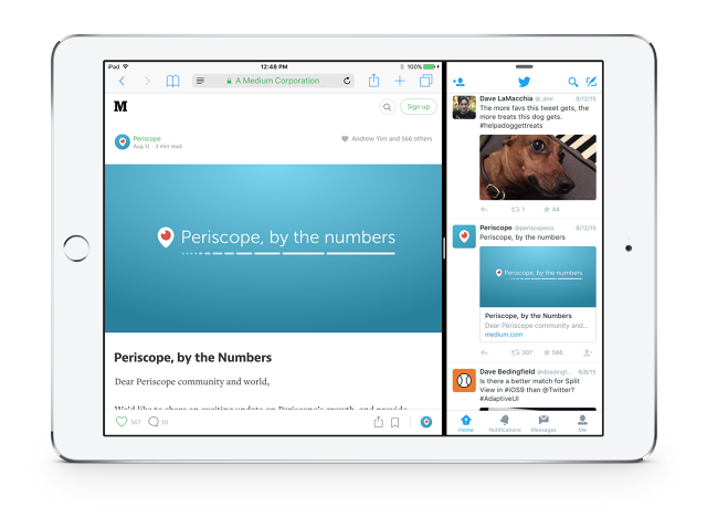
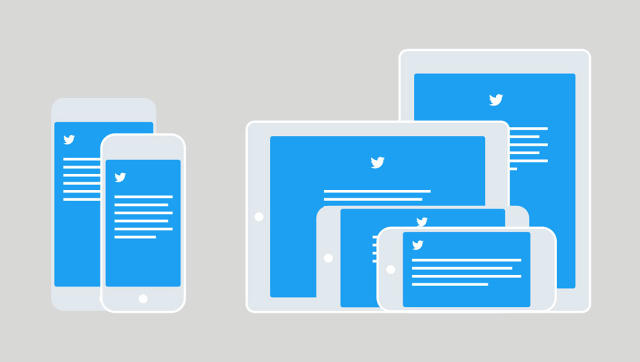
After years of having two very different apps for iPhone and iPad, Twitter consolidated the two into a single adaptive interface that can automatically adjust itself for different resolutions and aspect ratios.
For years, Twitter has been developing its iPhone and iPad apps separately. Though they were functionally similar, each emphasized different features and interface elements. But that's not unheard of: for years, this was the way Cupertino was encouraging developers to design their apps: treat iPhone and iPad UIs separately. Apple didn't have to worry about supporting the vast array of screen sizes that Google has had to support with Android, so this approach made sense.

But in the last few years, things have changed. iOS now runs on screens running the gamut from 3.5-inches (the iPhone 4s) all the way to the upcoming iPad Pro's rumored 12.9-inch display. Apple started baking responsive layout tools into iOS a couple years back, and encouraging developers to use them. Larger handsets like the iPhone 6 Plus now have the ability to show "more" of apps than smaller handsets like the iPhone 6. Meanwhile, the next version of Apple's mobile operating system, iOS 9, allows iPad users to put two apps side-by-side on the same screen.
What we're seeing here is a shift in the way iOS apps are developed to be more like Android, or even Windows. And Twitter is finally embracing it. In a blog post about the change, they says: "Although they shared some code, Twitter for iPad and Twitter for iPhone were originally developed and designed separately. Each app was tailored to its platform—but required a lot of extra effort to develop. All too often, this meant that Twitter for iPad features lagged behind other updates..."

The new Twitter iOS apps will calculate on-the-fly how to adapt the Twitter UI according to several factors: canvas, device, orientation, size class and typography. The idea is that Twitter for iOS will act more like responsive websites, invisibly shrinking, tweaking, and expanding how it displays content according to the way you're using it, and the device you're using it on. And as a bonus, Twitter should, in theory at least, be able to instantly adapt to any future screens Apple throws at users, without going back to the drawing board. It will also play nicely with the iPad's new split screen mode, which required minimal effort to implement on Twitter's part.

Twitter sums up the changes nicely. "[Now] it's no longer Twitter for iPhone and Twitter for iPad: it's Twitter for iOS, and it will now be optimized for different contexts. That's a freedom which helps us to make Twitter the best experience it can be for everyone, regardless of device."