Let's say you want to take a selfie, or hail an Uber, or send a new email. How many taps does it take you? How many screens do you have to visit? It depends on what you're trying to do, but the answer's going to be "more than one." This is mobile's shallow UI problem; everyone from Google to Apple is feeling the pinch.
Mobile operating systems are designed to be shallow: for the most part, anything you do on a smartphone or tablet takes you to another screen to do it. That was okay in the early days of mobile, when apps were single-serving as a concession to screen size and the relatively underpowered nature of early smartphones. Since Apple released the first iPhone, devices have gotten more powerful, and consequently, what people expect to be able to do with them has exploded. Yet mobile devices are still locked into this one tap, one screen, one action paradigm.

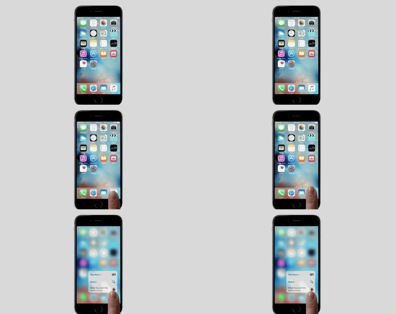
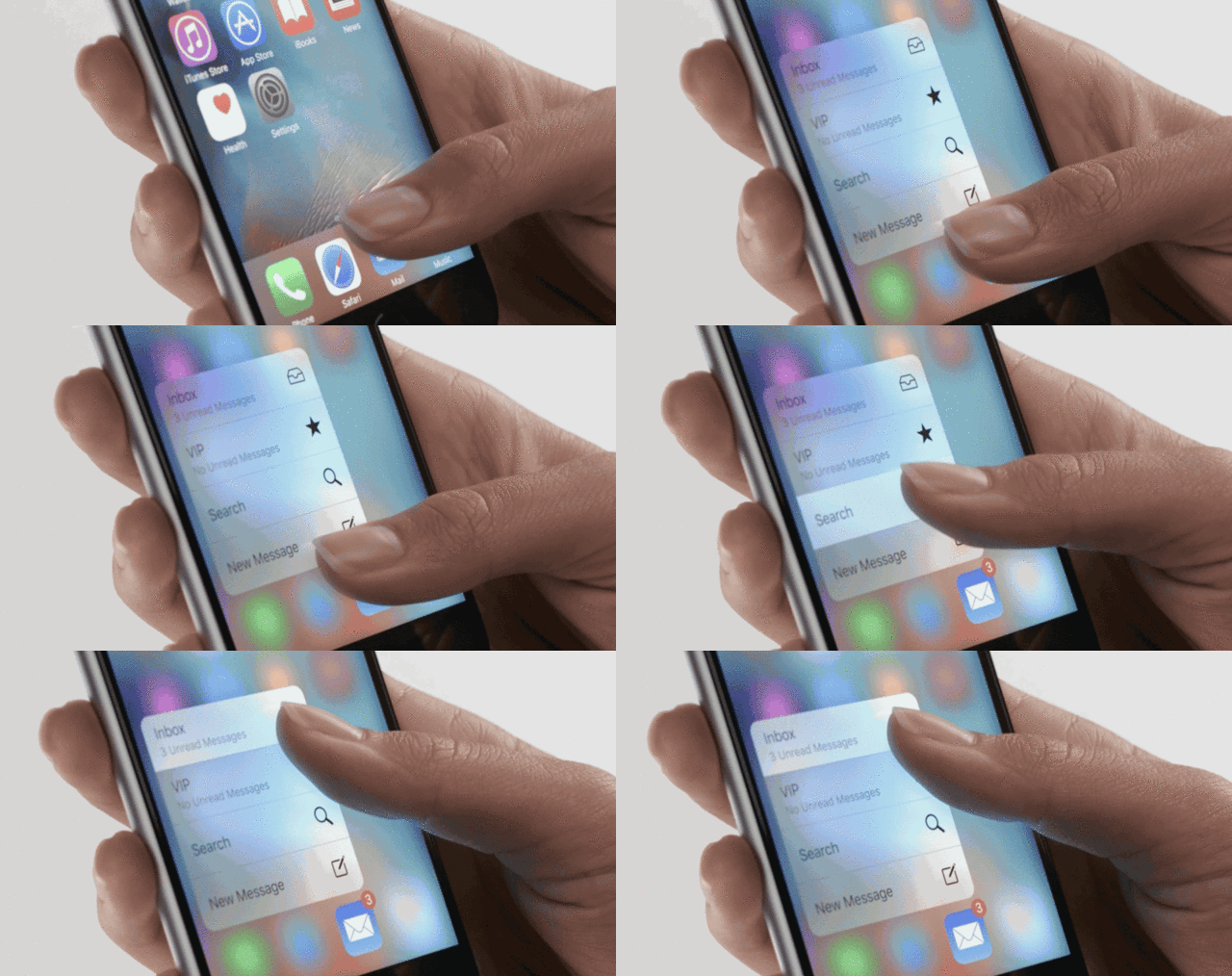
Unveiled Wednesday as an integral feature of the new iPhone 6s and 6s Plus, 3D Touch is Apple's attempt to solve the shallow UI problem on iOS. The idea is simple: your touch screen can now detect exactly how hard you are pressing on it, the multitouch equivalent of a right-click on the desktop. By pressing on the screen longer, you can interact with it contextually.
For example, Apple showed how you could easily call a contact on your iPhone, just by hard-pressing on the Phone app icon and then tapping on your contact's name in a new menu that pops up. Release your finger and the menu goes away. But this can be used for a lot: previewing an email link in Safari without switching apps, for example, or ordering an Uber without ever leaving your home screen, or peeking at an upcoming calendar appointment.
At first, 3D Touch is going to be locked to Apple's new iPhones, which is slightly ridiculous: the new iPad Pro, which is aimed at design professionals and supports a stylus (called the Apple Pencil) that is just begging to interact with a pressure-sensitive screen, is the more obvious fit. But no matter. In two or three years, every iPhone and iPad Apple sells will have 3D Touch.

How much this will change the core UX of iOS remains to be seen. Apple's SVP of Design, Alan Dye, told Bloomberg they want 3D Touch to feel "inevitable." Will 3D Touch makes the same sort of intuitive tactile sense that multitouch does, or will it be the iOS equivalent of hot keys or OS X right clicks: a feature mastered only by power users (or at least people who spend a ton of time on their devices)? Time will tell, although ultimately, it'll probably be obvious how confident Apple is in 3D Touch by how easy it is to trigger. Users don't want to hunt around for inevitability.
It's also interesting to think about what ramifications this could have for developers. When every app icon is just a tickle away from opening into a menu, do the way app icons are designed have to change? Right now, if a user taps the wrong icon on iOS, you know because the wrong app opens up, but 3D Touch menus allow users to skip the launch screen of an app entirely. If two similar looking, functioning apps both use 3D Touch menus for their icons, how do you ensure users don't accidentally confuse the menus on the two apps? Do you heavily brand the menu? (Send a FACEBOOK message.) Do you go all crazy with the colors of your icon, so no one could possibly mistake it for another one? (If so, purple and yellow icons might go from being an App Store rarity to the most common colors, then bounce back again.) Or is this an issue that needs worrying about at all?

Either way, what's particularly interesting about 3D Touch is how different it is to another attempt at solving mobile's shallow UI problem, Now On Tap. In Google's upcoming Android M operating system, users can tap and hold the home button inside any Android app. From there, Google tries to guess what you want to do next, and presents a dynamic, AI-driven card filled with possible follow-up actions.
The two approaches seem very different, but they're both attempts at breaking through mobile's one screen, one tap, one action bottleneck, from two companies with very different strengths: one, the integration of hardware and software, touch and tactility; the other, data and artificial intelligence, invisibility and context. Google can't easily do something like 3D Touch, because they don't totally control the hardware of the Android device ecosystem. Likewise, while iOS 9 narrows the gap between Siri and Now On Tap, Apple's nowhere close to matching Google's expertise when it comes to predictive interactions driven by big data and AI.

For smartphones and tablets to fully grow up, they need to break the shallow UI problem once and for all. The question is this: what feels more inevitable to the future of mobile? Apple's approach, 3D Touch, a language of haptic hotkeys that allow you to jump between tasks more easily? Or Google's deep data approach, in which an AI learns your patterns and intuits your next step, before you even do it?
Or, even better, will both of these approaches become part of a common currency across all smartphones in time? My money's on the latter. On the desktop, hotkeys and right-click both solve the same problem, but every app has both anyway.


