Save for electricians, no one gives much thought to fuse boxes. After all, if a fuse box is working, it's just going to be collecting dust in your basement, right? Not necessarily. In apartments, fuse boxes are just as likely to be visible as your thermostat, so why shouldn't they be as nicely designed as a Nest? And even in the basement, fuse boxes are confusing to operate and badly labeled.
There's a lot of room for design to improve the old fuse box, and make it a proud member of the Internet of things. And that's just what designer Dan Salisbury has imagined with his concept for the Fuse, a 21st-century fuse box that both conforms to industry standard, but has the brains and beauty of a Nest product.
Envisioned with an e-ink display and a white aluminum body worth of Apple, the Fuse would supercharge the traditional fuse box in a number of clever ways. First, unlike regular fuse boxes, the Fuse would be more than just a panel of switches that shut off when there's a problem. It would also display exactly how much juice each fuse is taking up, using e-ink to display the wattage and name of each room. This e-ink panel could provides useful safety tips for when a fuse does get tripped. And with this design, the switches all contain LED strips which illuminates them in the dark, perfect in case of power outage.
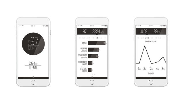
Sweetening the deal is a connected smart app even forecasts how much electricity you're using, what it's likely to cost, and how it compares with your historical usage, as well as alerting you in case there's a problem.

It's an incredibly smart concept, which is why it won both a Red Dot Award and the BraunPrize this year. While it sadly remains just an idea for now, it's obvious that the Fuse is a natural extension of the smart home concept that utility companies should be subsidizing in the future. As Nest has shown, good design is even more important for the appliances and gadgets that serve as gateways to the most important utilities in our lives.
[via Yanko Design]