First created by famed British typeface designer Eric Gill in 1928, Gill Sans has been used over the years by everyone from the BBC to Ferris Bueller. Its most iconic use, though, is probably on the jackets of Penguin paperbacks starting in 1935. Penguin's vintage covers are a good illustration of both Gill Sans's strengths (it's an excellent font for headlines, titles, and logos), as well as its drawbacks (it's much poorer at body text). Joanna, Eric Gill's lovely serif typeface, has similar qualities, which is why Penguin used it on the covers of their Modern Classics series, starting in the 1960s.
Add in the fact that both typefaces are looking a little frayed in the digital age, and it's no wonder that Monotype is remastering Gill Sans and Joanna for the 21st century as Gill Sans Nova and Joanna Nova. But they're not stopping there. In addition to expanding and cleaning up Gill Sans and Joanna, Monotype is releasing a new typeface, called Joanna Sans Nova, which combines the DNA of both fonts to create a humanist sans serif. The result is the first Gill-family font designed for pixels, and not hot type.

"The reason we're doing this is because Monotype needs to have both a foot in the past and a foot in the future," says Steve Matteson, creative type director at Monotype. "We have this amazing legacy, represented by Eric Gill and other famous designers, who brought a rich tradition of type to our company. But we also need to focus on contemporary type designs for contemporary needs. With the Eric Gill Series, it was a unique opportunity to put both of those feet on the same page."
Monotype is no stranger to remastering typefaces from its archives: It has previously remastered Verdana and Georgia, Unica, and many others. There are many reasons why you might remaster a typeface—perhaps expanding it with new characters and weights. And that's certainly true of Gill Sans Nova and Joanna Nova, which gain both features. But the real reason Monotype is remastering these fonts has to do with the time in which they were originally created.
"Both Gill Sans and Joanna were originally designed for Monotype machine typesetting," Matteson explains. In other words, each character in these typefaces needed to be physically carved out of a piece of metal, so Gill Sans and Joanna were originally optimized for a finite number of point sizes. In the digital age, though, a font can be anywhere from 6 points on an Apple Watch to 1,000 points on a billboard. To keep up, Gill Sans and Joanna needed to be unbounded, tweaking their designs so they looked clean, crisp, and readable at a nearly infinite number of sizes, weights, and mediums.

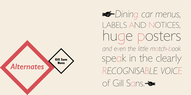
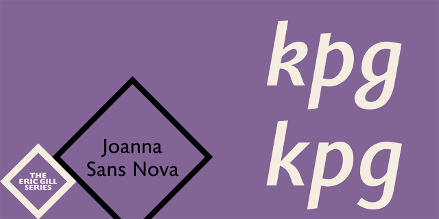
The remastering of the Eric Gill Family has also allowed Monotype to expand these typefaces in fun, unexpected, and sometimes obscure ways. Matteson tells me that Monotype, over the years, has occasionally created custom versions of Gill Sans for various customers. One such variation called Gill Sans Deco, which contained drop shadows, was withdrawn from production because it was simply too expensive to maintain. But now it's a part of Gill Sans Nova. Likewise, when Gill Sans was first released, its main competition was Futura, prompting some Monotype customers to ask if Gill Sans could be retrofitted with the pointy tips of the font (now a Wes Anderson favorite). They weren't ever part of the regular production of Gill Sans, but for Gill Sans Nova, Monotype has introduced these Futura hybrids as alternate characters. (Joana Sans Nova also has some adorable alternate characters, such as a curvy, loopy K.)

But let's not forget the other half of the equation: Joanna Sans Nova. Designed not just to be a digital-first typeface, perfect for reading on screens, it also fills a hole in the Eric Gill Family of fonts as a go-to for body text. "The three typefaces work perfectly together in a publishing situation," he says. "For a magazine, you might put your subheadings in Joanna Nova, the bulk of your text in Joanna Sans Nova, and your headlines in Gill Sans Nova."
After spending two years as part of a team of three other designers (George Ryan, Ben Jones, and Terrance Weinzierl) putting the Eric Gill Series together, Matteson says he's confident that these three new typefaces can now stand up to the scrutiny of the 21st century. But would they stand up to the scrutiny of Eric Gill, the notoriously fussy perfectionist?
"Is Eric Gill rolling over in his grave? Probably yes," laughs Matteson. "He was quite a character, but he also had a big ego. He wanted the public to appreciate his work. So even if he's rolling in his grave over some of our decisions, we think he'd still be in approval of bringing his work into the 21st century. He'd be happy he's still relevant."
The new typefaces are available for license and download from MyFonts, Fonts.com, and Linotype.com.