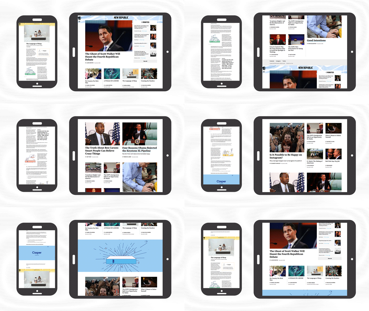
One hundred and one years old this month, The New Republic is probably America's oldest liberal political magazine. But its readers are younger than ever. While the vast majority of The New Republic's print readers have been historically over 55, 60% of TNR's online audience is between the ages of 18 and 44, and more than half of them visit the site exclusively on smartphones.

Now, TNR is launching a major redesign. Spare, fast, and mobile-first, it is the website's first major redo since Chris Hughes, the co-founder of Facebook, purchased a majority share in the company in 2012, with the aim of transforming the old magazine into a vertically integrated digital media company, a move which saw 10 long-time writers quit in protest.
Given the magazine's demographic shift, it's no surprise that TNR is chasing millennials with this update. "We've historically appealed to a pretty traditional demographic, but we're now making a concerted effort to reach out to a much younger and diverse group of people: insurgent thinkers who are suspicious of the status quo, and care about the way the world works," Hughes says. "And the data says those people are more likely to read our site on mobile phones." But will the new redesign reach them?

Putting Content Front And Center
The old design was fine—pretty typical of politics sites, complete with sidebars, banner ads, and a homepage that was just a grid of stories. That's all gone with the new design. There are no sidebars and almost no ads. There aren't even really any navigation elements: they've all been hidden away in a hamburger menu. (More on that in a second.) Regardless of what device you're reading TNR on, pretty much the only thing you see is content. "Whether the story is a long-form reported piece, or a post about Jeb Bush and his Vines, the goal was to put the content front and center," says editor-in-chief Gabriel Snyder, who helped drive the internal redesign.
The old site was also slow. The new site is much faster. Even on slow connections, the new site opens in just a few seconds. That's important, because on mobile, the longer a page takes to load, the more likely a reader is to move on and not come back. Part of the speed bump comes from abandoning Drupal, TNR's previous content management system, with something custom. "Mobile page article on Drupal was in the realm of 30 seconds," says Elliott Pierce, chief product officer who oversaw the nuts-and-bolts of the redesign. "No one waits that long for content in this day and age."

Fresh Type
With so much of TNR's new look being made up of text, typography is an important aspect of the redesign. TNR decided to bring in a couple of the typefaces the magazine currently uses in print. The headlines and body copy are Lava by Peter Bil'ak, an elegant serif-based typeface that was designed in 2013 to bridge the divide between digital and print publishing. Navigation, subheds, and other text will be handled by Tal Leming's Balto, a contemporary version of a classic American Gothic sans serif that balances Lava nicely.

New Navigation
As for navigation: Hamburger menus are often cited as one of the worst modern UI elements, a "throw up your hands and give up" approach to designing a workable navigation system on mobile. (Here's a good overview on why hamburger menus are falling out of favor.) Pearce says they're aware of the criticism, but thinks most website navigation systems are pretty superfluous. "I think it's like a table of contents in a book: most people just jump in and read," he says. That's why TNR's redesign introduces readers to new content through infinite scroll. When you reach the bottom of an article, it automatically loads the most popular article, then a sponsored content article, and then the rest of TNR's content in reverse chronological order. In other words, it'll work a little more like Facebook's News feed, or other social media streams millennials are familiar with.
Asked what the metrics of success will be for the new TNR, Snyder is blunt. Although TNR reaches about seven million people a month across thenewrepublic.com, Facebook and Twitter, "we're still not doing as well as we'd like in regards to visitors," he says. By focusing on speed and content, in both design and editorial, TNR hopes to catch up with a younger, more tech-savvy readership, Chris Hughes'"insurgent thinkers" armed with smartphones. "In many ways, the kind of issues we have always written about at The New Republic are more in the zeitgeist than ever," he says. "On the other end of this redesign, our hope is that our technology will reflect not only this new demographic, but a new sensibility for TNR as a whole."
That said, the new design isn't going to melt anyone's faces off. In the sake of keeping up with the fastest audience around, mobile-first millennials, it's as streamlined, stripped back, and frankly unadventurous as it can possibly be. Time will have to tell if that kind of strategy can help grow The New Republic's readership.