2015 was as progressive a year for gender and trans politics as we've ever seen. It's the year Caitlyn Jenner made the cover of People, the first openly transgender person was nominated for a primetime Emmy, fashion labels went gender neutral, Will Smith's son wore a dress to his high school prom, and Miley Cyrus described herself as pansexual and gender fluid.

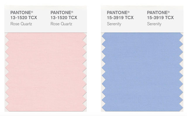
The trend going into 2016 is clear: gender is less binary than ever. So how do the color maestros over at Pantone decide to mark it? By releasing their first totally binary Colors of the Year. Meet Pantone 13-1520 TCX (Rose Quartz) and Pantone 14-3919-TCX (Serenity), which you probably know better by their street names: baby girl pink, and little boy blue. Jesus Christ, Pantone.
It's not like the folks at Pantone don't know what they're doing here. In their press release saying why they picked baby girl pink Rose Quartz and little boy blue Serenity, Leatrice Eiseman, Pantone's executive director, said (emphasis mine):
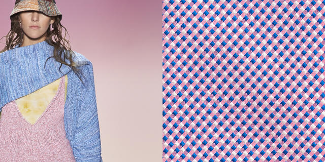
In many parts of the world we are experiencing a gender blur as it relates to fashion, which has in turn impacted color trends throughout all other areas of design. This more unilateral approach to color is coinciding with societal movements toward gender equality and fluidity, the consumers' increased comfort with using color as a form of expression which includes a generation that has less concern about being typecast or judged...
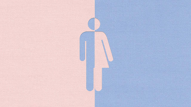
Because what better way to celebrate the breakdown of oppressive, binary gender norms than dressing everyone in pink and fucking blue, right?

I admit, it's a nice pink and blue. They have the sort of ambiguous, desaturated hue of a couple of baby blankets that were run through the same wash with a little too much bleach. The shade of pink looks like it would be just as at home on Karim Rashid's banana hammock as it would on a tube of Strawberry Shortcake brand lip gloss. The blue, meanwhile, is not overbearingly masculine: it would look absolutely bitching on the dusky eye of your daughter's favorite Monster High character.
It's pretty obvious what Pantone's trying to get across here. In their own impossibly milquetoast way, they're trying to say it's okay for boys to wear "girl" colors, and girls to wear "boy" colors: they're all just colors. But come on, Pantone. Jaden Smith—one of the most loathsome humans in the world!—is walking around in dresses, and your big message is it's okay for boys to wear pink, and girls to wear blue? Duh. Not only do we already know that, it wasn't even progressive 100 years ago, when the gender signifying colors of boys and girls were totally reversed.

What's so frustrating about this is it's a real missed opportunity for Pantone to actually influence people's notions about gender through color. Pantone's Color of the Year schtick is influential. Every December for the last 26 years, Pantone "predicts"—and consequently helps influence—the single hue that the design world will go nuts about for the next year. Last year, it was Marsala, a color perhaps best compared to menstrual drippings that fashion editors scrabbled for the better part of a year to make happen regardless. So when Pantone says that "gender blurring" pink and blue are their Colors of the Year, what they're really saying is we're going to have to spend the next 12 months looking at Vogue spreads of women in Boo-Berry colored skirts, and men prancing around in dusty pink Dockers. It's a rote reversal of the gender politics of color that we've already seen a thousand times before.
Silly or not, Pantone picking two Colors of the Year—not just one—is a big deal. It's never been done before. Which is why it's so frustrating to see Pantone break tradition just to reinforce binary gender stereotypes. If Pantone can pick two Colors of the Year, why not more? Why not make a real statement that gender isn't just a choice between two swatches, but a spectrum? Why not make your "gender blurring" Color of the Year something that actually could further diversity: a plaid of every color, where blue and pink are just two small colors among the palette?