Pantone's annual Color of the Year stunt may be silly, but it does prove that our taste in color changes almost as quickly as our taste in fashion. And like fashion, color taste comes in cycles, and reflects world events—something on stark display when you look at an entire century's worth of color trends.
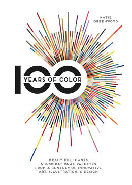
In 100 Years of Color, author Katie Greenwood takes a single example of great graphic design from every year of the 20th century, and breaks it down into its RGB color spectrum.

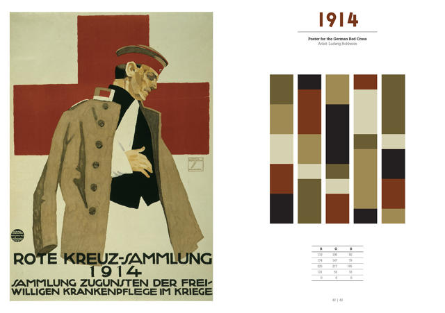
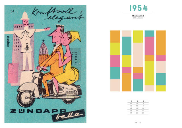
Generally speaking, war years have subdued colors, and peace years have brighter palettes. For example, a 1903 advertisement for Chocolat Klaus by Leonetto Cappiello largely breaks down into cheery primary colors — red, green, yellow, and blue. By the outbreak of the first World War, though, you're looking at very subdued tones of brick, black, and beige (see the 1914 poster for the Red Cross). Likewise, a furnishing fabric designed in 1946 by Paul Rand called "Abacus" favors a subdued color scheme, filled with pales blues and greens; by 1954, though, you're seeing peppy European matchbox covers, swimming with orange, yellow, blue, and pink pastels.
More recently, technology has influenced the dominant color schemes of the day. For example, shockingly bright colors start being widely used in the 1960s, after the invention of fluorescent ink; similarly, the introduction of the personal computer into the graphics design process in the 1990s led to a broader array of colors.

A freelance picture researcher and photographer based in the U.K., Greenwood says that it was hard to select a single example of graphic design to represent each year. "There are obviously so many amazing images from the 20th century to choose from, so it took a lot of deliberation," she says. "I brainstormed movements, events, and trends for each decade, and made a wish list of people I knew I wanted to include and ideas that might be good to convey through the pictures." In general, she tried to not limit herself to just iconic or well-known images, but also included unknown or forgotten designers and illustrators, as well as items from her own personal collection of prints and ephemera.

Asked what her favorite era of color design is, Greenwood points to the Art Deco movement of the 1920s and 1930s. "Within Deco, you get very different approaches to color, from the unexpectedly bright, exotic, and sometimes clashing, to really very muted, restricted, often smoldering combinations," she says. "But I think there's something inspirational and surprising to be taken from the use of color in every era of design."
You can purchase a copy of 100 Years of Color on Amazon here.