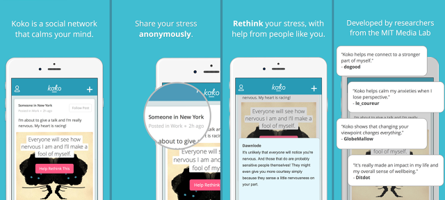
Earlier this year, Robert Morris, an MIT graduate working on making health care accessible to everyone through technology, told us about his dissertation project: Koko, a kind of social network focused on mental health. Now, the so-called "Facebook for depression" is available to everyone.
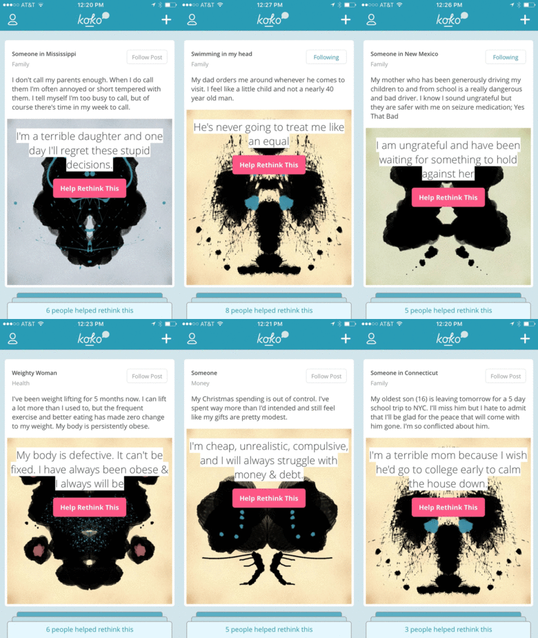
As an app, Koko's like a kinder, gentler Secret. Users are encouraged to post short messages about what is currently making them depressed or anxious, along with what they think the worst case scenario is. Once they've posted their message, other users try to point out what Morris calls the "bugs" in their operating system by suggesting more positive ways to think the problem.

For example, one Koko user recently posted that her sister-in-law, cat, and mother all died within a couple months of each other, and now her father might have terminal cancer. Her worst case scenario was: "What if things get worse?" Koko asks its users to try to reframe the way the person is thinking about the problem: say, by suggesting she try to focus on her positive memories of the departed, or to recognize that all of these tragic events are ultimately unlinked, and therefore, things will eventually get better.
It's easy enough to get people to share their problems anonymously, as many other apps have proven before Koko. But how do you get people to reply to those comments in a positive way? The earliest versions of Koko depended heavily upon tutorials before you could use the app, but it proved to be a significant barrier to entry. "When you're designing for an app, you're dealing with bite-sized windows of attention," Morris says. "The previous tutorial was four or five minutes, which doesn't sound like a long time, but feels glacial in an app."

For Koko, the trick was to try to whittle down its extensive tutorial into UI elements and visual cues. For example, every post is represented by a card with a randomly generated Rorschach blot. Morris says that not all Koko testers understand the historical connotation of the ink blot, but they still intuitively understand it has something to do with perspective, and the different way people can see the same things. Responding to a post is as easy as tapping on an ink blot, popping up a text entry field that cues the user to respond productively with sample microcopy like, "What's a more optimistic take on this situation?" or "Perhaps you're being a little too hard on yourself because . . ."
So far, Koko's users are seem to be getting it. Although the app goes officially public today, it has about 3,000 beta users already, and Morris says that 30% of those users are still coming back and using it a few times a day after a few months. That's a healthy engagement rate for an app whose purpose, on the surface of things, shouldn't be as easily understandable as Twitter's or Facebook's. But good UI design and a conscientious approach to subject matter have helped make Koko just as compelling, by turning the mindless affirmation of other social networks on their head into something just as addictive, and far more productive. When you hit the "like" button in Koko, you can feel confident it's doing some good.
Download Koko from the iTunes App Store here.


