In the Brothers Grimm, Goldilocks refers to the hard-to-please home invader who ultimately gets eaten by three bears. In astronomical terms, Goldilocks refers to extrasolar planets that are "just right": Earth-like worlds that, through a fascinating combination of qualities, may allow them to support life.
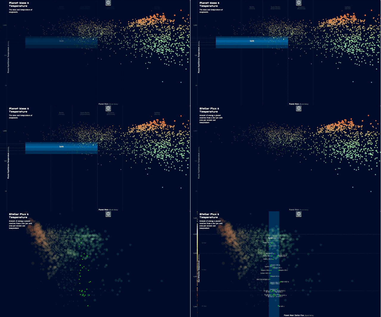
To visualize the spectrum of possibly life-bearing planets, there's Goldilocks.info, a swirling nebula of worlds that can be broken down according to their similarity to Earth in various ways. The viz starts as just a look at where all 1,960 currently known exoplanets sit within our own night sky, but by clicking on the tabs at the bottom of the screen, those orbs whisk away like a cosmic Pachinko machine, to compare their make-up to our planet in other ways: where they are within their host star's habitable zone, its radius, its density, its surface temperature, its mass, its atmosphere, and more.

Goldilocks was commissioned by Visualized, a creative data viz conference held in New York, and was designed by Jan Willem Tulp, alongside members of the European Space Agency and the American History Museum's Earth & Planetary Sciences Division. The goal was to create a fun, engaging new way to compare the planets that could potentially hold life.
Enter Goldilocks.info in the rapidly expanding sub-genre of data viz that explore alien worlds, such as this one, fully explorable through a Minority Report interface or this staggering map of 500 exoplanets put to scale.