The new Star Wars movie is good. But it's not revolutionary. Its plot is a loose beat-by-beat remake of A New Hope, with a little bit of Empire thrown in at the end. There's a planet-sized star base, the Millennium Falcon, and a cute, round droid on a mission to find the last remaining Jedi. It even starts on a desert planet.
That goes for character and set design, too. Design-wise, the boldest thing about the The Force Awakensmight just be that hilted lightsaber everyone was so upset about last year. Because for the most part, the rest of the film's set, character, and creature designs are mostly just rehashes of the work of Ralph McQuarrie, the designer whose work informed the original trilogy's iconic look.
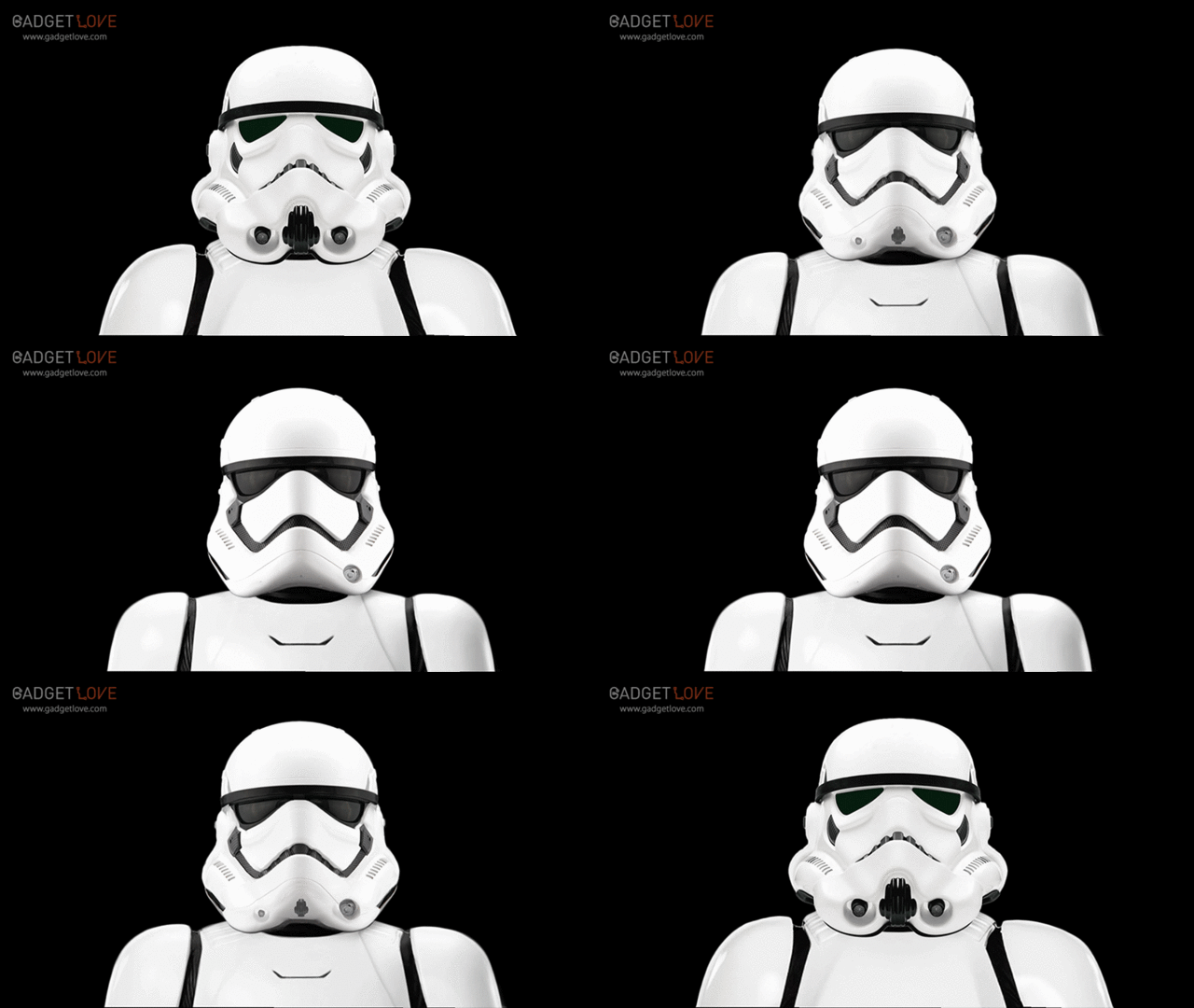
But you know what? That's okay. Because when I was watching The Force Awakens, one thing that really stuck out to me was that the reason it works is a lot why the iPhone works. Both owe their success to design visionaries who built their iconic product on a core set of design principles in such a way that it could be reiterated and refined over a series of generations. In that way, Ralph McQuarrie is Star Wars' Jony Ive. What I'm talking about is everywhere in the new Star Wars, but the most obvious example is the evolution of the Imperial Stormtrooper.

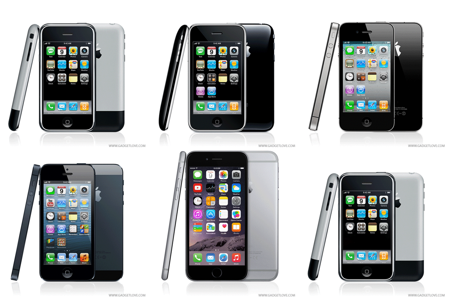
Look at this hypnotic GIF of the New Hope stormtrooper morphing into The Force Awakens trooper, courtesy of Gadget Love. Now compare it to this GIF of the iPhone evolving from the iPhone 2G to the iPhone 6. It's not just speculative to say that the new Stormtrooper took its design inspiration from Apple. J.J. Abrams's has openly talked about how they streamlined the Stormtrooper's iconic look to be more Apple-like. But these GIFs really put it in perspective: the Stormtroopers are the iPhones of Star Wars.

In both, the core design elements remain the same, but everything else becomes more streamlined. Like the iPhone's home button, its aluminum chassis, and its touch screen, the Stormtrooper design retains its most iconic materials and elements across generations: the white metal helmet with glassy black eyes, the mouth and breathing apparatus, and the tight black band across the forehead. Yet everything else evolves. Like the iPhone, the Stormtrooper helmet loses bulk and extraneous ports, while maximizing other design details for the sake of usability: for example, the Stormtrooper's eyes, which like the iPhone's touch screen, grow larger over time.
When I first saw the new Stormtrooper design in last year's The Force Awakens trailer, I thought it looked a little too thin and insubstantial, compared to the Stormtroopers I grew up with. A year later, when I see the old Stormtroopers, I can't believe how bulky they look (even though they still look great). For me, that feeling is the hallmark of good iterative design, which many of us feel every time we upgrade our iPhones: a feeling of intense personal loyalty to something old that is rapidly and invisibly transferred to its more streamlined successor. That's why the new Star Wars works. Same as an iPhone, it's great generational design.