There are many reasons to go to Tokyo: the food, the shopping, the museums, the culture, and, if you're a design nerd like us, the signage. Japanese signage is in a class all its own: an onslaught of abstract shapes, typography, and colors palettes, evident everywhere from the stations of Shinjuku to the shops of Shibuya.
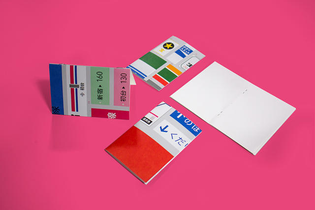
Now, Brooklyn-based designer Kendall Henderson has created a poster-sized tribute to Tokyo's signage. Called "For the love of Tokyo," he's offering an A1-sized, limited-edition print that highlights signage design in the Japanese capitol, as well as some slick mini A6 notebooks based off the same.

What makes Japan's signage so special, according to Henderson, isn't just the wonderful, unexpected colors or the strangely idiosyncratic symbols at play. A big part of it is just letting go, and washing away in the information overload: Japan loves signage, and so practically every street corner contains a dizzying array of signs and symbols.

"It is such a different place with so much to look at. Often times too much to look at," Henderson says. "As a graphic designer I was drawn to certain details during my visit [to Japan] such as color, shape, and Japanese typography." The illustrations Henderson developed after his visit try to reduce these elements to iconic elements of Tokyo signage: the shapes, colors, and type. The palette of the poster was inspired by Sanzo Wada's A Dictionary of Color Combinations, a book of 348 color combinations published by Seigenesha (which actually looks like it would make for a good addition to any graphic design lover's wishlist in its own right).
The result, Henderson hopes, is a "snapshot of the city, for those who have memories there, or for those who just aspire to visit." If you'd like to buy the poster, it's available for $40 as a limited-edition print. The notebooks, meanwhile, will run you $10.