Slowly but surely, America is winning its war on smoking. In 1970, 37% of all Americans smoked cigarettes. Today, it's less than half of that. Every segment of the population is smoking less, except for one: the severely mentally ill. Of the 13.6 million Americans suffering severe mental illnesses including schizophrenia, major depression, and acute bipolar disorder, an astonishing 80% smoke. People with severe mental illnesses are believed to consume one out of every three cigarettes sold in this country.
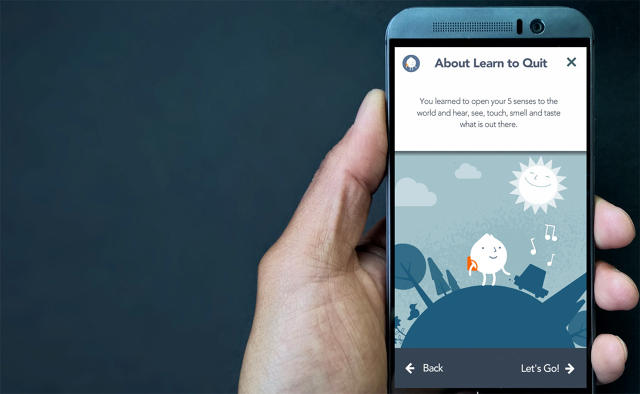
Funded by the National Institute of Drug Abuse, Learn to Quit is the first mobile app that has been specifically designed to help the severely mentally ill quit smoking. It was developed by Smashing Ideas, a Seattle-based digital design firm, and Roger Vilardaga, a professor at the University of Washington's department of psychiatry and behavioral sciences. Here's how they tweaked the design to suit the needs of their unique user base.

Illustrating The Abstract
The goal of Learn to Quit is to help patients quit smoking using Acceptance Commitment Therapy, a therapeutic technique that teaches acceptance and mindfulness through a series of exercises. Although they are often successful in treating addiction, anxiety, and depression, these concepts are largely abstract—which can be particularly difficult for the severely mentally ill to grasp through words alone.
"In his research, [Vilardaga] had found that illustration and visuals were really important to getting patients to understand these abstract ideas," says Chad Otis, executive creative director at Smashing Ideas. "So he'd come up with about 300 Post-its worth of simple stick drawings to explain the concepts, which we worked to bring to life."
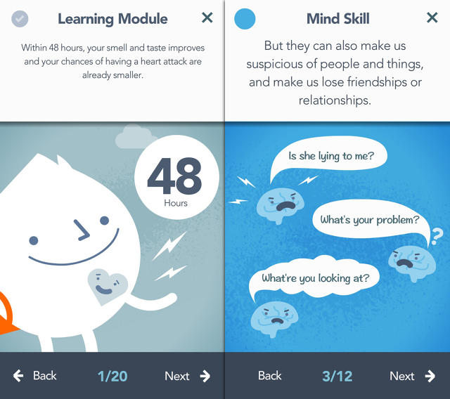
For Learn to Quit, Smashing Ideas worked with Vilardaga to literally visualize the exercises. In the app, a user controls a cute, cartoon-style avatar on a journey through a world of urges. As they navigate these urges, they complete a series of exercises about acceptance, mindfulness, health, and addiction. Use of explanatory text is kept to a minimum whenever possible; instead, animation and illustrations are used to visualize particular techniques.
The result is an app that almost feels like it's aimed at children—but which patients find friendly and easy to understand, even if they have trouble reading. It's also quite funny, with jokes sprinkled throughout. "Humor's something every patient we tested really reacted positively to," says Vilardaga.

Designing For Tremors
In the world of mobile app design, swiping is ubiquitous. You swipe your iPhone to lock it, to navigate screens, or to scroll up and down.
But swiping—especially precisely swiping on a UI element, like your iPhone's unlock slider—is actually a big challenge for patients with severe mental illnesses. "About half of the patients we see have tremors, often due to the medication they are on," explains Vilardaga. "This has a collateral effect on their fine motor skills, for things like using touch screens and keypads."
For Learn to Quit, the design team had to find ways to tailor the interface to these issues. For example, most of the interaction a player has with the game is done through simple tapping. The app offers up large balloon-like buttons, so when Learn to Quit asks a patient to enter some data—for example, how many cigarettes they've skipped—it's more forgiving about where they tap. But many screens don't even have buttons at all. You can tap anywhere to move forward.
Minimizing Cognitive Overload
You don't think about it, but most apps are like choose-your-own-adventure novels. When every possible screen you can go to is fully mapped out, the resulting diagram is incredibly complex. It's like navigating a maze. Whether we're aware of it or not, using any app requires us to build a mental model of where we are within it.
But those with mental illnesses tend to have a harder time creating complicated mental models. So for Learn to Quit, Smashing Ideas had to try to flatten the entire app's navigation structure. "We spent a lot of time simplifying wayfinding and backtracking. We also worked hard to simplify areas where there were too many subscreens, to minimize cognitive overload," Otis explains.
This strategy of minimizing overload extended all the way down to the colors used in the app's interface. "This is aimed at a pretty broad group of patients, some of whom can be overwhelmed by colors that are too flashy or bright," explains Vilardaga. So when it came time to pick a color palette, Smashing Ideas chose one that was nice and muted without being depressing, which ended up including lots of saturated blues, creams, and oranges.

Gamification
Plenty of motivational and self-help apps use gaming elements to incentivize users to keep going—but this was a particularly important aspect of the design process with Learn to Quit.
"A big thing our interviews showed going in was that they found the idea of winning points or playing games like Bingo incredibly exciting," Vilardaga says. "So we knew from the beginning that having some kind of gaming element in our app was going to be very important if it was going to be successful."
That's why Learn to Quit has tons of game aspects, such as achievements and stats. The app tracks your progress, rewards you with achievements over time, assigns you stars, and even keeps "score" of how much money you've saved from cutting down on smoking so far.

Conclusion
In many ways, designing for the mentally ill is about following the same best UI/UX practices as any other app, Otis told me. But there are some key differences—especially with regards to maximizing user friendliness and minimizing cognitive load—that Smashing Ideas needed to keep in mind to make an effective app.
Of course, how effective Learn to Quit actually is at preventing patients from smoking is still unknown. Yet unlike most self-help apps, its impact will be scientifically determined, and soon. Because it was funded by the National Institute of Drug Abuse, Learn to Quit will actually undergo clinical trials, starting next month and continuing through July, to see how effective it is at getting 90 patients to quit smoking.
Unfortunately, that also means the app won't be available to download by the general public until those trials are over. When Learn to Quit is eventually released, though, expect it to come to Google Play first.
Adaptive design, or design that specifically aims itself at adapting to the needs of groups with special usability requirements, is a design school that many industries are finally starting to take seriously. That includes giants such as Microsoft and Google, but also smaller companies and fashion designers. With Learn to Quit, they finally have a corollary in app design.