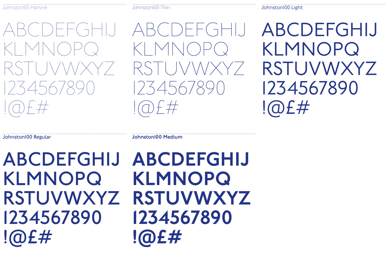
There's no font as synonymous with a single city as Johnston, the official typeface of the London Underground. First commissioned in 1913 from its eponymous creator Edward Johnston to be used in London's Underground Electric Railway, Johnston today is used in all of Transport for London's signage and branding, as well as materials for the Mayor of London.

Over the past century, Johnston has evolved alongside the system it's most closely associated with, the Tube. As London has become more thickly populated, high-tech, and modern, its subways have become more cramped and antiseptic. The same is true of Johnston, says Malou Verlomme, senior type designer of Monotype. As the original design was transferred from metal to phototype, then again to digital, it lost some its roominess and quirkiness.
Those qualities are part of what Monotype is trying to bring back. Today, the type foundry is announcing a new remastering of Johnston called Johnston100. As the first major overhaul of Johnston to be completed since 1979, it's designed to bring Johnston more firmly into the 21st century with a new ultra-thin weight, perfect for today's high-res displays. It also tries to bring a little bit of Johnston's original spirit back, with wider characters, looser spacing, and a slightly more eccentric feel.

Typographic Manspreading
"With Johnston100, we wanted to try to bring back some of Johnston's relaxed feel," says Verlomme, "like the trains of the early 20th century that originally inspired it." This more relaxed feel is reflected in the slightly adjusted proportions of many of the characters: for example, the capital M and H. You could hardly call it manspreading, but compared to its direct predecessor, New Johnston, Johnston100's letters tend to feel more comfortable and less pinched.

Embracing The Quirks
Much of Monotype's work concentrated on trying to give Johnston back some of the eccentricity that marked the original design.
"When you look over Johnston's original sketches for this typeface, you can tell he wasn't really a typeface designer, but more of a calligrapher," says Nadine Chahine, type director of Monotype's U.K. offices. The distinction is that a type designer is always thinking of how a character's form will look when it's mass produced, while a calligrapher is more interested in its pure form.
For example, a character with delicate features that a calligrapher can draw might not work in type, because of how the ink spreads when pressed between paper and metal. Typeface designers also employ a lot of optical tricks to make things "look right," even if, geometrically, they're "wrong." Horizontal strokes are a good example. They look thicker than vertical strokes to people because of an optical illusion. Type designers would make these strokes thinner to compensate, while a calligrapher would not.
Edward Johnston didn't really bother with these sorts of type designer's tricks, resulting in a typeface with some idiosyncrasies. Johnston (the font) is almost chimeric, straddling both geometric and humanist schools of sans-serif type design. Yet somehow, this works. "It's like the Mona Lisa," says Chahine. "Sometimes when you look at it, she's smiling, and sometimes, she's frowning. This typeface is the same. Is it geometric, or is it humanist? That's the secret to its appeal, and why it's so loved."
If Johnston is the Mona Lisa of fonts, though, attempts to tweak the typeface over the years to make it more robust and flexible sometimes resulted in the corners of her lips being pulled up or down a shade too far.
Chahine admits many of these tweaks seem extremely tiny, and maybe even invisible, on their own. "That's the difference between designing a new font, and remastering one," she says. "It's all about subtle little differences, applied with a masterful touch, not about totally redesigning what a letter should look like." Still, they're there if you know where to look: the diamond dotting the lowercase 'i' and 'j' isn't nearly as high in Johnston and Johnston100 as it is in New Johnston, while the top half of the lowercase 'g' has been stretched out to be less perfectly geometric, like it was back in the early 20th century. The end result, Monotype hopes, is a typeface that is closer to Johnston's original intent, feeling more personal and less utilitarian than it did before.

New Characters
Ironically, this is a change which is most obvious in two characters that Johnston didn't actually design himself: the @ symbol and the hashtag symbol. While major typographical marks in the digital age, Johnston originally didn't contain these symbols, and when eventually added, they were ill-proportioned and generic. Johnston100 redesigns these symbols to feel native to the typeface, giving the hashtag Johnston's pointy strokes, or giving the @ symbol geometric shoulders.
Going forward, Johnston100 will be used in all of Transport for London's new signage and branding materials. It will be particularly highlighted in the construction and branding of London's new Cross Rail Elizabeth line, which is due to open in 2018. With any luck, Monotype's work on Johnston100 will be enough to keep Johnston synonymous with London for another 100 years.
All Images (unless otherwise noted): courtesy Monotype. Cover background photo: Flickr user Dunja Klar