Consisting of four bold, balloon-like caps smeared together to look like they are blurring in and out of focus, the Tate logo designed by Wolff Olins in 2000 might be one of the most recognizable identities in the museum world. But for those working behind the scenes, the identity was maddeningly inconsistent at best and a nightmare to work with at worst.
"The Tate is all about being edgy, but the logo had lost the edge we'd always admired in it," says Stephen Gilmore, partner at North, the design agency brought in to rework the Tate's identity. Nonetheless, after careful consideration, North opted not to throw out the classic Wolff Olins identity but instead give it an overhaul. In doing so, they adapted it to the digital requirements of today, while also making it simpler and less schizophrenic.

The Tate logo was never just a single logo. Instead, any designer working on a project for the Tate previously had to choose between 1 of 75 different slight variations of the logo to work with. Worse, there was no guidance on how these logos should be used: Any one of these 75 logos could go anywhere and be any size. Add in a custom typeface that came with half a dozen weights, ranging from super bold to super thin, and you have an overarching identity with very little consistency. "There were so many possibilities that it just paralyzed the designer, who had to pretty much approach every project by starting from scratch each time," says Gilmore. Consequently, "no two pieces of Tate [branding] ever felt like part of the same organization."
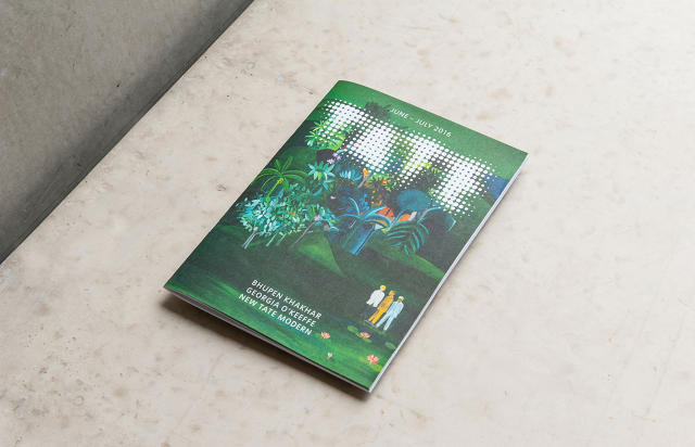
Under North, the new Tate identity is much simpler. The original Wolff Olins logo consisted of more than 3,000 separate dots, but North reduced this to just 300. The resulting logo retains the feel of the Tate's blur but is easier to reproduce at both small and large sizes, and lends itself well to animation digitally. It also eliminates a big problem with the original Wolff Olins logo, which is that it tended to create a disorienting Moiré effect, depending on how it was used, as if it were embroidered or used on a T-shirt.

Another advantage of the new Tate logo is that it doesn't need to be all that legible to work. A small chunk of the old Tate logo just looked like a smudge, but the bigger bubbles in the new logo make it instantly recognizable as a pattern, even if you can't read the whole wordmark.
Outside of the refreshed logo, much of North's work was spent determining the visual language of the identity and simplifying how it should be used. For example, the Tate custom typeface, Tate Pro, has been simplified to only have two weights, strong and thin, each of which is used in specific circumstances—strong for identifying individual Tate museums, and thin for supplementary text.
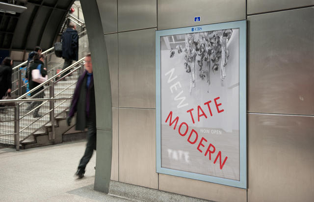
Previously, the four museums that make up the Tate—Tate Britain, Tate Modern, Tate Liverpool, and Tate St Ives—all had their own variations of the Tate logo, with their location sloppily added on top. "Emotionally, it didn't feel appropriate," Gilmore says. In the new identity, the Tate logo always stands by itself in marketing materials, such as posters, to establish the overarching identity of the brand. The individual museums, meanwhile, are clearly identified in a set location in the bolded Tate Pro typeface.

Like the original Wolff Olins Tate branding, which was unveiled alongside the Tate Modern in 2000, North's refreshed identity has been rolling out since January, to prepare for the launch of the new Tate Modern building.
But why didn't North just throw the old Tate identity away and start fresh if it had so many problems? It wasn't just because it was a design classic. In fact, North and Tate explored a number of alternative identities together. But ultimately, they decided to rescue the old logo from itself. "We looked at the equity that Tate already has, and the international recognition of the old logo, and asked ourselves: Why would we throw that away?" Gilmore says. "We felt that actually it was braver and more exciting to work with the existing identity and take it further forward."