First launched in 2005, Google Maps has helped hundreds of millions of people plot billions of trips worldwide. It's one of the most indispensable Internet services available: more than 54% of all smartphone owners in the world use it at least once a month.
So how do you redesign Maps for the next decade, those next billion trips? You throw everything out and redesign it from the ground up with the future in mind--and not just the future of smartphones and tablets, but also the future of Google Glass, the iWatch, and self-driving cars.

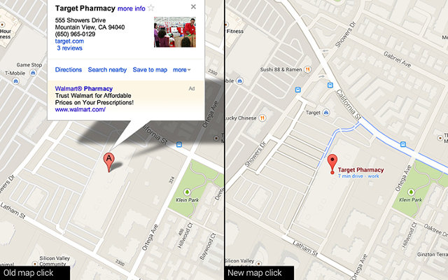
Currently rolling out to all users internationally, Google's new Maps design is a radical overhaul of the service that most of us have grown familiar with over the years. Featuring a minimalist UI based off of Chrome, it's faster, more responsive, more personalized, and more integrated with related Maps services like Google Earth than ever before.
"The old Maps was a lot like a Christmas tree," says Jonah Jones, lead designer for Google Maps. "We kept on adding these beautiful new ornaments, but over the years, the ornaments started weighing the tree down, and it became hard to find the one you were looking for." The accumulated cruft of almost a decade of development had resulted in a design that was cluttered and obtuse, with countless Google services layered over one another. This made features hard to discover, unless you already knew they were there.
For the update, Google wanted to take a step back and redesign Google Maps from scratch to accommodate the feature set it had built up over the years. Not only did it need to seamlessly integrate Google's many mapping services such as Google Earth and Street Views, but it also needed to provide as future-proof of a base as possible to build out Maps for the next decade.
Interacting With The Content, Not The Dropdowns
One thing that liberated the Google Maps design team, Jones says, is the fact that people's expectations of user interfaces are changing. In an age of touch-screen devices and minimal UIs, people are used to more directly interacting with content, instead of menus and dropdowns. For the redesign, Jones and his team wanted to do for Maps what Chrome had done for browsers: strip away all the buttons and controls, and have users interacting with maps directly.

"During our design process, we were super aggressive," says Jones. "We would ask ourselves, 'What would we design if we could only keep 20% of Maps' features? In the end, though, there were incredibly few features that ended up being dropped. They're just not all screaming for attention anymore."
The cardinal design principle of the new Maps design is to contextualize the location it is showing a user at any time, and only present the user further options for interacting with a location as appropriate. For example, if you are browsing a map, and click or tap a nearby subway station, Google Maps will present you with a card telling you what trains and buses service the station, and when they will be arriving. Simultaneously, Maps adds an overlay so you can see the train and bus routes.
The same principle governs interacting with any other location. Click on a restaurant, or search for it, and a card will pop up with its address, hours, website, phone number, and reviews. From there, you can save it to a list of your Google Maps favorites, making it easier to navigate to in the future, or call up directions with just a tap. A Street View or Google Earth view of that location is just a button click away.
A Maps For Many Platforms
The new Google Maps is not just a new interface, though. There are some significant technological changes happening behind the scenes to bring Google Maps into 2014. It's faster, it's 3-D, and it is designed from the ground up to handle any device you can throw at it.
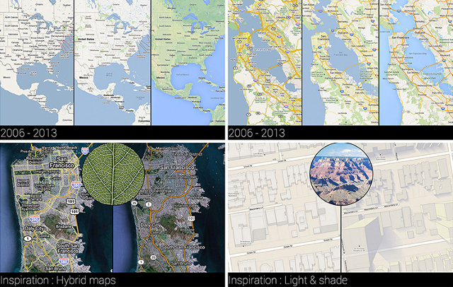
The old Google Maps displayed map information as a series of pre-rendered tiles, fit together so as to best represent the location you were searching for. If you have ever played a game of Carcassonne, you've got the idea. The problem with tiles, though, is that since they are pre-rendered, they need to be downloaded every time you refresh a map. This can result in slower download times, especially in mobile devices. For the redesign, Google switched to vector-based maps. Instead of downloading a series of pre-rendered images for each map, Google's servers pass along a stream of data to the new Maps that describes what a location should look like using points, lines, curves, and other geometric objects.

Not only is the vector approach faster, but it is also truly 3-D (albeit, most of the time, viewed from a two-dimensional perspective). This allows Google to do things it could never do before, like incorporate Google Earth's 3-D view into Maps directly, without loading up an entirely separate app. This shift to true 3-D, though, did have one casualty: a fake shadow on the Google Maps pin.
"In the past, the perspective was a bit weird, because while you were always viewing the map from above, a prominent branding element--which you can still see even on the official app icons--was a fake shadow on the pin, set at a 45-degree angle," Jones says. "In the new Maps, that 45-degree shadow is discordant: because everything is now rendered in 3-D, we can now have real shadows on all the buildings. So the fake shadow had to go. You wouldn't believe how many discussions we had, just about dropping the shadow from the pin."
Finally, the new Google Maps was designed from the ground up to work well on everything, from smartphones to tablets to PCs. In 2014, a responsive, scalable design that works everywhere might seem like a matter of course for a company like Google, but Jones and his team needed to also design the new Maps while keeping in mind the devices of the future. Jones and his team have worked with the engineers behind Google Glass to lay the groundwork for Maps on the company's wearable headset; the interface of Google Maps has been designed so that it could, in theory, scale down to be visible on a watch face.
"Eventually, Google Maps might have to run on Glass, or even on a smartwatch. It will have to integrate new services and features, too," says Jones. "The whole point of this redesign is to make the first baby steps towards a new future, half of which we've already imagined, and the other half of which we haven't even conceived of yet."
The new Google Maps should finish its rollout to users this month. If you don't see it yet, check back.