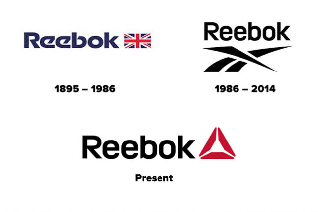
Reebok is a 120-year-old brand, but it was only in the last 30 years that the sports apparel maker traded in its classic Union Jack logo for something new. Released in 1986, the vector logo abstracted the original Union Jack into a streak across a racing tack. It was meant to symbolize Reebok's transition into a performance brand, and as such, the company became heavily focused around striking licensing deals with professional athletes in the NFL and NBA.
Over time, though, growth across Reebok's line of products has slowed, with one major exception: Reebok's CrossFit range, which saw a 13% increase in revenue in the first quarter of 2013. Which is why the Reebok logo--a delta symbol--is now taking over the entire brand. The transition signifies a major shift in Reebok's brand strategies: pro athletes are out, and fitness junkies are in.

"A brand is something that constantly evolves, based on a new insight or an opportunity," says Yan Martin, vice president of global brand marketing at Reebok. "In the late '80s, Reebok was very, very strong in the world of professional sports, but the landscape changes, as has the way people approach physical activity. We wanted to sharpen Reebok's point of view around fitness to change with the times."
First unveiled in 2011 and designed internally, Reebok's Delta CrossFit logo is meant to symbolize the three pillars of positive self-change: mental, physical, and social. In many ways, these pillars represent the changes happening at Reebok as well. As the company has increasingly embraced CrossFit, yoga, dance, and aerobics as a means of growing the business, it has simultaneously abandoned sponsorships, such as a deal with the NFL that lapsed in 2012. Over time, what began as the logo of a sub-brand began to better represent the future of Reebok, much more than its 28-year-old vector logo.
"The more we looked at it, the more it seemed like the right symbol for today's brand purpose," says Martin. "The core philosophy of the fitness lifestyle is that people can change for the better, and that rang true to us. We really believe that, at the end of the day, Reebok's products should be about the benefit of fitness to everyday people, not about elevating athletes to new heights of unattainable prowess."

If there is criticism to aim at the new logo, it's that Reebok is hardly the first company to embrace the delta symbol's association with the concept of change and transformation. Whether you think its ubiquity makes it tired or a classic, there's no shortage of delta logos out there, from your recycling bin to the icon of Google Drive to the design printed on the back of your Delta airplane ticket.
But while the new Reebok logo might be a little drab and unoriginal--I personally prefer the vintage Union Jack, a mark which still adorns clothes in Reebok's lifestyle range of products--it is, at least, earnestly felt, and a good example of why the logos of companies change. It's not always a senior executive pulling the trigger in a blind attempt to remain relevant. Sometimes, companies really believe that a logo should represent what it is now.
That's not to say, though, that market forces haven't motivated Reebok's transition. In an interview with Bloomberg, Katja Erbe, brand director for Reebok in Germany, Switzerland, and Austria, said that Reebok is embracing the delta because the brand is currently not at the top of people's minds like the two other big brands in the market [Nike and Adidas]." Doubling down on the delta logo is Reebok's big push to stop being an also-ran.