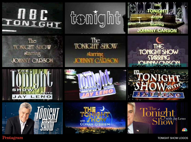
As part of her work designing a new logo for The Tonight Show Starring Jimmy Fallon, Pentagram's Emily Oberman--a 20-year veteran in television branding and logo design--studied the entire galaxy of late night branding over the last 60 years to see just what worked (David Letterman's logo, The Arsenio Hall Show, and Dick Cavett's weird hippy typography) and what didn't (*ahem* Thicke of the Night *cough*). Here's what Pentagram found out about what worked and what didn't in the history of the late night galaxy.
Channel The Host's Personality
Perhaps the central element of any late-night talk-show logo is that it must reflect the personality of the host. In the case of the original Late Night with Jimmy Fallon logo, created by Oberman while she was with Number 17, she decided to keep the logo very simple, with a modern sans-serif typeface that felt solid and present, but then made it slightly slanted and off-kilter, to better represent Fallon's sense of humor.

"I believe all good design has a little wit to it, just that little bit of known intent," Oberman tells Co.Design. "Another logo I love is the original Late Night with David Letterman logo. It was very particular, designed to look like a sports brand, but it perfectly represented who David Letterman was at that moment in time." Quirky, down-to-Earth, personal, disruptive, but very embracing of New York. Since switching networks and becoming the Late Show, David Letterman's logo has changed to become less sports driven and more marquee style, but it still has Letterman's name in its signature hand-written font beneath the big, bold letters. Oberman still likes it. "Even though it's different, it works for Dave. He understands who he is now."
Create A Vessel For The Guests
Oberman says that the best late night logos in history have usually been clean, simple, and strong designs that could act as vessels for whatever content a host wants to fill it with. As such, a talk show logo can also too closely adhere to the idiosyncrasies of its host, because a talk show isn't just a showcase for one person's personality. It needs to also feel broad enough to accommodate the personalities of the guests, and be something that a number of celebrities with very different styles can associate with, from Kim Kardashian to the president of the United States.

The President Litmus Test
In fact, according to Oberman, whether or not you can imagine the president on a given show just by looking at the logo is a pretty good litmus test for whether it's a good late-night logo design. "Look at the old Arsenio Hall show logo," Oberman says. "Sure, it feels super '90s, but still, it's understated enough that Bill Clinton could still show up and play sax on the show. I feel like Arsenio's identity allowed for that, where as The Magic Hour's Space Jam logo just couldn't support that."
Looking back over the history of late night branding, Oberman says, the shows that faded tended to be too much of their time to adapt over time. Many of the talk shows that have been canceled over the years (such as The Chevy Chase Show, The Pat Sajak Show or Alan Thicke's Thicke Of The Night) have logos that practically scream out in horror the year they were designed.

Keep It Simple And Classy, And It'll Last
There are exceptions--Oberman is an unabashed fan of The Dick Cavett Show's quirky flower-power logo--but for the most part, the talk shows that have survived have all had clean, classic, and simple logos. Oberman isn't suggesting that the logo design is what made these shows successful, but rather that the showrunners understood that a good talk-show logo needs to be more than just of its time; it needs to look classy even as trends shift.
As such, Oberman and her team decided not to rock the boat too much when she reunited with Jimmy Fallon to design the Tonight Show with Jimmy Fallon logo. "The whole idea was to take the moon that you've always seen in the Tonight Show logo and make it the thing," Oberman says. "It's not like it's this crazy, kooky idea, but because of that, I think it will stand the test of time. It feels very friendly and big in a way that is not showy, which I guess is the way I think of Jimmy."
To read more about how Pentagram rebranded The Tonight Show for Jimmy Fallon, read our previous coverage here.