At least since the invention of the typewriter, people have been using type to create art. In 1893, the first typographic pictures of Christopher Columbus, the Santa Maria, and a butterfly were laboriously pecked out, letter by letter, on an old Underwood. In the 1920s, Bauhaus artist H.N. Werkman used type to create abstract art. And before we took GIFs and videos for granted, ASCII art was the most common way of drawing a picture on the antediluvian network terminals of the pre-Internet age.
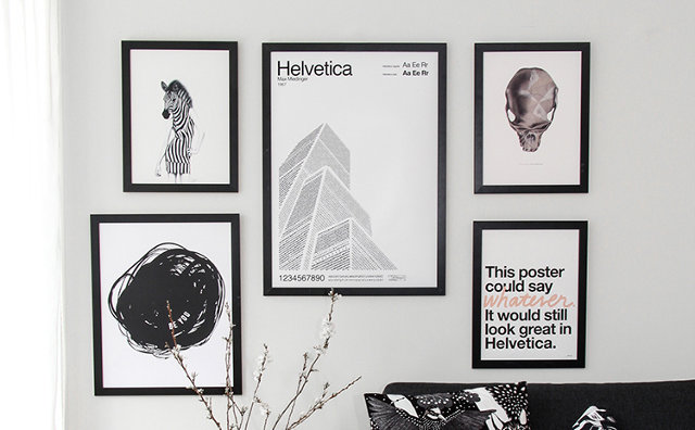
Given the rich history of artyping, I particularly love these prints by Swedish engineer and designer Per Nilsson. Fusing architecture, history, and typography, Nilsson's prints use typefaces--and nothing but--to bring well-known international landmarks to life, while paying tribute to legendary fonts and the type designers who created them.

Each of Nilsson's prints is based around one of three typefaces: Futura, Garamond, or Helvetica. For type-lovers, these prints function almost as typographical charts, showing the full range of characters and fonts of a given typeface. But they are also evocative of the history and creator of each font.
Nilsson's Garamond print, for example, features a Garamond-typed depiction of the Arc de Triomphe, which explored the typeface's French roots. The Helvetica print, on the other hand, represents New York's towering skyscrapers through thousands of intersecting sans-serif glyphs, evoking Helvetica's powerful presence in the modern metropolis. As for Futura, that print conjures up the Pyramids, which is meant to symbolize the jagged peaks of Futura's As and Ms.
Each print also features the typeface's creator as well as the year in which it was first designed. Available as a series of 18-by-28-inch prints, you can buy Nilsson's typart prints online for around $60 a piece here.