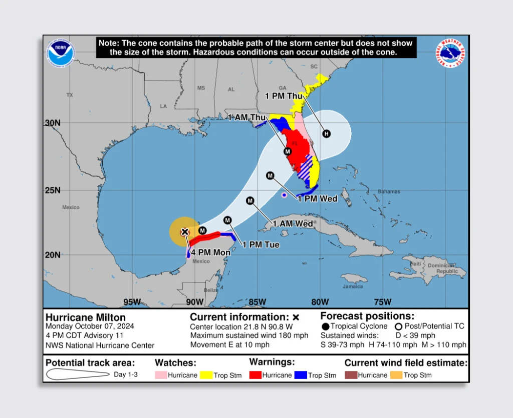
After the devastating effects of Hurricane Helene and the ongoing impact of Hurricane Milton, it’s clear that extreme weather events won’t stop—and will likely only get worse due to the effects of climate change. Now, more than ever, we need clear communication around the potential impact of storms. To do that, some experts are urging meteorologists to retire one of the most common graphics shown during hurricane season: the hurricane cone.
The classical cone graphic used by the National Hurricane Center (NHC) is a familiar sight. From the New York Times to the Drudge Report to TV stations across the country, the cone is the dominant graphic shown during an impending hurricane. But it’s also deeply flawed. The cone, designed to depict the probable path of a storm’s center, has misled people into believing that if they live outside its boundaries, they’re safe.

In reality, storm surges and winds extend far beyond the path suggested by the cone. Rob Lydick, a forecaster for Weather World at Penn State, explained over email that the public needs a lot more. “By highlighting, for example, what 10-15 feet of storm surge looks like in a community, you’re adding important insight that could encourage someone, who for one reason or another, was not going to evacuate or take appropriate action, to do so.”
I interviewed Steve Caparotta, chief meteorologist for WAFB 9 in Baton Rouge, Louisiana, over Zoom, and he shared similar thoughts. He says he tries to focus less on the cone and more on what really matters to people—the specific impacts to their homes and communities. “People want to know how much wind speed they’re going to get, how much rainfall they can expect; if they’re along the coast, how high that storm surge is going to get,” Caparotta says.
The classic cone fails to answer these questions in a meaningful way, instead creating a false sense of security for those outside its borders. During Hurricane Francine, which battered Louisiana in September, Caparotta gave his team of meteorologists a clear directive: “Make sure you’re focusing on impacts. It’s all about impacts,” he says.
A new era for the cone
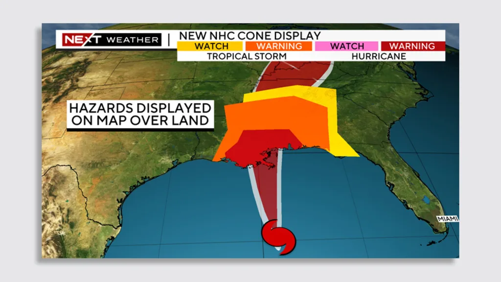
The NHC has acknowledged the cone’s issues. In January 2024, it introduced a new experimental graphic that attempts to combine the impact zones overlaid on the cone’s path and shape. The hurricane is represented by the stylization of its shape, but this shape doesn’t provide clear information. (As Edward Tufte would say: It’s wasted ink.) The impact zones are shown as big patches that come in four colors: yellow is for “tropical storm watch,” orange for “tropical storm warning,” pink for “hurricane watch,” and red for “hurricane warning.” While this graphic can convey some additional information, its meaning is confusing. The real question: What is the difference between a tropical storm warning and a hurricane warning in terms of impact for the public?

NHC spokesperson Maria Torres explained to CBS News that the organization’s new experimental graphic aims to highlight watches and warnings more prominently. The alerts are taking precedence over the cone, and will be predominant on the graphic, Torres says. This is an attempt to address the so-called containment effect, where people mistakenly believe areas outside the cone are free from risk.
But the new map still presents challenges. Caparotta says it’s “a bit busy and hard to interpret,” with so much information that the core message can get lost.
Caparotta also believes that the NHC has become a victim of its own success in predicting storms. In 1992, for example, the cone for Hurricane Andrew was much larger, reflecting the imprecision of forecasts at the time. The broad cone made people more cautious. Now, with vastly improved accuracy, the cone has shrunk, leading to a more precise forecast but one that doesn’t quite communicate the risk for people outside the cone’s prescribed danger zone. “Now the cone is so small that it doesn’t do a good job of showing who will be impacted,” he says.
We need an effective communication center
Information about a storm’s potential impact is out there—the NHC offers detailed maps, wind projections, rainfall estimates—but it’s hard to find, and most people don’t know where to look. Much of the detailed information is buried deep within the NHC’s website, far from the front page. And it looks to be designed for meteorologists, not the average person looking for definitive, easy-to-understand information on a storm. (The NHC didn’t respond to comment as of publication.)
As the information landscape becomes more fragmented, there’s an argument to be made for a centralized, comprehendible source of truth. You could imagine two views of NHC data—more granular data for scientists, and simpler views for the public. Caparotta says that while there’s a need for more detailed information about the impact of storms, “meteorologists want to be a little careful with being too precise because there is still uncertainty [during any given storm].”
Today, broadcast newsrooms are moving beyond the cone with VFX virtual reality graphics that simulate potential storm surges. The graphics are indeed high impact—almost sensational. But they achieve precisely what Caparotta and other meteorologists are after: a simple, visceral graphic that might be the push people need to get out of a potentially disastrous situation.