Paul Rudolph (1917-1997) is what you might call an acquired taste. While the modernist architect dabbled in elegant international style beach houses, swanky townhouses for the glitterati, and dizzying conceptual megastructures, he’s best known for his mammoth brutalist buildings, many of which have been on the losing end of high-profile historic preservation debates. One person’s monumental structure is just as easily another’s authoritarian symbol.
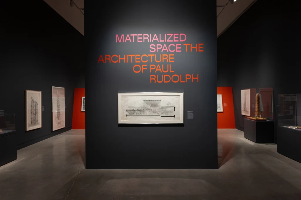
On my visit to Materialized Space: The Architecture of Paul Rudolph, a new exhibition at the Metropolitan Museum of Art, the first major museum retrospective on the architect, this split was reflected in a couple of the comments I overheard in the gallery. “He really was a genius—misunderstood and underappreciated,” one woman said to her friend while watching a video of Hollywood productions that were either filmed in or had set design inspired by Rudolph’s buildings, including Wes Anderson’s 2001 film The Royal Tenenbaums and the Disney+ series Loki. While watching the same scene, another visitor remarked, “A prison, perfect.”
Abraham Thomas, the Met’s curator of architecture, design, and decorative art, says that these mixed feelings about Rudolph’s work made revisiting his career all the more satisfying. “He had always struck me as a bit of a conundrum,” Thomas says. Rudolph had a meteoric ascent in the world of architecture (he appeared on the cover of The New York Times Magazine in 1967 and became the dean of the Yale School of Architecture before he was 40), before he practically disappeared from the North American architectural scene later in his career, spending his final years building in Southeast Asia.
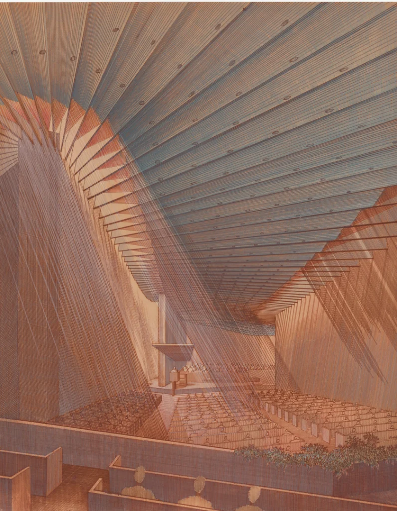
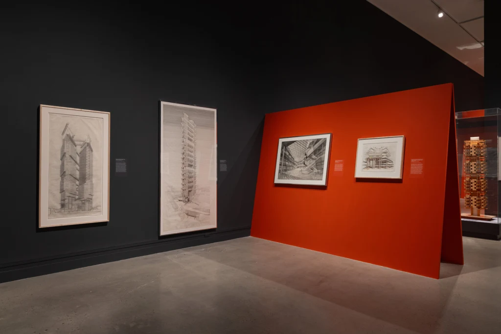
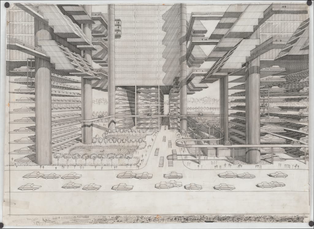
But where the exhibition is most successful is welcoming us into his intricately made hand drawings, some of which are 6-and-a-half-feet tall, while others are more than 4 feet wide. Thomas says the exhibition was “partly just to have the opportunity to showcase these drawings in the flesh for the first time.”
Who is Paul Rudolph?
Throughout his career, Rudolph was wildly ambitious. Born in Kentucky, he studied at what’s now Auburn University before heading to the Harvard Graduate School of Design. After briefly serving in the military during WWII, he applied the new materials used in battleship repair, like plastic and plywood, to architecture. His first commissions were in Florida, where he developed the Sarasota modern style—think white, boxy, open-plan homes with large windows and deep eaves. He designed affordable housing developments, government structures, university buildings—everything from “Christmas lights to megastructures,” as he once said.
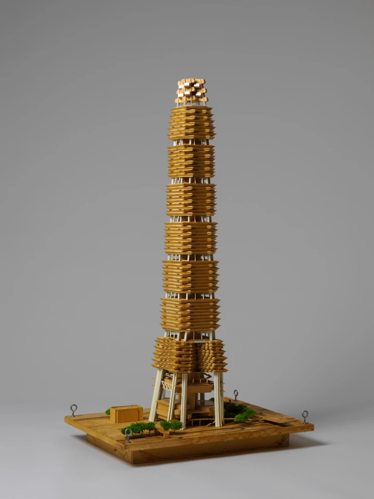
Rudolph was initially celebrated in the press (one critic speculated that his friendships with editors spared him harsh reviews) and kept his practice in conversation with contemporary events. Engaging with Robert Moses’s Lower Manhattan Expressway idea, he proposed turning the highway into a continuous modular structure with apartments built over an enclosed roadway. If it was going to happen, his thinking was, may as well make it nice. But by the late 1960s, Rudolph was falling out of style as postmodernists came into the picture and positioned him as the figurehead for modernism’s failings.
For the past 15 years or so, there’s been a steady reconsidering of Rudolph’s work. After he died in 1997, obituaries focused on the “perplexing” nature of his career, and more architecture students and scholars became interested in learning about all the sides to his work, which has led to renewed appreciation for it.
“I’m not sure there has ever been an architect whose work was as seductive, as beautiful, as exhilarating, and as downright frightening as Paul Rudolph’s,” wrote critic Paul Goldberger in The New Yorker in a 2010 review of a small exhibition at the Cooper Union. The Rudolph Renaissance has also included a show at the Center for Architecture, a scholarly book by historian Timothy Rohan, and a photography book of Rudolph-designed homes on the eve of their demolition (which has become a collector’s item). In 2023, Rudolph’s Modulightor building became New York City’s first landmark to acknowledge an architect’s LGBTQ+ identity.
The architectural drawing revival
Now, amid a rise in AI-generated images and the ease with which renderings can be produced, Rudolph’s laborious drawings find themselves in the center of a conversation about how architecture is represented. There’s a renewed interest in physical media within contemporary architecture. To wit: The SoHo print shop and architecture gallery a83 opened the third exhibition in its series of shows on architectural drawings, coincidentally, just four days after the Rudolph survey.
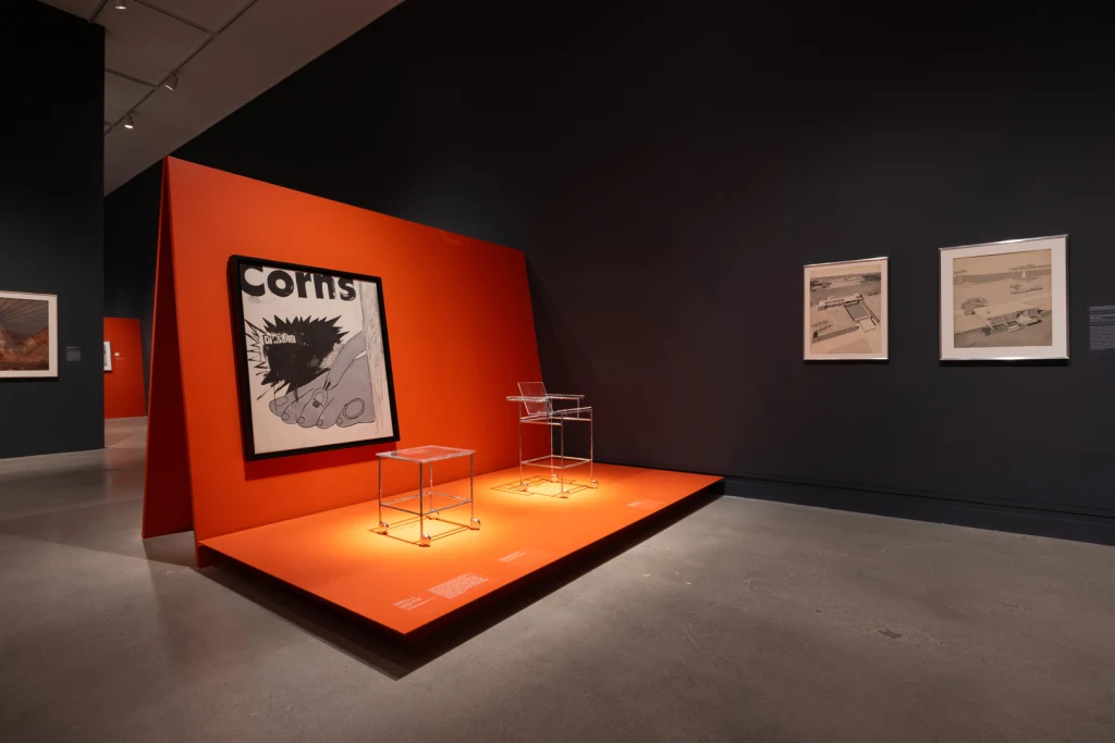
Rudolph’s sketches for his projects were a hit with the design press when he drew them and have continued to captivate audiences ever since. Many of them are now held at the Library of Congress and haven’t been exhibited publicly.
“It’s hard not to be romantic about these drawings,” Thomas says. “I think when people see the power of them, I think it might be an interesting question in terms of the role of drawing within architectural education or even within architecture practice in general.”
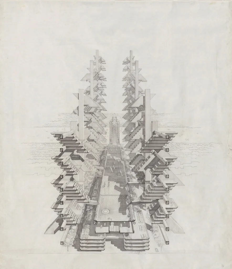
Rudolph always held the pen when it came to his drawings. It’s exceedingly rare for the principal of an architecture firm to do this. Just like so much of Rudolph’s career can be considered a “cautionary tale,” as Thomas describes, so too can the drawings. Thomas wonders how different Rudolph’s career might have been if he were able to delegate some of this work.
“You often read these stories about him being quite a difficult architect to work with,” Thomas says. “Many of his students often described him as brutal, but also brilliant and the most important influence they ever had in their career. I think he also refused to play the game. As architectural practices became more corporate and large-scale in the ’70s and ’80s, people like Philip Johnston and I.M. Pei had partners and they were happy to share the headline with other architects. And Rudolph, of course, never did that. He always treated the office almost like an atelier, like he was still at Yale running a studio with students. There’s a cap to how much productivity you can have when he’s being so involved with even client-side renderings.”
That said, architectural spectators today are lucky that Rudolph never passed off the pen since we can now appreciate them as originals, especially since the buildings themselves were never constructed or have since been lost. Materialized Space: The Architecture of Paul Rudolph is on view at the Metropolitan Museum of Art through March 16, 2025.