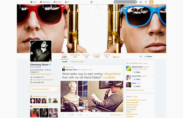
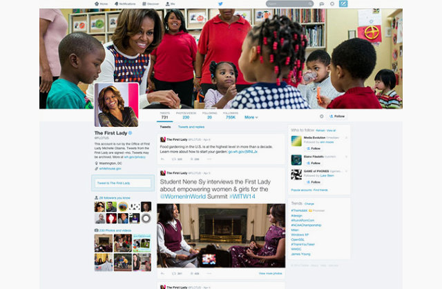
After months of testing, Twitter has announced a new design that makes the popular micro-blogging service look a lot more like Facebook. But don't let that fool you. Twitter's as dedicated to being a digital stream of consciousness as ever. The redesign just makes it easier for others to track your thoughts. If your old Twitter was Finnegan's Wake, the new Twitter design integrates CliffsNotes inside the text.
Rolling out to new users today (and gradually to the rest of us), the most obvious change in the new Twitter design is the aesthetic. While previously a user's Twitter profile was a rather austere two-paned list of tweets, statistics, and hashtags, the new Twitter opts for a flashy, Facebook-style profile, with wide horizontal header images, bigger user pictures, and tabs for photos and videos, followers, and more. It looks nice and clean.

Twitter was experimenting earlier this year with presenting a user's tweets as a series of cards aligned in a grid, but it looks as though the company's designers have opted to not pursue that approach (we reached out to Twitter for comment, and we'll update the post if and when we hear back). That's a good move. We've previously argued that Twitter should never abandon its news river format; the format sets Twitter apart from the likes of Pinterest and gives the micro-blogging network a sense of immediacy.
The best part of the new design is it doesn't muck with what makes Twitter great. Your Twitter profile is still a digital stream of your online consciousness: It's just that some of your thoughts are more prominent in that stream than others.
The new Twitter emphasizes those thoughts in a couple of key ways. The first is by leveraging engagement: the number of replies, retweets, and likes that any of your tweets get. Twitter always tracked these metrics, but now, the company will be using them to influence formatting. This means that a particularly popular tweet ("Just kicked @justinbieber in the groin! #betterbeliebit") will have a slightly larger font size in your stream than, say, your tweet lamenting the loss of a gym sock. It's Twitter's way of surfacing the flotsam and submerging the jetsam.
The other big change is the ability to pin a single tweet to the top of the page. In Twitter's new design, this acts as almost a supplement to your bio: while the latter tells people information about you, the pinned tweet is a snapshot of what you're all about now.
In addition to the new tweet-surfacing features, Twitter has rolled out one more feature to make the platform more user-friendly. Like on Facebook, users can now filter what they see when they look at a profile: tweets, tweets with photo or video, and tweets and replies.

Between Twitter's new Facebook-like look and a recently announced feature that lets you tag people in pictures, some are wondering if Twitter is losing sight of what makes it great. But nothing is really different here; the new design simply makes what is otherwise an unordered stream of your thoughts easier for other people to follow. And if you follow some of the borderline personalities I follow, you'd thank Twitter's designers for it.