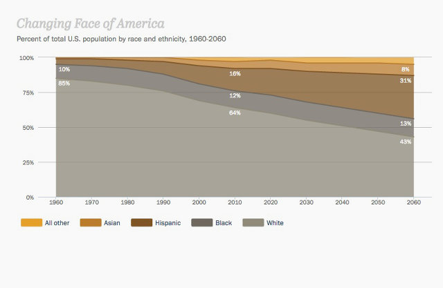
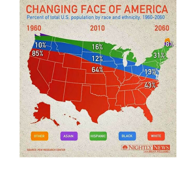
Earlier this week, the NBC Nightly News decided to recreate an infographic originally published by the Pew Research Center, showing the distribution of race and ethnicity in the U.S. from 1960 to 2060. The result is so hilariously thick-headed, it might have already won the title of worst infographic of 2014.
As designed by Pew Research, the original visualization wasn't particularly exotic. A rectangular graph tracking how the percentages of different ethnicities in America (white, black, Hispanic, Asian, and so on) had changed across the U.S. over the past 100 years. It wasn't flashy, but it was easy to read and showed, at a glance, where the distribution of races was in 1960 compared with where they are today, and where they are predicted to be by 2060.

But when NBC Nightly News came along, they decided to punch up the "Changing Face Of America" visualization by abandoning the rectangle and charting the graph to a map of the United States instead. And in doing so, they completely changed the data's meaning, instead visualizing... what, exactly?
According to the NBC Nightly News infographic, all Asians live in either Northern Maine or upstate Washington, while South Dakota is an excellent place to be black, along with much of Montana. There is not a single Hispanic within a thousand miles of the Mexican border. And more over, there are hard geographic borders set up to prevent races from drifting into each other's territories.
Meanwhile, talk about jet lag. The time zone difference between the West Coast and the East Coast is 100 years! And, in fact, thanks to some sort of apocalyptic disruption of space-time, the vast majority of Americans either live in the future or the past.

In short, just by changing the context of the original infographic, NBC Nightly News turned what was a straightforward visualization of America's demographics over time into some sort of alt-history map of 100 years of ethnic cleansing and racial segregation. Oh, and there's time travel in there for some reason too.
Golf clap, NBC. Golf clap.
Update: Since publishing, NBC has corrected the graphic.
[via Cartonerd]
* - Correction: The original version of this post misidentified Washington as Oregon.