When you first load the page to Feminist Spatial Practices (FSP), a new online archive, the site appears to be a collage of multicolor organic shapes and hundreds of vibrant squares. But zoom in and pixelated icons start to appear. Click on any one of them and you’ll discover an encyclopedia-like entry for a feminist collective, project, protest, publication (and more): The Combahee River Collective’s 1977 manifesto for Black feminism; a biography of Margarette Schütte-Lihotzky, one of Austria’s first women architects and a socialist activist; and a link to a booklet by the Tender Yet Furious Oracle, a collective of disabled, sick, and caregiving cultural workers.
“We wanted to shake up the way people think about feminism in the built environment,” says Bryony Roberts, an architect and one of the project’s cofounders. “I think a lot of the discussion about the topic focuses on issues of representation, and this idea that if you just put enough people who identify as women in certain positions, then that will address any kind of gender inequities. We were interested in an approach to feminism that is about ways of making and ways of knowing.”
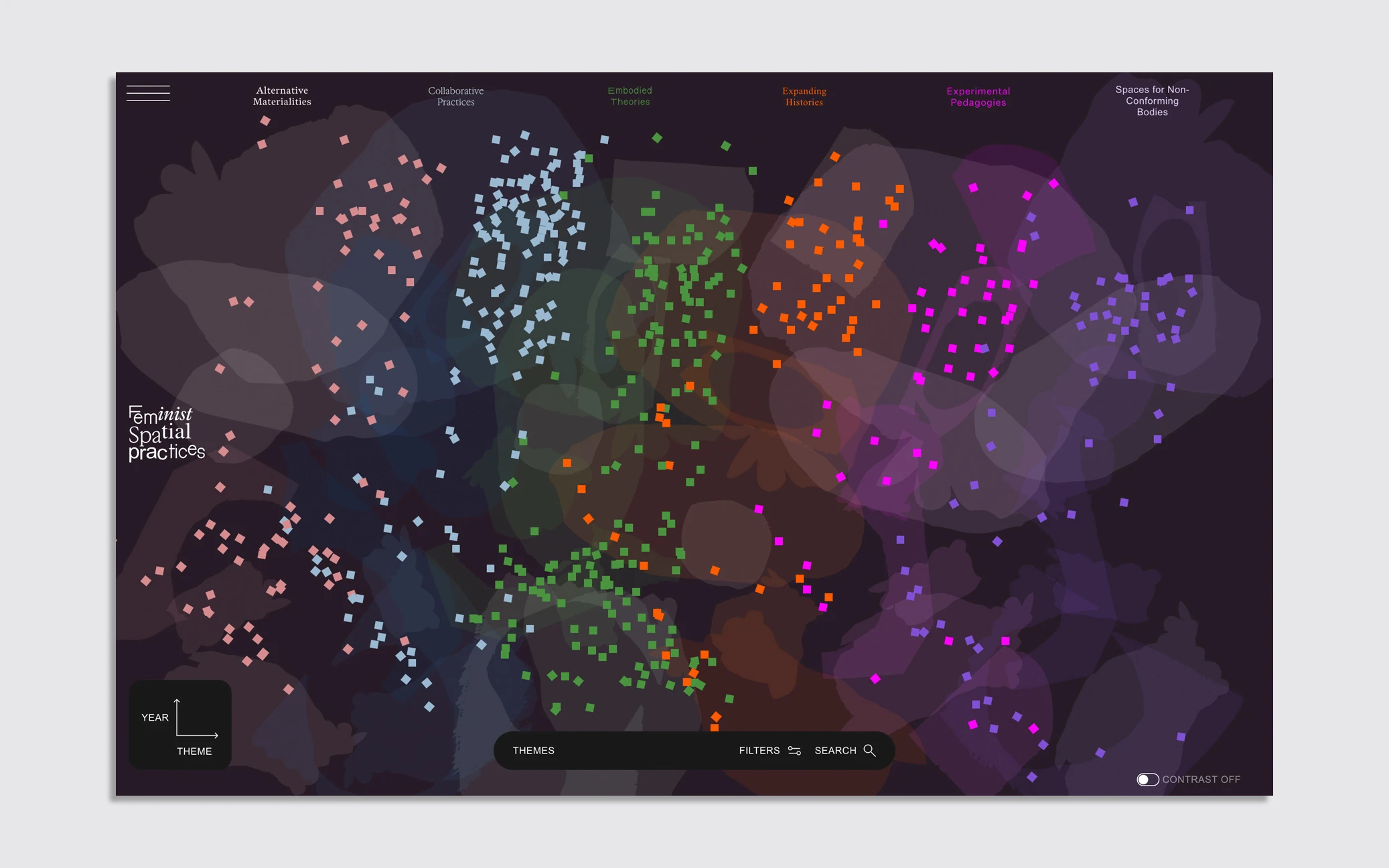
The design of the site itself is one of the metaphors for what this knowledge represents. To that end, the team behind FSP—an international group of architects, artists, programmers, and designers—intentionally looked beyond the expectations Big Tech has created for user experiences and interfaces and made something that reflects the message of the archive, which is, there are many ways to exist in and move through the world.
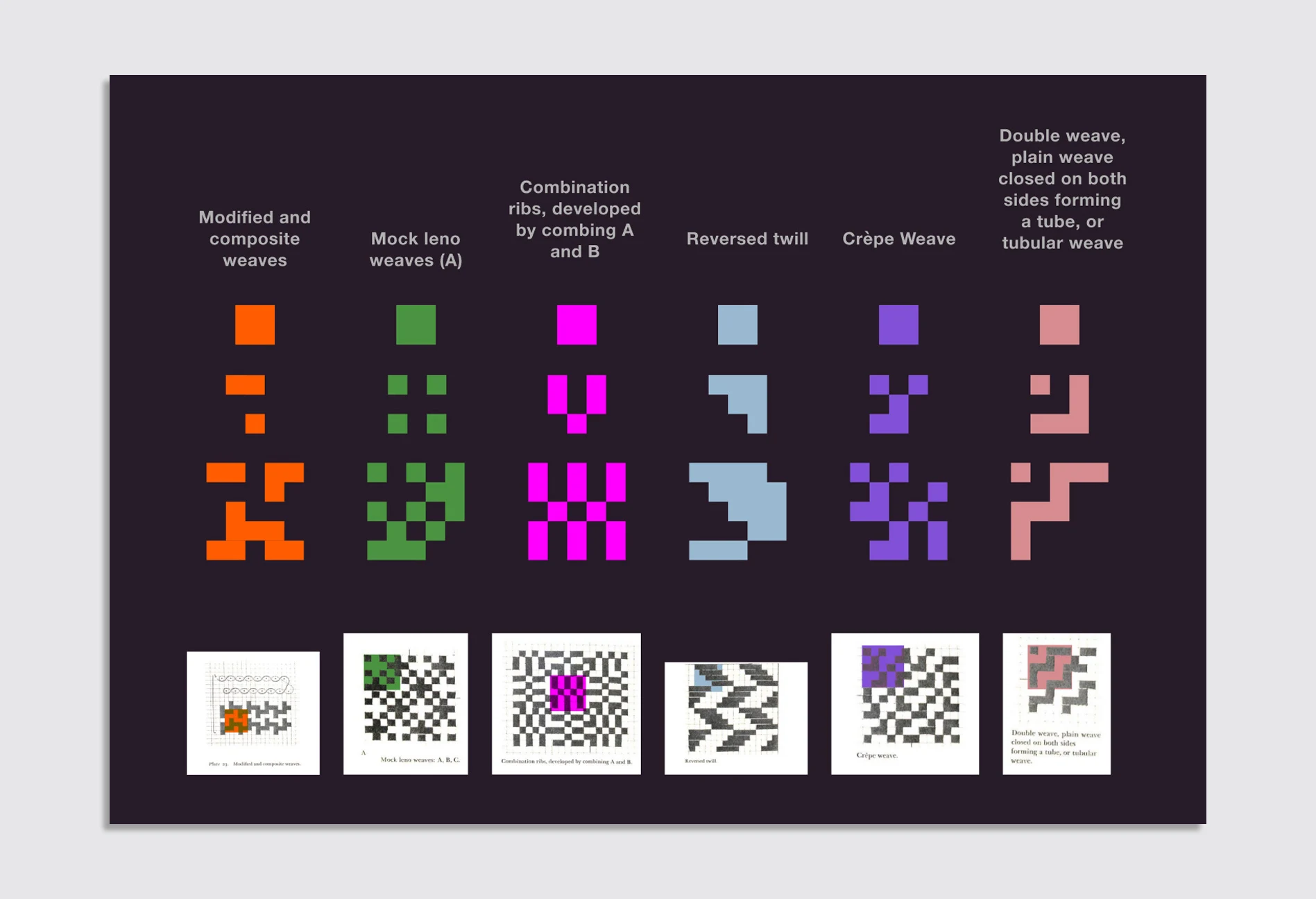
The designers looked to weaving, sewing, and mending—all feminized crafts—to inform the site’s design rather than “at times, reductive nature of the index and its rule lines, grids, and sans-serif text,” says Julie Cho, a cofounder of the women-led graphic studio Omnivore, which designed the site. This philosophy shows up in the design of the site’s icons, which reference Anni Albers’s weaving patterns, as well as the structure of the page itself, which has depth and dimension and can continually be added to, just like a tapestry structure can continue infinitely.
“The challenge of legibility and structure always acts as a foil to the poetics of something more entangled, but perhaps they don’t need to be foils of each other,” Cho adds. “Sewing does offer a kind of mathematical way of thinking, with its own set of grids and stitch counts.”
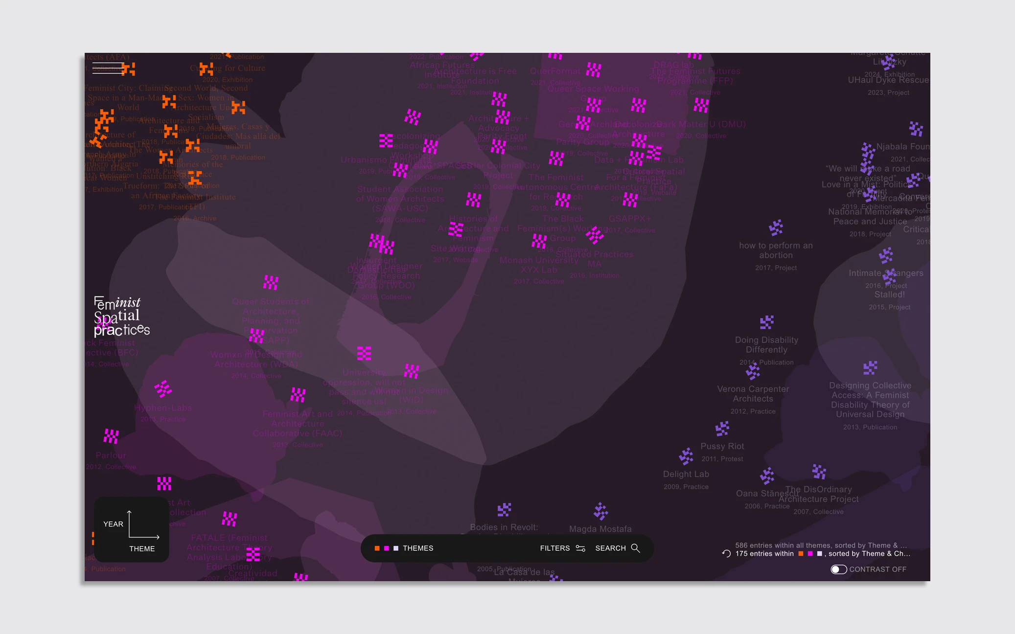
A visual history of feminist collectives
FSP began as a response to the architect Charles Jencks’s famous c. 1970 chronogram of the history of architecture, which categorized various styles and movements into a diagram of flowing shapes. In 2023, Roberts and her collaborator, Abriannah Aiken, riffed on the form, creating a similar—yet more complex—visualization of feminist practices. The FSP archive is an adaptation of that two-dimensional image. They thought a better version of the graphic is one that is interactive, editable, and can grow infinitely through crowdsourced contributions. Anyone can submit an entry for inclusion, which is then vetted for accuracy by the FSP team.
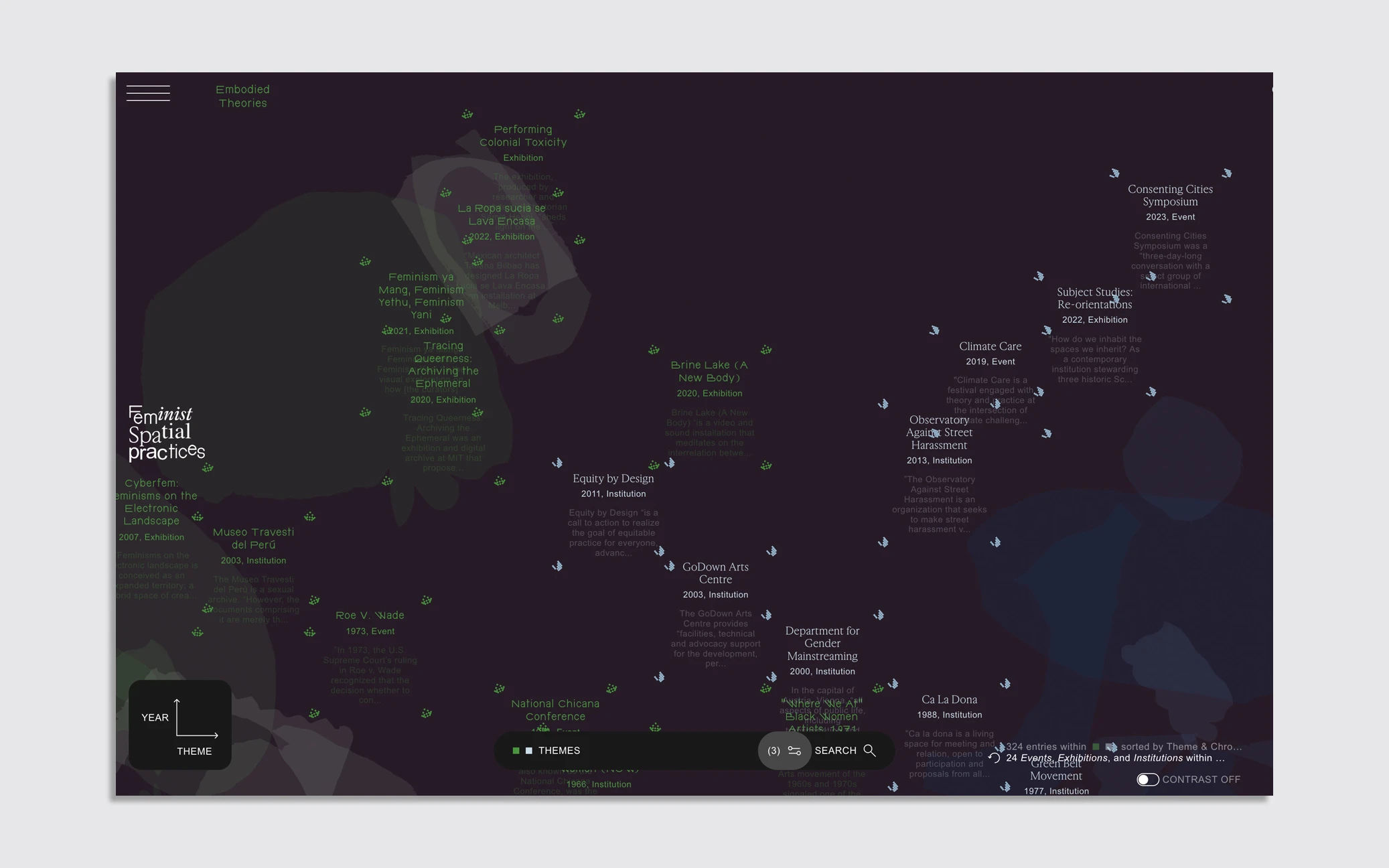
“We wanted it to feel like a space,” Roberts says of the online platform. “It started as a landscape but then it became a cosmos.”
While the “tapestry,” as FSP calls it, is one way to explore the site, there is also a traditional chronological index. Search tools also enable you to filter by themes—which are alternative materialities, collaborative practices, embodied theories, expanding histories, experimental pedagogies, and spaces for nonconforming bodies. You can also search by category of entry—like exhibitions, publications, and collectives.
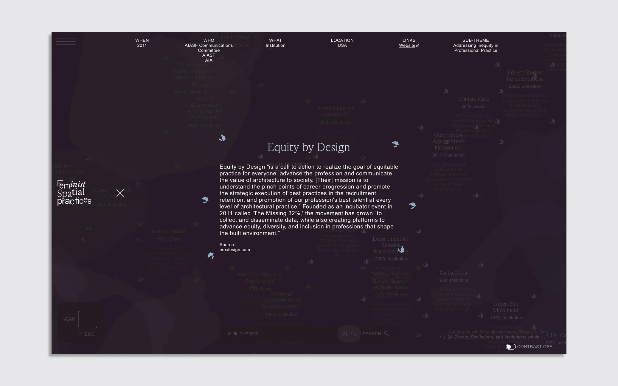
“At the first scale, you see the whole galaxy, you see the different themes or the different categories that you’ve chosen,” Roberts explains. “And then as you move in, you start to see the relationships between the entries. You see a cluster, and that helps you understand that none of these exist in isolation, but they all exist in relation to each other. And then you zoom in and you see the entry itself with all the detailed information.”
Rahul Shinde, one of FSP’s web developers, along with Lukas Eigler-Harding, describes this dichotomy of user friendliness and metaphorical experience as “a balancing act.”
“At the end of the day Lukas and I are both interested in developing well-performing and accessible websites that remain approachable,” Shinde says. “But, we also hope that by providing a (sometimes) more challenging and unique experience, we are catering to people who will invest time into exploration and reward curiosity.”
The archive presents relationships between feminist practices and how similar themes occur across time and place, yet have nuance when it comes to specific projects. As visitors to the site explore it, they are developing their own relationship to this history.
“That becomes a kind of community building, which is fundamentally the motivation for all of this,” Roberts says. “We felt like it’s very difficult to work on these issues and feel isolated in your own context; it can feel very lonely to do this work. To feel a kind of solidarity and community growing up around you, to know that you’re not alone and, in fact, there’s so much inspirational work out there can be super motivating.”