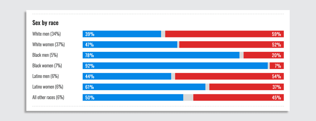
Exit polls are by no means a perfectly accurate measure of which candidate voters opted for on Election Day. But they can be indicative of what happened, and why. Take this national exit poll of the 2024 presidential race conducted by NBC and a consortium of news organizations. It’s a good example of how clear, simple graphics can tell a deeper story of an election at a glance.
This chart, one of the many demographic breakdowns of the poll, filters data through the lens of “sex by race,” with blue representing people who voted Democrat, red indicating Republican voters, and gray being other candidates.

As NBC explains, exit polls offer a glimpse into the thought processes and motivations of voters nationwide (they do not provide actual voting results). They serve as a tool to enhance the public’s understanding of the composition and driving factors behind the electorate.
According to this chart, the largest demographic groups that tilted toward Trump were white men and white women, who account for 71% of the total vote. Latino men also represented a large shift to the right. Meanwhile, Black voters went decisively for Democrats, with Black women being the most solidly Democratic group.
Of course, this chart is only one page of the full story. NBC’s data on age reveals that Gen X voted pro-Trump across both genders, despite the overturning of Roe v Wade, Trump’s guilty verdict for being a sex abuser, the Stormy Daniels case, and a long trail of misogynistic behavior.
The chart is simple, yes, but the narrative it tells is quite a bit more complicated.