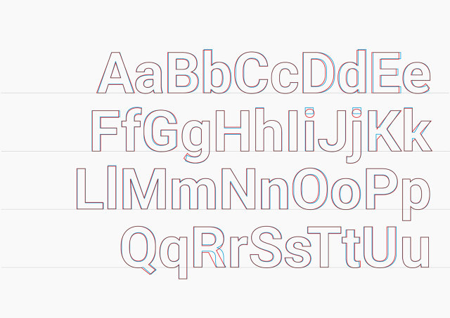
In the digital age, the printing press has largely gone the way of Dodo, but we still treat the design of typefaces as being as permanent as if it was made up of centuries-old metal blocks. You just don't 'tweak' a typeface... do you?
Google thinks you do. Today, Google announced an overhaul to Roboto, the Android system font first unveiled two years ago. More than just a series of optimizations to ready Android for an entire new wave of devices, Roboto 2.0 aims to prove that typefaces don't need to be written in stone anymore.
Roboto's designer, Christian Robertson, has always argued that the font is a work-in-progress. "The old model for releasing metal typefaces doesn't make sense for an operating system that is constantly improving," Robertson says.

In other words, as Android evolves, so should Roboto. Every time Android supports a new type of device--which now includes phones,tablets, computers, TVs, and watches--or changes it's design philosophy, Roboto should be re-evaluated and tweaked to make sure it's still doing what typography is supposed to do: be the skeleton of interface design.
"Compare Android Wear to Android TV," says Matias Duarte, Google's Director of Android Experience. "On a 2-inch smartwatch, text will have to be squeezed into a small, narrow column, which gives it a different rhythm than seeing the same text on a wide 50-inch television screen." But Roboto has to work well on both, as well as hundreds of other contexts.
Rhythm is a hard thing to quantify. If your typeface looks too scrunched together in some places than in others, for example, you can't just average out the distance between characters and call it a day, because our eyes interpret spaces differently: a capital 'F'', for example, might look farther apart next to a lower case 'e' than if it were next to an 'a', even if the distance between them was exactly the same.
Hence the need for an evolving typeface that is just as responsive to criticism as it is to user testing. "That's the way we plan to keep Roboto robust over time," says Robertson. "Most people can't really articulate their reaction to a typeface. The most important thing is to get it in front of people and see how they interact with it."
First released by Google in early 2012 as a replacement for the system-wide Droid font, Roboto was designed to be a more modern and approachable typeface that would look great on high-resolution devices. But typography critics were not kind to Google.
Citing its amalgam of various typographical styles, Stephen Coles of Typographica said: "[Roboto] is not a typeface. It's... a four-headed Frankenstein. You never know which personality you'll get." Other critics, meanwhile, claimed that Roboto was nothing more than a bad Helvetica clone: a super-bland sans serif font that would go down in history as Google's own version of Arial.

Although critics may still deride it as a Helvetica clone or a Frankenfont, Roboto 2.0 addresses many issues with the original version. The vast majority of tweaks to Roboto have to do with the way the letters look together, not just in words and sentences, but in a variety of different types of screens. It's subtle, but these changes - an 'O' rounded here, a couple of pixels shaved off an 'l' there - give the typeface a different balance than it had before.
"The system font for an operating system needs to help give the UI character, but you still don't want people to fixate on specific glyphs," Robertson tells me. Although the 'K' and 'R' were some of Roboto's most distinctively shaped letters, two years of feedback showed Google that they needed to be dialed back. "With a system font, you really don't want people going, oh, here's that weird 'K' again," says Robertson.
In Roboto 2.0, other such 'problem glyphs' have also been tweaked. Most users, for example, will never notice that the lower terminals of the lower-case 'e' and 'g' have been closed, where as previously, they were more open. But when Roboto was first released, many critics considered the design of the 'e' and 'g' to be borderline sacrilege, leading to Google rolling it back in this release.
"That was a way we were deliberately trying to push the boundaries," admits Robertson. "People act as if there's this hard fast rule for designing sans serif typefaces that, say, if your 'a' is closed, your 'e' needs to be closed, too. We didn't think that was necessarily true, and so we tried to experiment with that."

But Roboto 2.0 isn't merely reacting to user criticisms. It is also taking on board lessons learned from the testing of new products, like Android Auto. Some of Roboto's subtler design changes happened after testing how well Roboto worked in a dashboard setting. By fitting users with special liquid crystal glasses, which turned on and off to simulate the maximum amount of time the National Highway Safety Commission deems safe to look away from the road while driving your car, Google was able to make changes to Roboto to improve its legibility both on-the-road and off.
The truth is that while critics might argue about Roboto's merits, Google looks at it as being the same as any of its other products, from search to Gmail to Android itself. Roboto doesn't exist as thousands of glyphs carved into individual metal blocks; it's a purely digital construct. Why not treat it like one, and keep it supported over time?