Ever since Coca-Cola started featuring him in holiday ads back in 1931, and thus helped turn him into a pop culture icon, Santa Claus has been as much of a brand as he has been an omnipotent shape-changing elf. Yet what would Santa Claus look like if his 21st-century identity had been determined not by the Rockwellian sentimentalists at Coke, but by today's jargon-obsessed branding "experts"?
If you want to know, look no further than the *Santa* Brand Book. Created by U.K. agency The Quiet Room, The *Santa* Brand Book is an amusing spoof of today's silliest branding strategies right down to the smallest details.
Consider the following branding trends that the Quiet Room expertly skewers:
A meaningless mission statement
The *Santa* Brand Book begins with a statement about who Santa is and what he represents that was seemingly written with a Speak 'N' Spell. "*Santa* is a Concept, not an idea. It's an Emotion, not a feeling. It's both Yesterday and Today. And it's Tomorrow as well." Bravo! It takes talent to write a paragraph this devoid of content.

Obnoxiously stylized brand name
Just as Sony once tried to force journalists to write Sony PLAYSTATION 3 (yes, in all caps) every time someone wrote about their video game console, the *Santa* Brand Book ostentatiously defies the rules of punctuation to place snowflake-like asterisks before and after the Santa name.
All rights reserved
*Santa* is a registered trademark. And don't you forget it. But do forget the caps when you write out the name of the registered trademark's holder, of santaclaus global enterprises incorporated. Faceless rightsholder conglomerates don't have time to capitalize their own names.
Acronyms up the wazoo
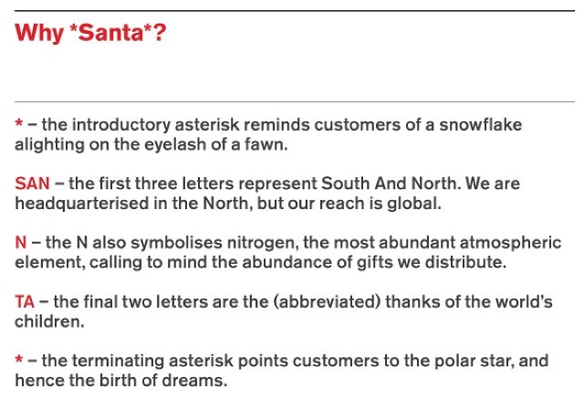
What does *Santa* represent? E(x)cellence, (m)easurability, (a)ccountability and (s)now. That spells XMAS! And don't forget the "why" of Santa, which can be represented by this handy acronym:

Obligatory diagrams
On page 3 of the *Santa* Brand Book, Santa's totally subjective values--which include concepts such as "Jollyness,""Red Nose," and "Ho"--are pseudo-scientifically objectified using a series of Venn Diagrams, just like the guys at Lippincott and Wolff Olins use! Later, *Santa*'s brand assets of Fatiness and Beardiness are used to chart the strengths of potential *Santa* competitors, such as Miley Cyrus (least threat) to Harry Potter's Hagrid (maximum threat).
Approved logo variations
Like many modern brands, the executives over at *Santa* get twitchy about how their logo is used within their "visual identity framework." Consequently, the three approved versions of the *Santa* logo (white on red, red on white, and white on white) must never be "altered, adjusted, changed, adapted, modified, varied, reformed, revamped, refined, reorientated, transmuted, metamorphosized, customized or tailored in any way." Redesigning it should be fine, though.

Official Palette And Typography
Dismissing other shades of red as either too naïve or too ironic, the only red *Santa* officially endorses is Pantone Red 032c. Likewise, *Santa* is a real stickler for his typography: all correspondence must be drafted using Santa Serif fonts.
There's more, but we'll let you discover it for yourself. Unlike most of the crappy gifts you'll be getting this Christmas, for marketing and branding nerds with a sense of humor, the *Santa* Brand Book is the gift that just keeps on giving. Check it out in full here.