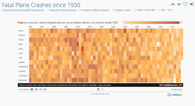
When you want to watch web videos, you often go to YouTube. When you want to listen to music from indie artists, you might hit up Soundcloud. But where do you go on the web if you want to see great data visualizations? With a few exceptions, like Reddit's Data Is Beautiful subforum, there is no one-stop destination for quality data viz on the web.
But Dadaviz aims to change all of that. Aiming to be a portal for the best visualization content on the web, it also want to teach big advertisers to harness the power of data to sell their brands.

Dadaviz started out as Wikibrains, a simple web app that made it simple to visualize Wikipedia topics as bubble maps. But looking at its traffic after launch, is soon had an epiphany: far more people wanted to browse existing data visualizations than make them.
"There was no equivalent to YouTube or Soundcloud for data visualization," says Dadaviz CEO Jishai Zevers. "So we decided to build one."
But does the world really need a YouTube for data visualizations? Zevers thinks so.
Right now, finding quality visualizations on the web are surprisingly hard to come by, their signal likely to be drowned out by the noise of a thousand shoddy infographics. Dadaviz aspires to be a curated stream for quality visualizations, in which particularly good work can bubble up to the top of the site thanks to user ratings and engagement.
But Dadaviz isn't entirely there yet. Although anyone can join, rank, and share visualizations already on the site, Dadaviz only allows around 17 independent experts to submit new ones. These can be visualizations they have created themselves, or ones they admire on the web.

The intention, says Zevers, is to eventually open the doors for everyone to submit their visualizations but before Dadaviz does, it wants to make sure that the algorithms it uses to surface quality visualizations can separate the wheat from the chaff.
"The audience who likes data visualizations is extremely sophisticated," Zevers tells Co.Design. "We don't want to let them down. We'll only open the doors to everyone once we're sure that we can keep the quality of the site high."
Once the doors open, though, Zevers believes that Dadaviz will prove a compelling platform to visualization experts who want a place to host their work. Currently, most data visualizations are just JPEG images that exist on a webpage. Hosting a visualization on Dadaviz not only makes them more discoverable to a larger audience, but it gives designers an easier, more powerful way to embed their work on external sites, with interface tools that enhance the viewing experience.

"With data visualization, it's really important for the design to just get out of the way and become invisible," explains Zevers. That's why Dadaviz strips away the site's interface to just four minimalistic buttons. Otherwise, each infographic is as big as your browser window. Even better, when a visualization is embedded on a blog post or web page, clicking on it turns it into a zoomable full-screen viewer.
Right now, anyone can browse Dadaviz's growing library of almost 500 visualizations. Those looking to submit their own work--specifically, designers and data viz experts--can email barbara@dadaviz.com to apply for the beta.