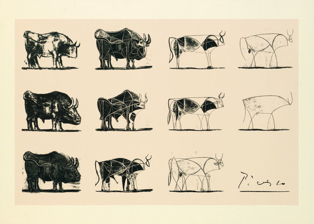
Founded by Steve Jobs in 2008 as a way to train future employees to think more like him, Apple University is an internal program that not only indoctrinates new employees into Cupertino's business culture, it also teaches new hires how the company designs its products: the Picasso Way.
In a behind-the-scenes look at Apple's secretive training program, the New York Times reports that Apple uses the 11 lithographs that make up Pablo Picasso's The Bull to explain the company's design process.

Picasso's The Bull, created in late 1945, reveals how a great artist turns an idea into a masterpiece. Starting the series with a realistic drawing of a bull, Picasso used the following 10 lithographs to mutate and dissect its form, stripping away details and stylizing its anatomy. In the end, Picasso turned a highly literal representation of a bull into an intertwined series of abstract elements that balance and counterbalance each other to make up a powerful and expressive work of art. The last image is a single sinuous line that is still unmistakably a bull.
Many artists have studied The Bull over the years. It is almost a master class in its own right on the artistic process. (You can read more analysis about The Bullhere.) But at Apple University, "The Bull" is used as a way to explain the company's design ethos, which Jony Ive once described as "A Thousand No's for Every Yes."
"You go through more iterations until you can simply deliver your message in a very concise way, and that is true to the Apple brand and everything we do," one person who took the course told the Times.
Steve Jobs was influenced by 20th-century European artists. In fact, the original Mac logo from 1984 was inspired by Picasso's contemporary and sometimes rival, Henri Matisse. That logo, incorrectly, is usually credited as the "Picasso logo" but the Spanish painter's legacy is obviously still alive and well at Apple.
Read more about Apple University at the New York Times.