Twentieth-century British typographer Eric Gill is known just as much these days for his typefaces as he is for his erotic proclivities (which include keeping a detailed diary of his rendezvouses with both his daughters and the family dog). Since 1928, the Gill Sans typeface has been an important aspect of the London Underground, where it is used for all station names and subway maps.
But the London Underground may have not even been around in 1928 if not for the accomplishments of Gill's younger brother, MacDonald, otherwise known as Max. Not only did Max Gill design one of the first maps of the London Underground, establishing a design language of colorful interconnected lines that continues to this day, but his more whimsical map of the "Wonderground" from 1914 helped save the London metro--or, at least, public perception of it.
These maps and more are on display in an exhibition of Max Gill's art at the Lettering Arts Centre in Suffolk, U.K.

Gill's Wonderground map helped the London Underground, previously considered claustrophobic and dirty, seem like a cheerier, friendlier place. Hung at every tube station, it was packed with cartoonish details such as talking birds, dead men hanging from trees, and dragons storming through Hyde Park, and it was designed to amuse and humanize the Underground's often cramped stations and carriages.
"He was one of the greatest decorative map-makers of the 20th century," Caroline Walker, Gill's great-niece, who is currently writing his biography, told the Guardian"There was always an element of entertainment in his work, and an enormous amount of wry visual humor."

Max Gill's commissions extended far beyond the London Underground. After the start of World War I, Gill was commissioned by the Commonwealth War Graves Commission to design the typeface for the headstones of soldiers who had been killed in action. A Roman typeface marked by a fastidious attention to detail, it was designed to maintain its letterforms even years after rain, sleet, and snow wore away at the headstones. Predictably, Gill's older brother Eric was jealous. He made a show in public of despising the work, calling it "feebly artistic" and saying that "good workmanship . . . cannot be ordered, like coal, by the ton."
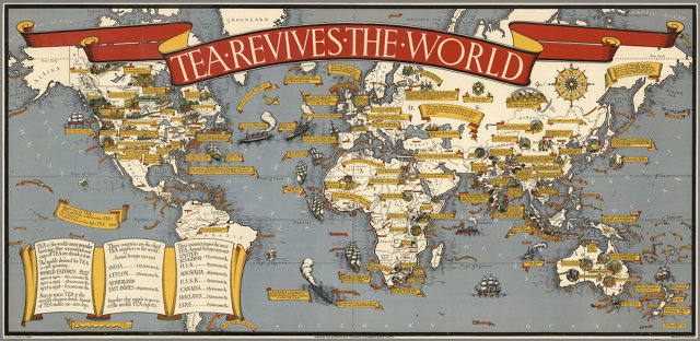
Besides saving the London Underground's public image and goosing his eccentric older brother, Max Gill produced many other works over the years, including royal ciphers, magazine covers, numerous logos, and a series of maps that illustrate the thrilling technologies of the 1930s and the 1940s with power, color, and whimsy.
The exhibit at the Lettering Arts Centre ends November 12.
[h/t the Guardian]