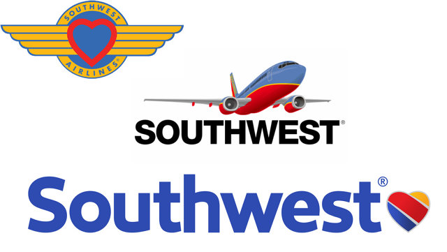
Founded in 1971, Southwest Airlines' first logo was a friendly heart emblazoned in a set of pilot wings, representing the airline's home airport of Dallas Love Field. But in 1998, Southwest replaced the heart with something starker and decidedly more corporate: an all-caps Helvetica wordmark, sometimes accompanied by a flying Southwest jet.
But the love is coming back. Southwest has just unveiled a new corporate identity that reimagines the vintage heart logo as a more colorful, modern design, along with a new custom sans-serif typeface, a new website, a fresh paint job for its fleet, and more.
Here's how the Wall Street Journaldescribes the new logo:
The new logo is a simpler heart colored by blue, red and orange stripes. It appears at the end of the airline's name, which is seen on the aircraft fuselages in bright letters of a white-like color called 'Summit Silver.'

What do you think: Love it? Hate it?