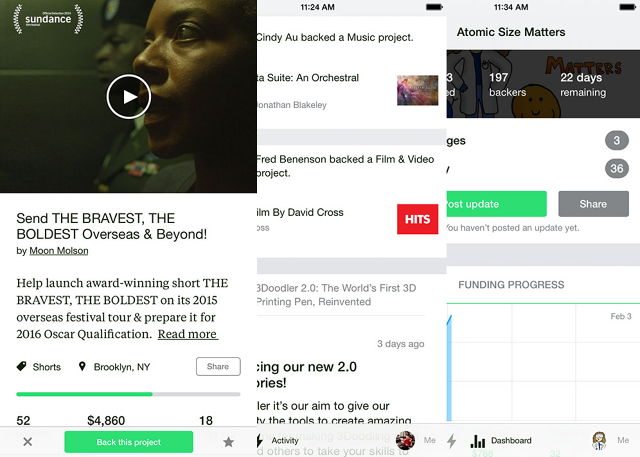
Crowdfunding super-site Kickstarter has just released a new iOS app. The first major overhaul since version 1.0 debuted almost two years ago, the new app is a major design overhaul that is now compatible with iPads and features a unique, colorful, and fluid new user interface, making Kickstarter feel almost like it was built from the ground up for iOS.
The original Kickstarter app for iPhone felt almost like Instagram or Vine, with a long vertical river of upcoming projects. That's a great approach if the only people use your service is chronologically, but Kickstarter patrons navigate the site in a number of ways: by category, by popularity, by close date, and even randomly.
Kickstarter's new card-based UI philosophy is much closer to Facebook's Paper, or the Yahoo News app: appealing colors, beautiful animations, excellent use of typography, and navigation that almost exclusively uses gestures.
Clik here to view.

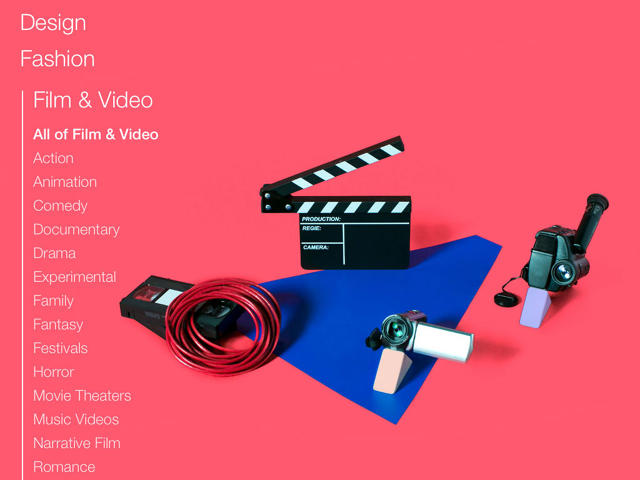
The interface is divided into a series of carousels for each of Kickstarter's categories, ranging from art to theater. These carousels are each themed with a different color and background images, so a user always knows where he is within Kickstarter's navigational hierarchy. Carousels can be sorted in different ways, according to everything from "popularity" to "magic" (Kickstarter's whimsical euphemism for the inscrutable surfacing algorithm that other services usually call "default"). Within a carousel, you can flick left or right through the cards to discover more Kickstarter projects. And when you see one you like, a tap will trigger an animation that blows the card up into a full-screen view, not unlike the NY Times' iPad cooking app.
According to Brandon Williams, the lead developer on the new Kickstarter app, the redesign was influenced largely by how Kickstarters were using the previous version. "In the original version, you could swipe left and right between Kickstarter projects," Williams tells me. "And even there was no on-screen cue saying that swiping was possible, we found that 25% of our users swept left and right to navigate between projects. It was such a nice experience, and on so inherent to smartphones and tablets, we decided we wanted to really embrace it in the redesign."
Clik here to view.

The new app design has a few advantages over the old version. For one, it's a much more distinctive-looking app. While Kickstarter 1.0 looked almost like it had been designed using an off-the-shelf app template, the new Kickstarter app is a lot more distinct and modern. The entire UI is not only swipe-based, but consistent in orientation no matter where you are in Kickstarter's navigation hierarchy (i.e. a swipe left or right always brings you to the next Kickstarter project, no matter where you are). Kickstarter hopes this will help reduce the cognitive load, letting users lose themselves in the incredible number of ideas, aspirations, and dreams that are realized (or, let's face it, dashed) on the site every day.
But it's also the start of something bigger. "One goal of the app is to create a tool to push new design, branding, and UI ideas throughout the company," lead designer Zack Sears tells me. "So instead of using our site as a testing ground for new design ideas, we'd use our apps." If the app redesign is popular, and the data checks out, it's even possible that someday the main Kickstarter website will look and feel a lot more like the mobile app. Only time will tell.
The new Kickstarter app is available as a free download from the iOS App Store.
