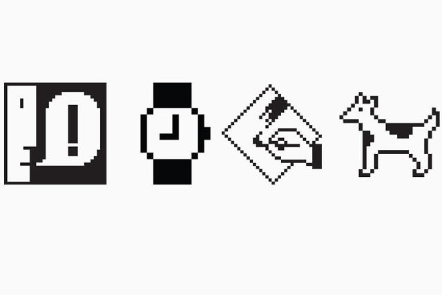
Susan Kare — the pioneering graphic designer whose pixel art icons for the original Macintosh helped define the language of graphical user interfaces (GUIs) — is being recognized by the New York Museum of Modern Art. Her archive of graph paper drawings sketching out her ideas for the original Macintosh interface have been acquired by the MoMA as part of the new exhibition, This is for Everyone: Design Experiments For The Common Good.

This is for Everyone takes its title from a tweet by Tim Berners-Lee, the inventor of the World Wide Web, who started off the 2012 London Summer Olympics' opening ceremony with those four words as a tweet. Nothing better exemplifies the spirit of that message than Kare's designs for the Macintosh's original icons. Many of her designs proved so universal that they have established a sort of universal grammar for computer GUIs. Although the cut-and-paste icon, the save icon, and the volume icon on your devices are probably a lot more colorful and higher resolution than the monochrome, 8-bit icons Kare designed during her time at Apple, they're still probably very similar to what she originally came up with: a pair of scissors, a floppy disc, and a speaker.
Kare designed all of her early icons on graph paper, with one square representing each pixel, and it is this archive of sheets that MoMA has acquired jointly with San Francisco's Museum of Modern Art. Although some of the designs she came up with as a contractor for Apple during the development of the first Mac aren't well remembered (*ahem* Mr. Macintosh), it's amazing how much of her visual iconography did stick manage to stick around.

Kare herself has always been humble about her success as a designer. In an interview with me last year, the vivacious Californian — who has a love of celebrity gossip, Game of Thrones, and surfboarding — told me that when she applied to Apple, she was basically just faking it until she made it. She had never designed a computer icon before, nor had she designed a typeface, so she just sort of winged it, never imagining that the work she did for Apple on computer icons and digital typefaces would become so revolutionary.
That's what makes Kare such a great addition to MoMA's permanent collection. Design is for everyone, and Kare's success proves that not only is great design universal, it often happens in spite of things like credentials and direct experience.
You can read more about the Museum of Modern Art's acquisition of Susan Kare's preliminary icon sketches, as well as the This is for Everyone exhibition, here.