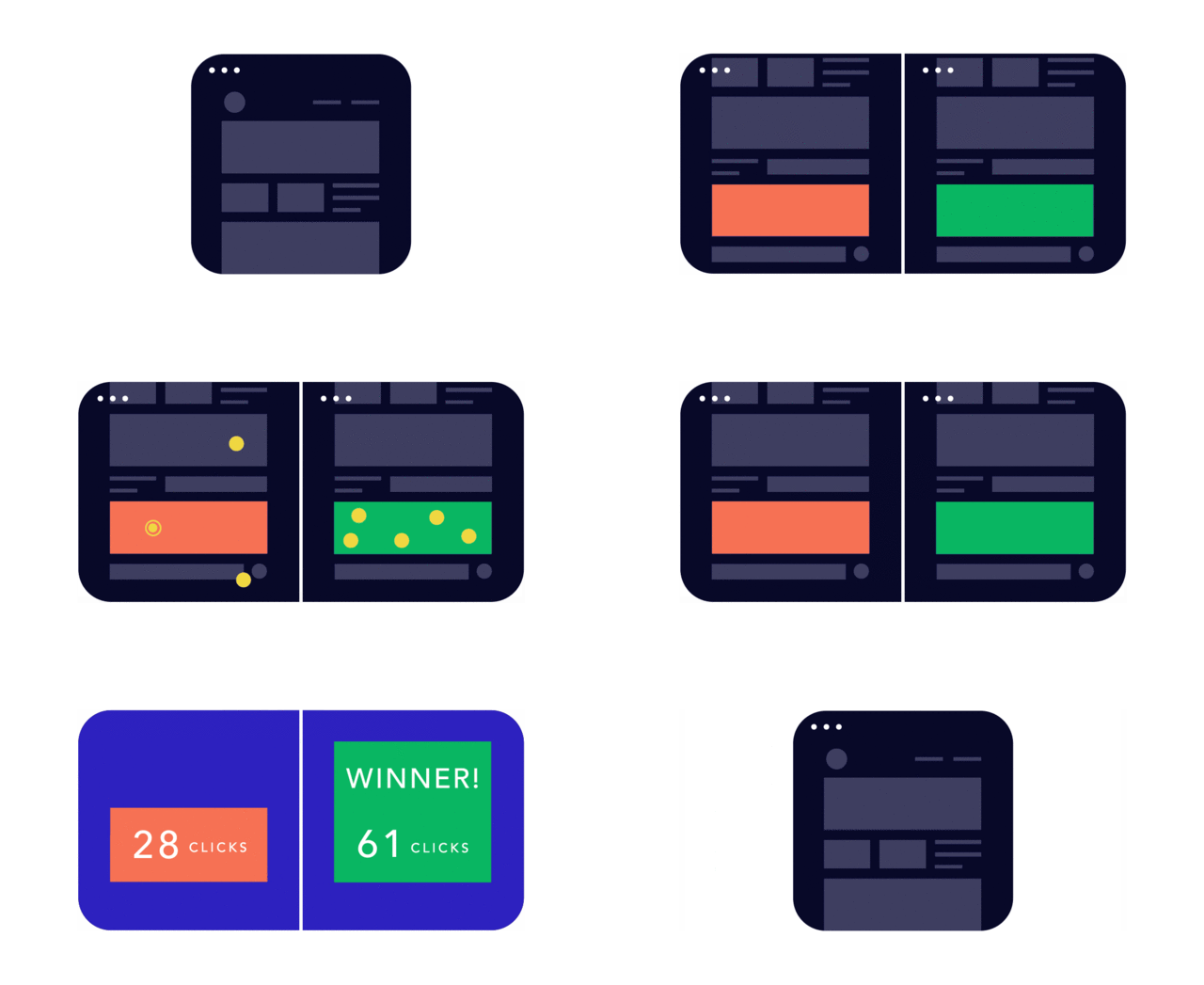
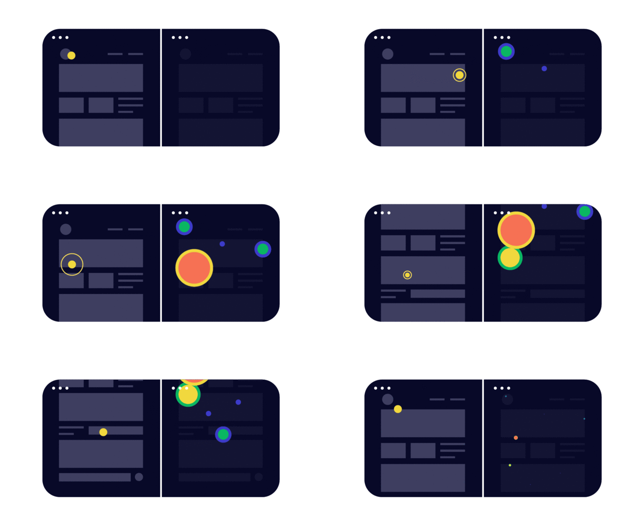
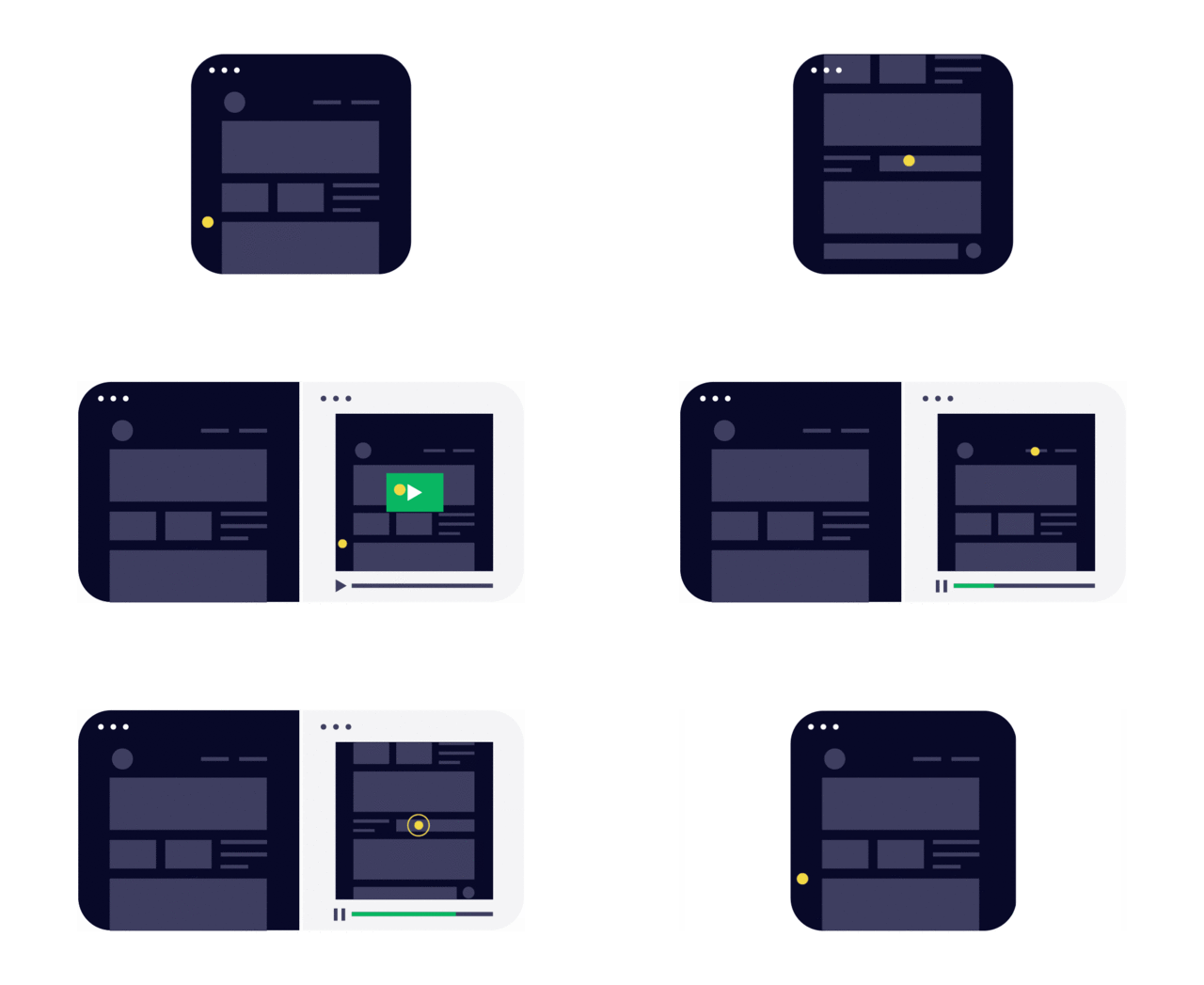
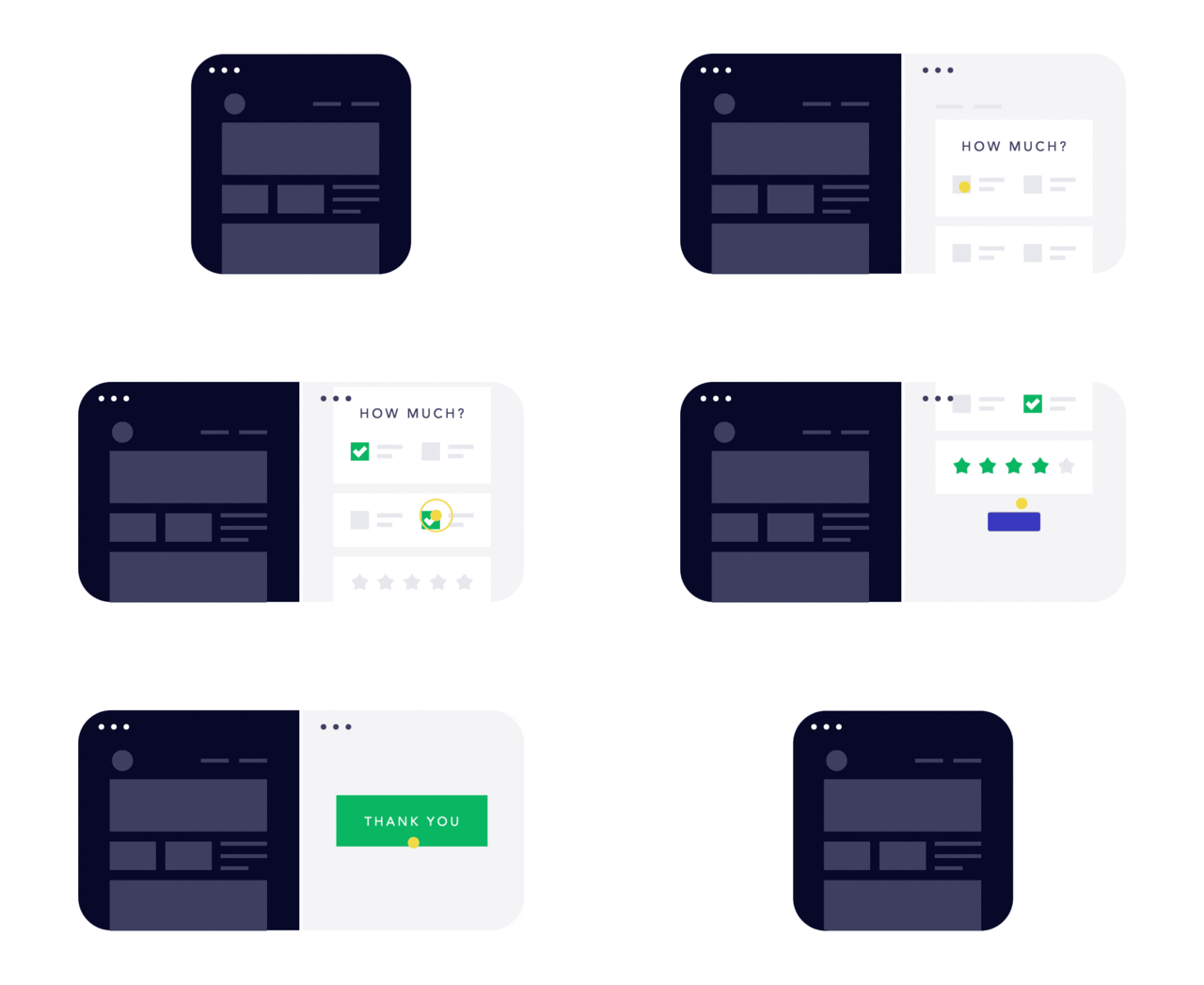
Great designs don't just fall out of a designer's brain. More often than not, they're the result of rigorous testing, using a nebulous mix of scientific and not-so-scientific techniques. But if you're not sure what the difference between a clickmap and a scrollmap is, you're in luck. Courtesy of the San Francisco web design firm, Froont, comes a new round of animations which show the four main types of UX testing that exist (and have been adopted by companies like Facebook, Google, and Netflix).
A/B Testing

A/B testing is when you expose users to two versions of a design to see which one performs better. It's a favorite tool of Google, who first used the method back in 2000 to determine how many search results to put on a page. Since then, it has rigorously A/B tested many a detail, right down to what shade of blue to use in an app design. Google isn't the only company to base design decisions around the results of A/B testing, though: Facebook, for example, tests changes to its news feed by showing users different content, and seeing what performs better.
Heatmaps

A/B testing can tell you if one design is more effective than another, but it can't tell you what specific elements users are focusing on. Enter heatmap testing, which is used to track where a user's eyes are focusing, where they are clicking (clickmaps), or how far they're scrolling down the page (scrollmaps). Last year, design firm Huge, Inc. used scroll maps to finally kill a persistent web design myth: that no one scrolls, and there's such a thing as "above the fold."
User testing

You'd think every company out there would do user testing, which is as simple as watching how a user actually interacts with your app in real life, and adjusting the design accordingly. In practice, though, even companies that ought to know better don't bother doing it. Netflix, in particular, likes to conduct user testing on new subscribers to get a sense of how easy it is to navigate its interface without a prior, intimate knowledge of it.
Surveys

Lastly, we have the survey, which is really just a focused design questionnaire. As Froont notes, the trick to an effective survey is to make sure your questions are precise enough, and you reach enough people that you can overcome your own assumptions as a designer. Surveys don't have to be technical, but we've definitely seen them turned into a cutting-edge design tool: for example, LocalData, an app that leverages surveys to help communities design their shared urban spaces.
You can read Froont's full post on the techniques designers use to test their designs here. And if you liked those, be sure to check out its previous posts on the history of web design in animated GIFs, and its animated primer on responsive web design.