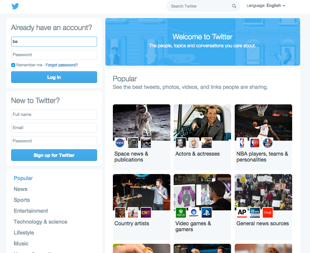
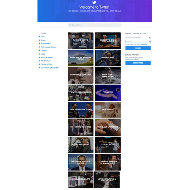
Twitter is currently experimenting with a major design overhaul that could transform the login page of the popular microblogging site into a real-time portal of news stories and celebrity updates.
Over the past week, Co.Design has discovered two separate Twitter redesigns, currently in limited-scope testing.
Both imagine the future of the Twitter homepage as a sort of social media news portal, in which tweets are grouped according to categories sorted by subject (Business News, Space News, Video Games, and so on) or author (Celebrity Chefs,Country Artists, and more). Users click a small banner to drill down to see tweets that fall within those categories.

The main difference between the two is layout. The more polished first design, spotted last week by Fast Company developer Yongzhi Huang, features a 3x3 grid of cards and a more densely packed, two-column design. The second was spotted by Search Engine Land's Danny Sullivan. Sullivan's Twitter homepage features a 2x2 grid of tweet categories and sparser, three-column design.
In truth, short of the obvious—that Twitter wants to emphasize discoverability—the new homepage designs brings up more questions than answers. For example, how would the new categories work? Would they be human-curated, driven by hashtags, sorted by algorithm, or some combination of the three? Or would you be able to subscribe to Twitter categories?

It's worth noting that Twitter, like many tech companies, periodically A/B tests multiple versions of new designs with a random, limited assortment of users. That doesn't mean either of the new designs is definitely coming, but rather is just a direction the company is considering.
Even so, the new designs could solve a couple of concrete design problems for Twitter. For one, the current Twitter homepage is totally devoid of content if you don't have an account (or aren't logged in). This design entices new users to sign up by luring them in with content. As a side bonus, it's a heck of a lot less boring than the current homepage design.
Twitter has yet to respond to two separate requests for comment, but we'll be sure to update if we hear back.