The login form doesn't immediately come to mind as something that needs better design standards. Once you think about it, though, it's obvious: How many times has a login screen coughed up a nondescript error, then refused to tell you if you got your password or your username wrong? Or how many times have you entered your login details, hit enter, then sat there for a minute, only to discover that you had to click the "submit" button instead?
Over on its blog, analytics company GoSquared has posted an enlightening rundown of how it designed a sleek and frictionless login screen. Here are a few of the GoSquared team's takeaways:
Logins should be effortless

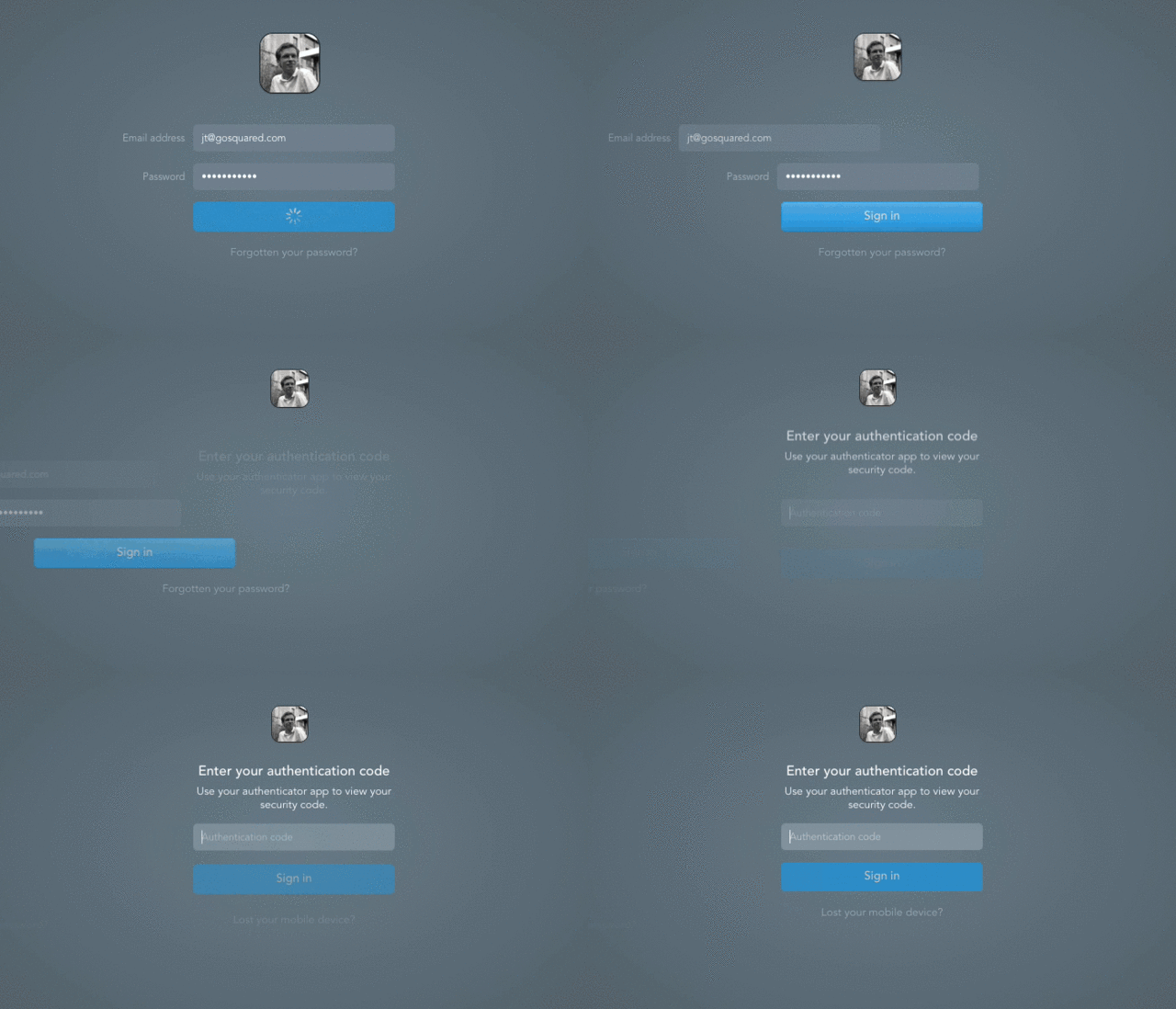
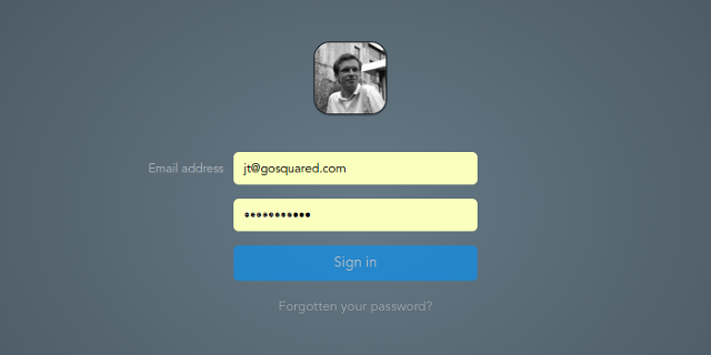
This almost goes without saying, but a login screen is just something people want to get past as quickly as possible. "The form itself is purely a means to an end," GoSquared writes. "For that reason it should be as effortless as possible." Yet with the login getting more and more complicated, thanks to two-factor authentication, designing an effortless login is easier said than done. In GoSquared's case, the designers hid a lot of the spaghetti of the login process behind the scenes, and used fluid animations and a single-page login design to feel speedy and frictionless: for example, by whisking away fields when needed, or by pulling up a user's Gravatar—a universal profile picture, used on many sites after a user has entered his email address, to personalize the experience.
Have a physical login button

These days, it's common for sites to allow you to login just by hitting "return" after entering your password. But in GoSquared's testing, designers found that a lot of people actually prefer to click a button to submit a form. So do both: a "return" key input for the power users, a physical login button for everyone else.
Correct mistakes before they happen

Nothing's more frustrating than getting a login error because of a stupid typo. For its login screen, GoSquared partnered with Mailcheck, a service that can find and correct typos in email addresses. That won't catch everything, but it will eliminate the pain point of buttery fingers accidentally typing in "gkail.con."
Smart placeholder labels

A lot of modern sites these days put the labels on a login form within the field itself. In other words, before you start typing your email address into a field, the field will just read "email address," then that text goes away. But in GoSquared's testing, as much as users liked the look of placeholder labels, they also liked the assurance of being able to review the form afterward to make sure they'd entered everything correctly. GoSquared's solution was to whisk the placeholder label to the side of the field once someone starts entering text. Not only does it generate a slick, satisfying animation, but it allows users to assure themselves before they click "submit" that they haven't done anything as stupid as, say, put their email address in the password field.
GoSquared's login page might be unique, but the techniques the designers used to build it are neither complicated, nor patented. Anyone can copy this technique. No matter how small your site, or how dusty the corner of the web it presides in, you should be putting just as much design focus into your login page as you do the rest of your site or service. After all, a well-designed login is the difference between a user and a passer-by.
Read more about GoSquared's process here.