Even way back in 2010, months before Apple debuted the iPad, the Consumer Electronics Show was a clearing house for a cornucopia of tablet designs, many of which tried to anticipate Apple's upcoming tablet. Four years ago, that meant that the likes of Microsoft rushing out a number of ill-considered devices such as the HP Slate in anticipation of Apple's forthcoming "iSlate," but things haven't changed too much today, with companies unveiling transformable tablets, giant tablets, teensy tablets, and more, all in the hopes of staying ahead of whatever Apple intends to do with the iPad lineup yet.
Yet such exotic designs miss the point. Apple is probably not going to do anything new with the design of the iPad in the near future, and there's a good reason why.
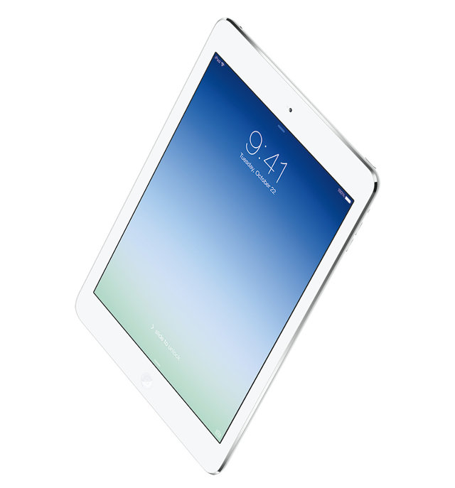
Go down to your local Apple Store right now and Apple will try to sell you two iPads: the iPad Air and the iPad mini with Retina Display. For all intents and purposes, these are the same device. They have the same processors, the same amount of RAM, the same graphics, the same storage, the same screen resolutions, the same battery life, the same wireless capabilities. The only distinction between them is one of size and weight.

Shorn from context, floating in a vacuum, both the iPad mini and iPad Air would appear identical as long as the bigger of the two was slightly further away. There's a reason for this. Both the iPad Air and iPad mini are, in fact, the same iPad, just seen from a different perspective. One is big, one is small. One is for creators, the other is for consumers. One is the high end, the other budget. But these are all matters of perception: the underlying design is exactly the same. The new iPads are a Janus: a singularity with two different facets at once.
What are we to make of all this? Simply put, as far as Apple is concerned, the iPad is now a solved problem.
When Apple first debuted the iPad in 2010, it was a solution to a perceived void in the computing market. The iPhone was more than just a cell phone: it was an ultra-portable computer that married great battery life and always-on internet connectivity with the immediacy and intimacy of touch. With the iPad, Apple wanted to bring these design considerations to a larger platform. They wanted to create a magic digital window you could carry with you.
The first iPad was a respectable first attempt at this goal, but the nature of a window is to forget it is there at all. You couldn't do this with the original iPad: it was big, it was bulky, and it was low-resolution. The iPad 2 slimmed the design down, and the third-gen iPad introduced a Retina Display that brought Apple's window to life with pixels too small to be seen by the naked eye. But it was still a supremely heavy device, surrounded by thick bezels: a window with a heavy pane of glass that was mostly frame.
Introduced in late 2012, the iPad mini stripped almost all of that window's frame away and brought the weight of the iPad down to under a pound, but that incredible portability came at the cost of slower speed and a lower-resolution display. It wasn't until this year that Apple finally made the window it wanted to begin with: two minimalist panes of glass, each weighing under a pound, that each peer into Apple's walled garden of apps and media like a pair of differently sized windows that open out onto the same digital vista.

But what now? Where do you go when you have created a device that is as powerful as most people's laptops, weighs less than a paperback, gets all-day battery life, features ultra high-resolution displays, costs less than $500, and is, in fact, only distinguishable from the next iPad by price and size? There are incremental refinements to look forward to, sure--some clock cycles here, some dropped ounces there--but if Apple's goal was to create a window, they have finally gotten to the point where they have stripped nearly everything away from that window's design besides the glass.
This why it's very difficult to imagine that an iPad five or 10 years from now will look, feel, or even function very differently from the ones we have right now. It's also why all the tablets of Apple's competitors at CES feel even more irrelevant than ever. Once you perfect the design of a window down to its essence, the only thing that matters about it anymore is the vista it overlooks.