In the world of art, architecture, and design, the golden ratio
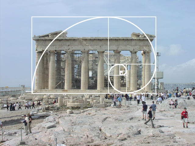
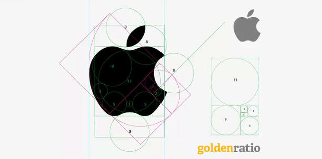
has earned a tremendous reputation. Greats like Le Corbusier and Salvador Dalí have used the number in their work. The Parthenon, the Pyramids at Giza, the paintings of Michelangelo, the Mona Lisa, even the Apple logo are all said to incorporate it.
It's bullshit. The golden ratio's aesthetic bona fides are an urban legend, a myth, a design unicorn. Many designers don't use it, and if they do, they vastly discount its importance. There's also no science to really back it up. Those who believe the golden ratio is the hidden math behind beauty are falling for a 150-year-old scam.

What Is The Golden Ratio?
First described in Euclid's Elements 2,300 years ago, the established definition is this: two objects are in the golden ratio if their ratio is the same as the ratio of their sum to the larger of the two quantities. The value this works out to is usually written as 1.6180. The most famous application of the golden ratio is the so-called golden rectangle, which can be split into a perfect square, and a smaller rectangle that has the same aspect ratio as the rectangle it was cut away from. You can apply this theory to a larger number of objects by similarly splitting them down.
In plain English: if you have two objects (or a single object that can be split into two objects, like the golden rectangle), and if, after you do the math above, you get the number 1.6180, it's usually accepted that those two objects fall within the golden ratio. Except there's a problem. When you do the math, the golden ratio doesn't come out to 1.6180. It comes out to 1.6180339887... And the decimal points go on forever.
"Strictly speaking, it's impossible for anything in the real-world to fall into the golden ratio, because it's an irrational number," says Keith Devlin, a professor of mathematics at Stanford University. You can get close with more standard aspect ratios. The iPad's 3:2 display, or the 16:9 display on your HDTV all "float around it," Devlin says. But the golden ratio is like pi. Just as it's impossible to find a perfect circle in the real world, the golden ratio cannot strictly be applied to any real world object. It's always going to be a little off.

The Golden Ratio as Mozart Effect
It's pedantic, sure. Isn't 1.6180 close enough? Yes, it probably would be, if there were anything to scientifically support the notion that the golden ratio had any bearing on why we find certain objects like the Parthenon or the Mona Lisa aesthetically pleasing.
But there isn't. Devlin says the idea that the golden ratio has any relationship to aesthetics at all comes primarily from two people, one of whom was misquoted, and the other of whom was just making shit up.
The first guy was Luca Pacioli, a Franciscan friar who wrote a book called De Divina Proportione back in 1509, which was named after the golden ratio. Weirdly, in his book, Pacioli didn't argue for a golden ratio-based theory of aesthetics as it should be applied to art, architecture, and design: he instead espoused the Vitruvian system of rational proportions, after the first-century Roman architect, Vitruvius. The golden ratio view was misattributed to Pacioli in 1799, according to Mario Livio, the guy who literally wrote the book on the golden ratio. But Pacioli was close friends with Leonardo da Vinci, whose works enjoyed a huge resurgence in popularity in the 19th century. Since Da Vinci illustrated De Divina Proportione, it was soon being said that Da Vinci himself used the golden ratio as the secret math behind his exquisitely beautiful paintings.
One guy who believed this was Adolf Zeising. "He's the guy you really want to burn at the stake for the reputation of the golden ratio," Devlin laughs. Zeising was a German psychologist who argued that the golden ratio was a universal law that described"beauty and completeness in the realms of both nature and art... which permeates, as a paramount spiritual ideal, all structures, forms and proportions, whether cosmic or individual, organic or inorganic, acoustic or optical."
He was a long-winded guy. The only problem with Zeising was he saw patterns where none exist. For example, Zeising argued that the golden ratio could be applied to the human body by taking the height from a person's navel to his toes, then dividing it by the person's total height. These are just arbitrary body parts, crammed into a formula, Devlin says: "When measuring anything as complex as the human body, it's easy to come up with examples of ratios that are very near to 1.6."
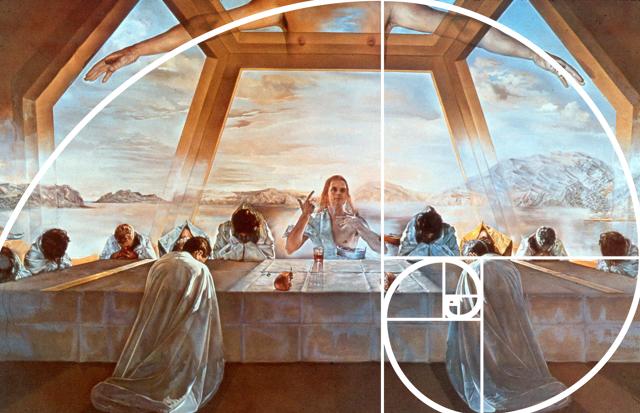
But it didn't matter if it was made up or not. Zeising's theories became extremely popular, "the 19th-century equivalent of the Mozart Effect," according to Devlin, referring to the belief that listening to classical music improves your intelligence. And it never really went away. In the 20th century, the famous Swiss-French architect Le Corbusier based his Modulor system of anthropometric proportions on the golden ratio. Dalí painted his masterpiece The Sacrament of the Last Supper on a canvas shaped like a golden rectangle. Meanwhile, art historians started combing back through the great designs of history, trying to retroactively apply the golden ratio to Stonehenge, Rembrandt, the Chatres Cathedral, and Seurat. The link between the golden ratio and beauty has been a canard of the world of art, architecture, and design ever since.

You Don't Really Prefer The Golden Ratio
In the real world, people don't necessarily prefer the golden ratio.
Devlin tells me that, as part of an ongoing, unpublished exercise at Stanford, he has worked with the university's psychology department to ask hundreds of students over the years what their favorite rectangle is. He shows the students collections of rectangles, then asks them pick out their favorite one. If there were any truth behind the idea that the golden ratio is key to beautiful aesthetics, the students would pick out the rectangle closest to a golden rectangle. But they don't. They pick seemingly at random. And if you ask them to repeat the exercise, they pick different rectangles. "It's a very useful way to show new psychology students the complexity of human perception," Devlin says. And it doesn't show that the golden ratio is more aesthetically pleasing to people at all.
Devlin's experiments aren't the only ones to show people don't prefer the golden ratio. A study from the Haas School of Business at Berkeley found that, on average, consumers prefer rectangles that are in the range of 1.414 and 1.732. The range contains the golden rectangle, but its exact dimensions are not the clear favorite.
Many Of Today's Designers Don't Think It's Useful
The designers we spoke to about the golden ratio don't actually find it to be very useful, anyway.
Richard Meier, the legendary architect behind the Getty Center and the Barcelona Museum of Contemporary Art, admits that when he first started his career, he had an architect's triangle made that matched the golden ratio, but he had never once designed his buildings keeping the golden ratio in mind. "There are so many other numbers and formulas that are more important when designing a building," he tells me by phone, referring to formulas that can calculate the maximum size certain spaces can be, or ones that can determine structural load.
Alisa Andrasek, the designer behind Biothing, an online repository of computational designs, agrees. "In my own work, I can't ever recall using the golden ratio," Andrasek writes in an email. "I can imagine embedding the golden ratio into different systems as additional 'spice,' but I can hardly imagine it driving the whole design as it did historically... it is way too simplistic."
Giorgia Lupi of Accurat, the Italian design and innovation firm, says that, at best, the golden ratio is as important to designers as any other compositional rule, such as the rule of thirds: maybe a fine rule-of-thumb, but one that good designers will feel free to reject. "I don't really know, in practice, how many designers deliberately employ the golden ratio," she writes. "I personally have never worked with it our used it in my projects."
Of the designers we spoke to, industrial designer Yves Béhar of Fuseproject is perhaps kindest to the golden ratio. "I sometimes look at the golden ratio as I observe proportions of the products and graphics we create, but it's more informational than dogmatic," he tells me. Even then, he never sets out to design something with the golden ratio in mind. "It's important as a tool, but not a rule."
Even designers who are also mathematicians are skeptical of the golden ratio's use in design. Edmund Harriss is a clinical assistant professor in the University of Arkansas' mathematics department who uses many formulas to help generate new works of art. But Harriss says that the golden ratio is, at best, just one of many tools at a mathematically inclined designer's fingertips. "It is a simple number in many ways, and as a result it does turn up in a wide variety of places..." Harriss tells me by email. "[But] it is certainly not the universal formula behind aesthetic beauty."

Why Does The Myth Persist?
If the golden ratio's aesthetic merit is so flimsy, then why does the myth persist?
Devlin says it's simple. "We're creatures who are genetically programmed to see patterns and to seek meaning," he says. It's not in our DNA to be comfortable with arbitrary things like aesthetics, so we try to back them up with our often limited grasp of math. But most people don't really understand math, or how even a simple formula like the golden ratio applies to complex system, so we can't error-check ourselves. "People think they see the golden ratio around them, in the natural world and the objects they love, but they can't actually substantiate it," Devlin tells me. "They are victims to their natural desire to find meaning in the pattern of the universe, without the math skills to tell them that the patterns they think they see are illusory." If you see the golden ratio in your favorite designs, you're probably seeing things.