On Sunday, Hillary Clinton announced her bid for presidency with a big blue 'H' connected by a red arrow pointing right. It's pretty obviously supposed to symbolize Clinton's ability to cross the aisles to get things done, or something, but it soon became a weird design Rorschach test, which the Internet interpreted as everything from the signage on a Carnival Cruise Ship to (duh!) 9/11.

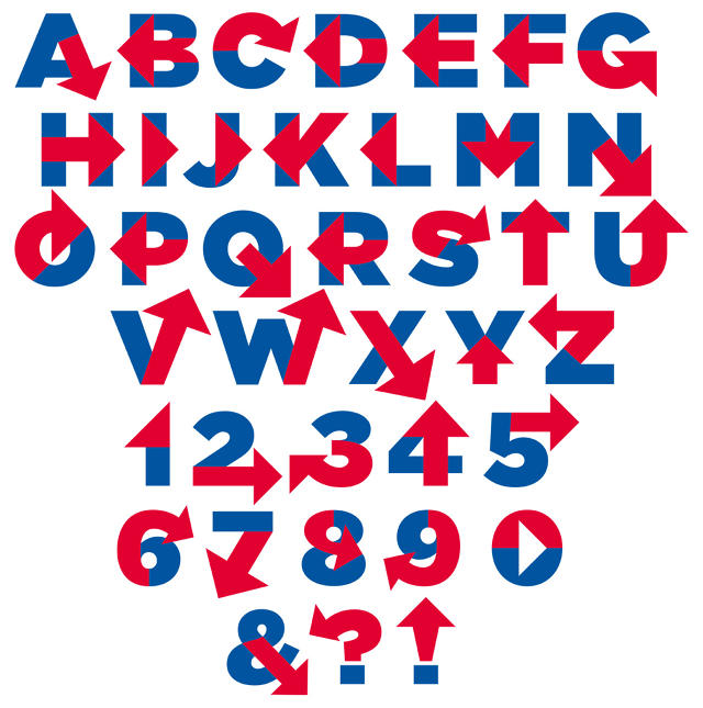
If just one little 'H' can cause all that pandemonium, imagine what a whole alphabet can do! Designer Rick Wolff has taken Hillary's campaign logo and turned it into an entire typeface, called (appropriately enough) Hillvetica. If you thought that red arrow was enraging on an "H," wait'll you get a load of it on a Q, and ampersand, or a question mark!
Sadly, Hillvetica isn't a computer downloadable font yet, but Wolff has started a crowdfunding campaign to get it off the ground. Donate to make Hillvetica a reality on GoFundMe by clicking here.