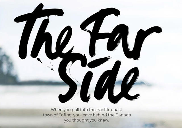
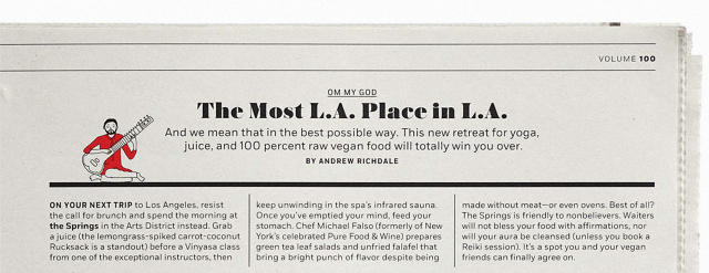
If most travel magazines are like a tired "Wish You Were Here" postcard, the new Afar is like ripping a bespoke, hand-lettered sign off of some exotic city wall, then bringing it back in your luggage. It's not just typographically beautiful, but it has a life of its own.
Although it has been published since 2009, Afar magazine's new look was orchestrated by Elizabeth Spirdakis Olson, a 36-year-old creative director who came to the magazine from Bon Appétit. According to Olson, she took the job specifically because she was offered free reign to rip it apart and redesign it from scratch.
"I had a lot of problems with the old version," Olson tells me. "The photography was excellent, the stories were good, but neither were being showcased in the best way."

The biggest pet peeve Olson had about the old Afar revolved around the typography, which lacked imagination. Olson's redesign ups Afar's cred amongst type lovers with a blend of bold new digital fonts and tactile, hand-drawn lettering.
The two new digital typefaces Afar mostly leans on are Austin, a serif by Commercial Type, which Olson says can go from super readable to super funky according to its weight, and Fort, a sans-serif by Jeremy Mickel Both Austin and Fort, though, are contrasted and complemented by calligraphy for things like headlines, pull-quotes, and sub headers, provided by a pool of freelance artists.
"My work has always integrated digital and hand-drawn type, so I wanted to bring it to Afar," says Olson. "That tactile quality of handmade type makes what you're reading seem more personal."

But maybe the biggest design change to come to Afar spawns from Olson's belief in the magazine's original mission. Although Afar always ostensibly set itself apart from the competition by putting the emphasis on experiential travel, in practice, the magazine didn't look that much different on the newsstands from other, more destination-oriented travel magazines. When Olson came onboard, she and the magazine's photography editor re-dedicated the magazine to the idea that even destinations as well-trodden as Tokyo, Rome, and Paris can feel unexpected, as long as you aren't afraid to come from it from a starkly different angle.
For example, an article on the Hawaiian island of Kauai might be expected in other travel magazines to start with a photo of a beautiful beach and some sort of tired reference to paradise. In Afar, this article begins with a hand-lettered manifesto about "chefs and cowboys, chickens and mongooses" over an image of a honeycomb. A short spread about eating in Buenos Aires is a whimsically illustrated infographic centered around a piece of raw steak, skewered on the tines of a fork. It makes for a substantially different take, where even tired destinations can seem fresh again.
Olson hopes the new Afar better encapsulates the magazine's mission to showcase the passion, energy, and excitement of travel. "Afar is about immersing yourself, wherever you go," she tells me. If early feedback is anything to go by, the redesign appears to be working: not only has the new Afar been nominated for seven design awards by the Society of Publication Designers, but ever issue has outsold the previous year's on the newsstands. The Afar.com homepage, which has seen a similar redesign, has seen similar success, seeing a 192% increase in monthly visitors year-over-year.
Correction: The original version of this article referred to the Sport typeface by Jeremy Nichols. It has been corrected to the Fort typeface by Jeremy Mickel.