Among animation and film buffs, Walt Disney's 12 Principles of Animation is rightly revered, but is that where their usefulness ends? Rebecca Ussai doesn't think so. With the help of ex-Disney animator Glen Keane, the R/GA senior experience designer explains that UX designers have a lot to learn from Disney.
Here are the five things Ussai says UI/UX designers can learn from Walt Disney, according to Ussai.

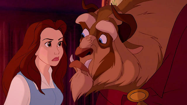
• Feedback. To Ussai, good feedback in a UI corresponds to Disney's principle of exaggeration by clearly demonstrating the result of a user's interaction. In Beauty and the Beast, the titular Beast might drop his jaw and bulge his eyes when Belle refuses to go to dinner with him. Likewise, good UI feedback should be more pronounced than it would seemingly need to be, like the almost head-like shake the iOS password screen makes when you enter your pin wrong.

• Feedforward, corresponding to Disney's principle of anticipation. In a Disney cartoon, a diver might bounce a few times on the diving board and comically wiggle his butt before diving in, thus creating anticipation. Similarly, a good UI prepares users for what is about to happen. A good example can be found in Clear, an iOS list making app which allows users to create a new list entry by pulling down on the top of the screen. In Clear, you can see this new entry start to appear even before you've pulled the element halfway down.

• Spatial awareness, corresponding to staging. In animation, staging creates the expectation that empty space will be filled. For example, if a character is standing far left with nothing to the right, you expect something to happen in the blank space. The same is true in apps. Ussai gives Calendar, an iOS calendar app, as an example of staging in UI done right: days in the app are positioned right next to each other, and when you change dates, the entire interface slides left and right, just as you'd expect them to.

• User focus, corresponding to Disney's unwritten 13th principle of animation, clarity. The idea here is never to leave your users behind, by putting emphasis on whatever element is most important at a given moment. In a Disney cartoon, this might be accomplished by making the hammer Mickey suddenly pulls out nearly as big as he is; in UI, this can be accomplished as simply as in the Pinterest app, where contextual controls appear on screen the moment a user touches a pin.

• Brand tone of voice, corresponding to Disney's principle of appeal. An app's UI should reflect the brand of the company that made it, not just looking but moving like you think that brand might move. Ussai points to Snapchat, with its whimsical ghosts playing in the app's UI margins, or how the UI of Nike+ app feels almost like it runs as much as you do.
Read the rest of Rebecca Ussai's post on UX Choreography at Medium.