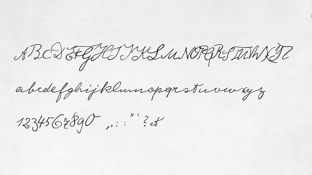
E=MC^2. It's not just a fascinating equation, it was written in a fascinating hand. The handwriting of Albert Einstein, the legendary German theoretical physicist, was unique: a wondrous calligraphy that borrowed elements from both the Latin and Kurrent, an old form of German handwriting based on late medieval cursive. Now, thanks to German typographer Harald Geisler, Einstein's handwriting is becoming a font.
Geisler is no stranger to the pages of Co.Design. The designer is the creator of a beautiful typographic calendar made up of 2,015 typewriter keys, and successfully crowdfunded an effort to digitize Sigmund Freud's handwriting in 2013.
But before he'd started work on his Siggy font, Geisler toyed around with digitizing Einstein's handwriting. It wasn't until he met Elizabeth Waterhouse, however, that he thought about making it into a font. A graduate from Harvard with a degree in astrophysics turned dance theorist, Waterhouse had a connection to the physics world which allowed her to attain rights for a font from the Einstein estate.

Like his Sigmund font, Geisler started his digitization efforts by combing through samples of Einstein's handwriting, and identified four versions of each character, both uppercase and lowercase, which could be considered typical samples. Simultaneously, Geisler tried to get a sense for the rhythm of Einstein's hand: how the discoverer of general relativity linked an 'a' to a 'b', or a 'b' to a 'c', making notes of the kinds of slopes and distances Einstein used. From there, Geisler meticulously copied every sample letter into a grid, and started tweaking it to make sure that it worked as a typeface.

It's a very labor intensive process, one that Geisler says required him to turn off his aesthetic instinct, especially when it came to designing individual characters. "I had to trust my process. When drawing the letters, I'd often be taken back by a letter that looked really odd or ugly by itself," Geisler tells me. "Only when it was combined with other letters did its place in the whole make sense."
Now that he's almost done after a couple years work, Geisler is currently taking pre-orders for the finished Albert Einstein font on Kickstarter. Backers who donate at least $25 will receive a digital copy of the font in June 2015, coinciding with the centennial of the General Theory of Relativity.
"Albert Einstein's handwriting was totally unique," Geisler tells me by email. "His rhythm is continuous, while his letters are both very disciplined and extremely playful, especially with his initials, A and E. His line spacing is also extremely accurate, as if he used a ruled paper under his writing paper to keep it in order. He was a thinker outside of mainstream physics, and this was also reflected in his style of writing."