Yesterday, Yahoo pushed out the biggest update to Flickr, maybe ever. An update two years in the making, Flickr 4.0 is a total redesign on every platform that uses magical backend algorithms and a slick UI to make it easy to upload, access, search, or share any photo you've ever taken, no matter what the device. It's the type of update that screams: "Flickr's identity crisis is over. It's time to take Flickr seriously again."
First things first: the new Flickr really wants you to backup all of your photos on the service. Flickr will store up to 1 terabyte of photos online for free, so most people won't run out of space. On desktop, the new Flickr Uploadr app will silently scan your hard drive, and automatically upload any photos it finds to the web; meanwhile, the Flickr app for smartphone and tablet will keep your Camera Roll automatically backed up to the cloud. And don't worry about your dick pics leaking out unknowingly: everything's set to private by default.

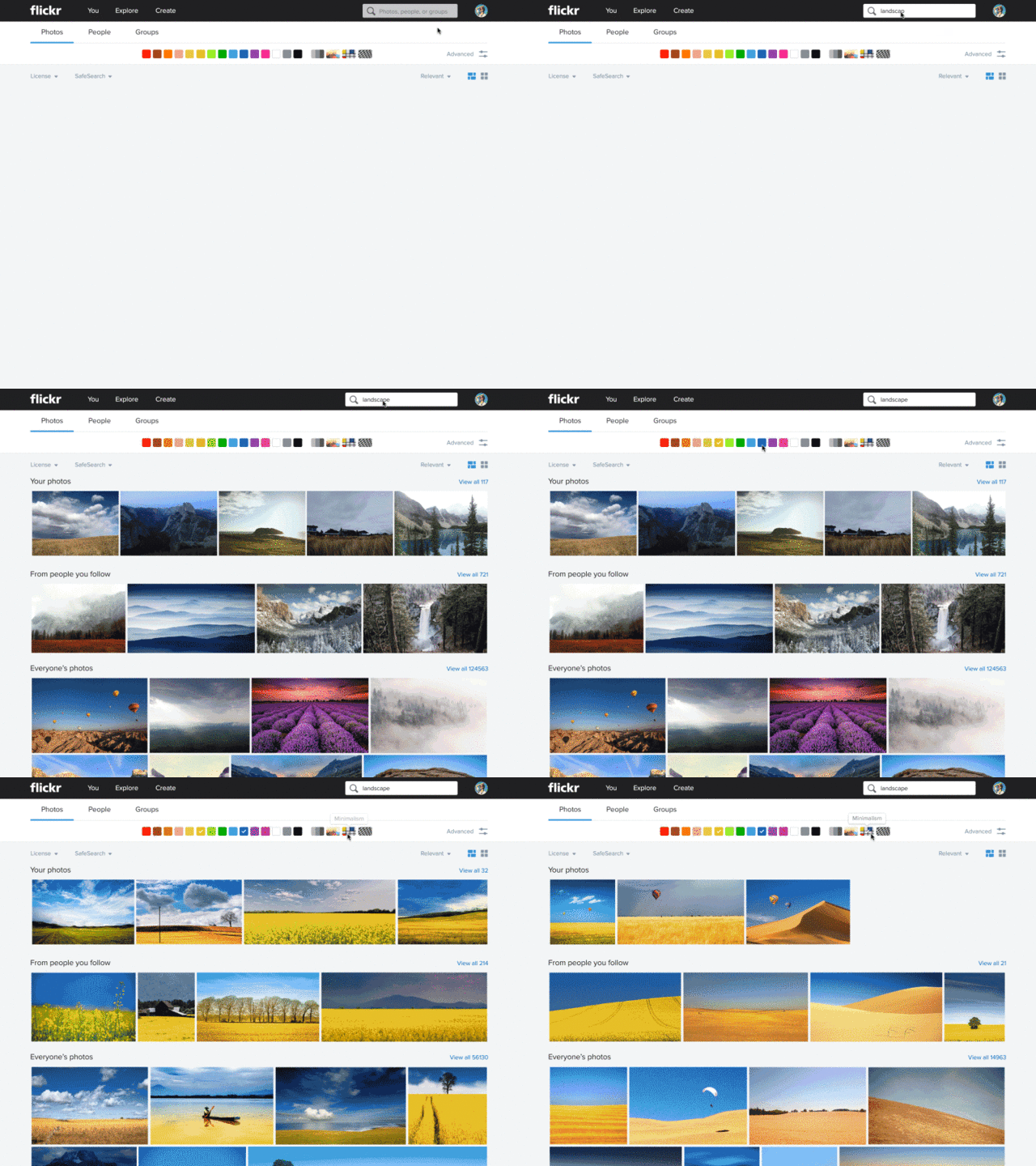
Once your photos are uploaded to Flickr, though, is when the magic happens. Let's say you want to find a picture of a bird you took a few years ago. To find it, all you have to do is search for "bird," and Flickr will automagically identify all the pictures of birds you ever took. But what's really amazing is you can further drill down from there. For example, if you're looking for an artsy black-and-white picture of a bird you took with a shallow depth of field, you can do that, all from Flickr's new search menu.
The thing that makes all this possible is a visual machine learning algorithm that automatically looks at every picture when you upload it and tries to identify its contents. Flickr can detect photos of nature, people, animals, and more. There's even a Magic View that sits in your Flickr camera roll, allowing you to sort images by date, content (things like whether your photos contain people, animals, nature, landscapes, and so on) or even style (are they bright, or abstract, or full of patterns).
You can sort of liken the new Flickr to Gmail when it came out. Before, Flickr wanted you to do all the heavy lifting to keep images organized. Now, they've built the tools-in that manually organizing your photos are optional. Powerful search can pretty much do everything else.

In addition to just making it easier to find the photos you're looking for, another major change in Flickr 4.0 is a totally overhauled photo manager, which makes it easy to select, tag, move, folder, delete, download, and share multiple images. "We really wanted to focus on the pain points of photography for this redesign," Shaun Forouzandeh, director of user experience design at Flickr, tells me. "We wanted to make the in-between steps easy and fun."
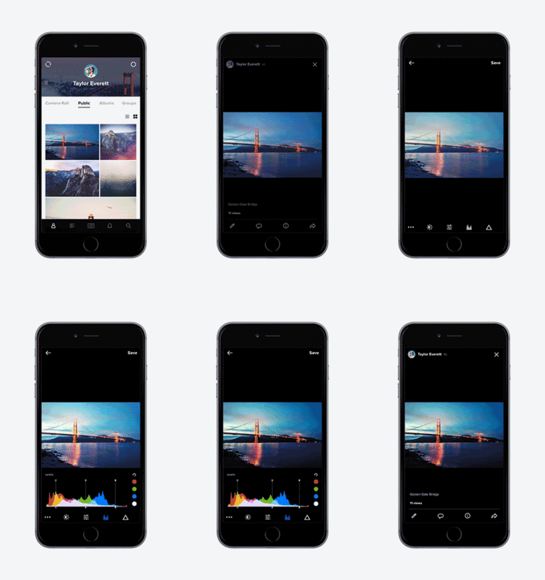
The redesign does much to restore focus and sense of purpose to a great web product that has increasingly felt directionless. Just last year, Flickr redesigned its smartphone and tablet apps to work a lot more like Instagram: when you opened up the app, it took you right to a feed of your friends' images. Version 4.0 takes a big step back from that, for the better: although you can still easily access your friends' photostream, Flickr 4.0 takes you directly to your camera roll when you load up the app.
It's a seemingly small change, but it's actually profound. Flickr 4.0 is Flickr's way of saying, hey, we know you're going to share your images on all sorts of different services, and we're okay with that. We're just hear to make that easier. No matter what device you took a picture on, how many photos you have, or how long ago you took it, we're here to make it easy for you to do whatever you want with that: for example, share it uncropped on Instagram, send it in an iMessage, or put it in a Dropbox-style folder that anyone with the link can see. Trust us to hold on for your photos for you, and we'll do the rest.
Read more about the new Flickr updates here.