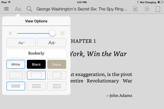
Amazon's Kindle e-reader is a lovely single-purpose gadget, with an industrial design ethos that, in its singular focus on the purity of e-reading, even Dieter Rams could love. The iOS and Android apps are even great. But no matter what gadget you read on, the Kindle's typography and typesetting has always been a bit of a disaster, with six different typefaces, that are barely suitable for reading an actual book. (Who reads books in Futura, anyways?) As for the typesetting, "hideous" is the word many type lovers would use to describe it.
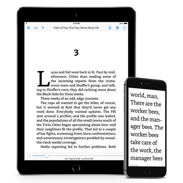
But today, Amazon is making a big step towards better typography on the Kindle. Not only are they unveiling Bookerly, the first typeface designed for the Kindle for scratch, but they're finally solving the Kindle's typesetting problems with an all-new layout engine that introduces better text justification, kerning, drop caps, image positioning, and more.

Bookerly - The First Font Designed for Kindle
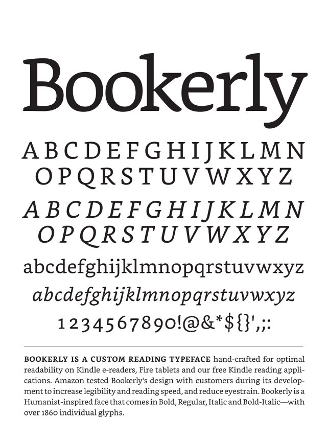
Replacing Caecilia as the new default font for Kindle, Bookerly is a serif that has been custom-made by Amazon to be as readable across as many different types of screens as possible. Like Google's Literata, Bookerly is meant to address many of the aesthetic issues surrounding e-book fonts.

In appearance, it looks something like if Baskerville, a 225-year-old typeface that has been shown to shape our perception of truth, and Caecilia made a baby. Both of these parent fonts were previously available on the Kindle, but they had issues. On low-res devices, Baskerville's thin, elegant lines looked crude, where as Caecilia, a slab serif, was just a bizarre choice for Amazon's previous default font: although it's highly readable, it's a type of font best used for headlines, not body text, because slab serifs often look and feel bolded, even when they're not.
Bookerly addresses both of these issues. No matter what screen you're on, Bookerly was designed from the ground-up to be even more readable that Caecilia. According to Amazon's internal tests, that means it's about 2% easier on the eye. That may seem like a small improvement, but spread that 2% across millions of Kindle users and billions of pages of e-reading, and it all starts to add up.
Read Bookerly at much larger font sizes, and some of the fonts delicate touches are allowed to shine: for example, the delicate way the upper arm almost licks the stem of the lower case 'k'. Bookerly even includes some lovely ligatures that makes reading on the Kindle feel more like printed typography, like the way the terminal on a lower case 'f' will replace the tittle on the lower case 'i', if they are right next to each other.
While Bookerly's not an entirely new typeface—Amazon silently soft-launched it on the Kindle Fire earlier this year, a development only a few people noticed—it's a lovely font. And in my testing, I thought it was even more pleasant than Palatino, the typeface I previously used on my Kindle.
Digital Typesetting That Doesn't Suck
But to be honest, Bookerly's not really what has me excited. The Kindle's new layout engine? That's another story. After almost eight years, Amazon's finally starting to get e-book typesetting bloody right.
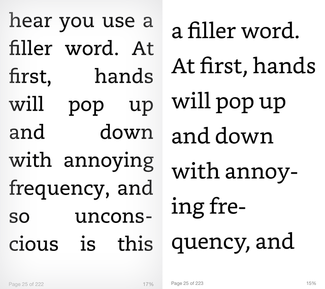
Previous to today's update, when you read an e-book on the Kindle, sentences were fully justified. In other words, no matter how big your font size, Kindle's invisible software always laid-out the page so that the left and right margins were completely straight. And it was ugly. Words were never split across lines, so there could be as many as half-a-dozen spaces between words.
Printed books just don't handle typesetting in this way: they fit as many words into a line as possible while maintaining the spacing between them, and they aren't afraid to either break a word in half to hyphenate it or to leave a gap at the end of a line.

But the new app finally gives the boot to the hideous absolute justification of text that the Kindle's been rocking since 2007. The new layout engine justifies text more like print typesetting. Even if you max out the font size on the new Kindle app, it will keep the spacing between words even, intelligently hyphenating words and spreading them between lines as need may be.
The layout engine also contains some beautiful new kerning options. They're subtle, but once you see them, you can't unsee them: for example, the way that the top and bottom of a drop cap on the Kindle now perfectly lines up with the tops and bottoms of its neighboring lines. Like I said, it's a small detail, but one that even Apple's iBooks and Google Play Books doesn't manage to quite get right.

Just a quick note if you don't see the improved layout engine when you update the app. Amazon needs to reprocess each book in their Kindle catalog to support the feature. They're currently working through an extensive backlog, so if you don't see any improvement, re-download your book, or try again later. Some of the books updated so far can be found here.
The Future
Instapaper founder Marco Arment once lamented that the Kindle's typography and layout engine was so bad, it felt like it only had a staff of one person "who's only allowed to work on it for a few weeks each year." That's apparently not true: Amazon tells me that the Kindle team is significantly larger than just one dude, although they refuse to give exact numbers. But they are aware of the criticisms from long-time Kindle users, and hope this new update will address some of their pet peeves.
"In e-books, you have this tension, between the purity of a book's layout as it was envisioned in print, and the flexibility that e-reading brings to a customer, by allowing you to increase font size, read books across multiple devices, and so on," says Dave Limp, senior vice president of Amazon Devices. "It's a tension between the beautiful but static nature of print, and the dynamism of digital. We're trying to strike a balance between those two things."
It has proven a tricky task, drawing criticism from the likes of Daring Fireball's Jon Gruber, who once noted: "Amazon's goal should be for Kindle typography to equal print typography. They're not even close."
Limp's comments, however, suggest that Amazon had criticisms like this in mind. "We do care. Our goal at Amazon is to eventually make digital typography as rich as it is in print. I'm not sure exactly when that day will come, but I'm optimistic we can get there."
Amazon updated the Kindle app for iOS with Bookerly and a new layout engine today this morning. Another update rolling out the new font and typesetting technology to users of Amazon's line of e-ink readers, Android, and other devices will be available later this summer.