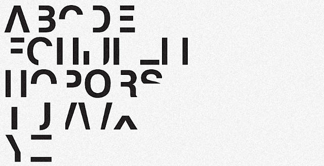
Good font design can't cure dyslexia. But it can raise awareness.
In his last year as a student at the London School of Communications, designer Daniel Britton was diagnosed with dyslexia. When Britton told his classmates and teachers about his diagnosis though, they just stared at him. They thought he was stupid. They thought he was lazy. They thought he was just slow.
So Britton decided to show them how it felt to be dyslexic. He designed a font, also called Dyslexia, which simulates the sense of frustration a dyslexic feels when he or she tries to read. Taking Helvetica as its base, Britton's font subtracts roughly 40% of the typeface's lines, to make one of the most readable typefaces around a veritable struggle to read.

That 40% isn't scientific: Britton admits that dyslexics don't necessarily have a 40% diminished ability to read than normal. It's just the rough average of the sweet spot he reached, trying to reduce Helvetica to a median between total unreadability and just enough visual information to labor through, albeit with vastly diminished reading times.
According to Britton, he's not trying to recreate the visual experience of dyslexia, which he thinks is ridiculously mischaracterized in the media. "At least in the UK, awareness ads will represent text as seen by dyslexics as a bunch of blurry letters, or an upside-down letter form," Britton says. "At least for me, that's not what it's like at all. It's more like text looks normal, but the part of my brain that decodes it just isn't awake."

And Britton thinks he's been successful in trying to convey what the learning disability is like. "When I showed it to classmates, they were suddenly like, 'Oh! Okay. I get it,'" he says. "Which is all I needed to hear."
Britton's font didn't just make his friends and classmates better understand his condition. It got him a job.

"My professor turned out to know someone in Parliament who oversaw the local commission on raising dyslexia awareness," Britton says. So now he does that, coming up with new designs that better represent the dyslexic condition, and replacing the very awareness ads that he hated.
Dyslexia isn't yet available as a downloadable font, but Britton hopes he can make that happen soon. In the meantime, you can see more of his design work here.