"Most people make the mistake of thinking design is what it looks like,"Steve Jobs once said. "That's not what we think design is. It's not just what it looks like and feels like. Design is how it works."
It's an ironic quote, given the countless examples of Apple making "how it works" an afterthought, especially in software. What about iTunes, MobileMe, and Apple Maps? What about the unpredictable Siri, the wildly inconsistent Apple Watch UI, or, for that matter, the completely broken iOS Shift Key? How well do any of these things "work"? For a long time, Apple could get away with these occasional lapses, because in most ways, it was just light years beyond the competition when it came to industrial design and painting beautiful pixels.
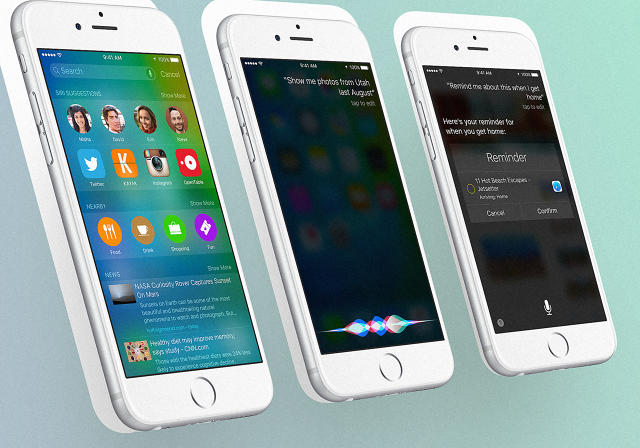
How things change. Yesterday at WWDC, Apple spent a bloated 270 minutes announcing fix after fix for what's broken in the company's software and services across two new versions of its operating systems, iOS 9 and OS X El Capitan (really). For iOS 9, Apple announced a successor for Newsstand, the company's broken attempt to bring magazines to the iPhone and iPad, with News, a Flipboard-like news curating app. For both OS X El Capitan and iOS 9, Apple announced Apple Music, not just a new streaming music service but a tacit admission it was time to drag iTunes to the glue factory. And for both iOS and OS X again, the company is trying to unbreak Siri by allowing it to proactively recommend apps and tie machine learning into search results, effectively turning it into iOS's version of Google Now. And so on.
What's important about these developments? First of all, all of the announcements are stuff other companies are already doing, from Spotify to Facebook to Android. Second: They're all about algorithms, search, curation, and deep learning, not what we usually think of as "design." This year's WWDC was a tacit admission that Apple needed to play catch-up. Cupertino spent so much energy over the past five years paying attention to the surface details of their products, it ignored a seismic shift in the industry: AI is the new UI
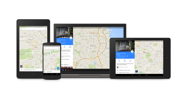
Here's the truth: while Apple's industrial design remains best-in-class, it is no longer at the top of the heap when it comes to digital UI or UX. Far from it. On the mobile side of things, ever since its Material Design refresh, Android has become a much more thoughtfully designed product than iOS, with a vivid and cohesive graphic design ethos, all its own.
That's a hard pill to swallow for some. For years, Apple fans (like me!) sneered at Android. "Look at this gross-looking OS those search engine eggheads have put together," we said. Where Android stole from iOS, it was merely derivative; where it was wholly original, it was just appalling. "Why doesn't Google just leave the design to Apple and do what it does best: all that crazy search and machine learning shit no one else wants to do?" we asked ourselves.
The thing is, Google knew something we didn't. It knew that Apple's taste was a temporary advantage. It knew that designing a host of functional, universally integrated services was harder than designing pixels. And in the protracted thermonuclear war between Apple and Google, which first started when the search giant launched Android in 2008, Google knew that ultimately, it would be AI, not UI, that would win the war.
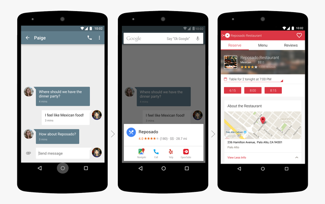
At this year's I/0 2015 conference, Google announced Now On Tap, the next-gen version of its Google Now digital assistant, which can contextually improve how you experience apps using machine learning and deep linking. So, for example, let's say you get a text message from a friend, who suggests meeting up that night for drinks before seeing the latest Mad Max movie. Tap and hold your Android phone's home button and Google Now On Tap will whip up a card, revealing showtimes for theaters nearby playing Mad Max: Fury Road, as well as bars around that theater, along with its Yelp reviews. It anticipates your needs.
Apple just has nothing like this. With the newly announced iOS 9 and OS X El Capitan, Apple is trying to build these sorts of smarts into Siri, but it has an uphill battle to climb. It has to try to catch up in the wake of both unparalleled post-Snowden privacy concerns that makes us ever more worried about giving up our data, and a slate of widespread iCloud security hacks that showed that Apple couldn't be trusted with the data it already has. And this is just one example of the sort of things we take for granted from Google that Apple is only now starting to truly work on.
Apple has long relied on having better taste in design than its competitors. This has served Cupertino well enough over the years, but you can learn good taste—competitors like Google and Microsoft have (hey, what can I say? I like Windows Phone, and I'm hopeful Windows 10 will solve a lot of the pain points of Windows 8). Increasingly, the only thing that's left is how things work. And despite Steve Jobs's famous 2003 navel-gazing about design, it's something Apple hasn't been paying enough attention to. The things Google was always good at—intelligent search, robust cloud services, and predicting what its users want next—are far harder to learn. Yet as our screens get smaller and fade away, that's where the next major campaign in the war between Apple and Google needs to be won.