According to the World Health Organization, more than 1 billion people worldwide have a disability. To Astrid Weber and Jen Devins, Google's resident accessibility experts, that stat should be stamped on the back of every designer's hand, because it means that one out of every seven people on the planet is potentially left behind by thoughtless design decisions. At this year's Google I/O conference in San Francisco, I sat down with the two UX experts and asked them what designers could do to make their apps more accessible. The key, they told me, was using your imagination and having a little more empathy. Here are six ways designers can reach that extra billion.
Pay Attention To Color
Color blindness is one of the world's most common disabilities. It affects approximately 1 in 12 men (8%) and 1 in 200 (.5%) women worldwide. These statistics prove that designers should be thinking very, very hard about the colors they use in their apps. "Colors are a great way to convey critical information in an app, but they can't be the only way," Devins says.
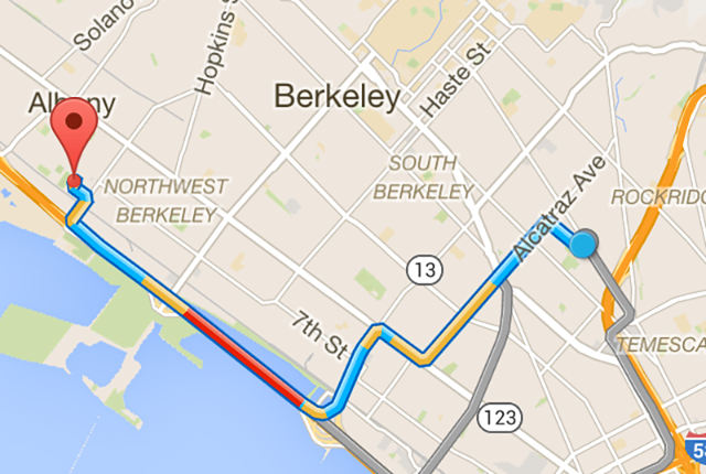
She gives traffic apps as an example. If there's a traffic jam up ahead, you can't just mark it in red to be understood. If you do, there are millions of users suffering from red-green colorblindness who won't know what you're talking about. You also need to accompany it with a label, or some other visual cue that doesn't depend on color to be understood.
Know How Screen Readers Work
Blind people use screen readers to access the internet and navigate smartphones. Yet few developers design their apps with screen readers in mind. "On smartphones, the way screen readers typically work is that a blind user navigates through all the elements on a page from top to bottom by swiping," Devins. "It's a very linear experience."
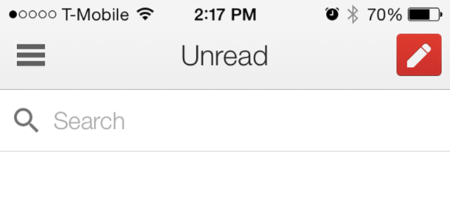
That's a problem. It's common in many apps for the most important interface elements to be at the bottom of the screen, closest to a user's thumb: for example, Instagram's button to take a new photo, or Twitter's navigation buttons. It's fine for sighted users, but users with visual impairments might have to swipe 50 times or more to reach that element, every time they switch screens.
The better solution? Put your most important interface elements closer to the top. That's how Google does it: open the Gmail app on your phone, and you'll see that the "Inbox" and "Write New Mail" buttons are at the top of every page.
Label Everything Usefully
Most designers know that interface elements and images need to be labeled for screen readers. But they often don't think about labeling them usefully.
"It's not enough to just label a close button with 'CLOSE,'" Devins says. "Close what? Make that text contextual and relevant. For example, 'close the new message window' or 'close the share window.'"
Remember: while a regular user might know where they are within an app's workflow, a user who is visually impaired will not.
Put Yourself In Your Users' Shoes
Empathy is all about understanding, but many designers never think beyond what life is like for them. Handicapped users have a very different experience of the world, even doing simple things. You need imagination if you're going to design an app that works for them.
"We'd love to see more developers imagining their users' journey," Weber says. "Put yourself in their shoes. Think about how you'd need to perform a task in your app if you were blind, or deaf, or had motor disabilities, and then pay attention to the steps it takes to get that task done."
Get To Know People With Disabilities
"You really can't ever replace the experience of seeing how how someone uses your app," Weber says. "No one will ever say, 'I just don't care,' but if they don't have that experience—a family member, or a personal connection—that allows them to understand how their design decisions are impacting the disabled, they might still not get it."

Weber recommends that designers try to make that connection. Within Google, Weber and Devins hold regular workshops with app teams, providing insight into how the disabled use their apps. She showed the dev team how users with visual disabilities were faring with Google Calendar, for example.
"There were so many different reactions. Some developers were mortified that their app was making someone struggle, while others were just delighted. 'Hey look, someone's able to do something they could never do before!" But if they hadn't actually seen someone with a disability use the app for themselves, they might never have understood the issue.
Conclusion
Ultimately, the biggest mistake Weber and Devins say they see when it comes to accessibility is that designers try to tack it on at the end. That's a big mistake.
"From a pure efficiency perspective, you should do everything you can to build accessibility into your design," Weber says. "If you do it later, you'll have to revisit everything you've already done: there's a ripple effect through your entire design, because accessibility is not a feature. It's just part of good design practice."