How many people do American police kill every year? It's a question that should have a concrete answer, yet no one really knows: no government agency transparently and accurately reports the total number of Americans killed every year by police officers. This despite the fact that media reports suggest that American police kill more people in an average month than the U.K. police killed last century. In the wake of high-profile killings of Michael Brown, Freddie Gray, and scores of others, it's a statistical blind spot that needs addressing more than ever.
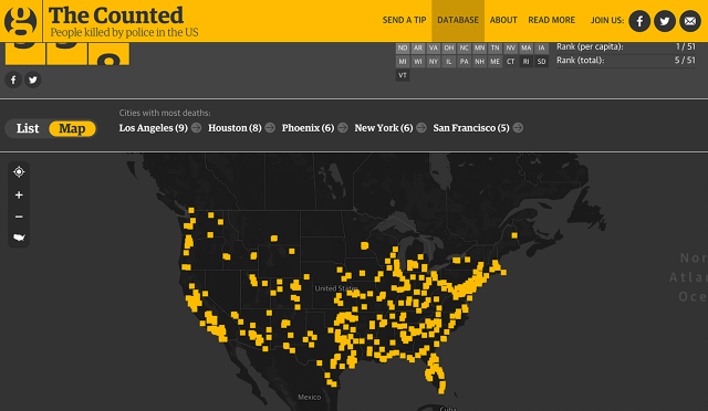
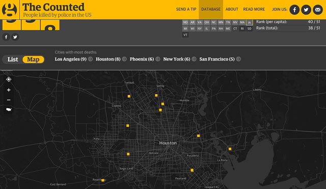
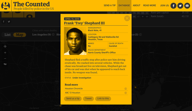
Given the lack of data, The Guardian took it upon itself to put together the most comprehensive database on American police killings so far. The result, The Counted, is an explorable interactive visualization of all the people police have killed in 2015 so far. Pulling their data from media reports and verified user tips, The Counted gives all known details about these killings, and lets users drill down into their statistics: which cities account for the most deaths (Los Angeles, Houston, and New York), which races are most affected (whites account for most of the deaths, but they are outnumbered by black deaths almost three-to-one when adjusted by capita), how often these killings happen (about four or five deaths a day), and so on. Deaths highlighted in orange are ones that The Guardian feels warrant more reporting: the rest are represented in neutral gray.

According to Kenan Davis, an interactive journalist with The Guardian, The Counted was created to address the troubling lack of data about police killings in America. The project started in late February, and took the better part of three months for the Guardian's interactive team to build. The interactive isn't flashy, but it wasn't designed to be: the Guardian team made a pointed effort to stay away from schmaltzy design details that could politicize the data. Rather, they wanted it to be a flexible, expandable front-end to a series of statistics that are powerful in their own right. The goal is to make it easy for people to find the information you want, so the interactive largely focuses on allowing people to run reports, and drill down into more data, not just look over a list of names. If people want to tell more emotional or political stories based on that data, The Guardian encourages it: anyone can download their database to visualize as they see fit.

"With The Counted, the goal was to highlight the absence of official data on the number of police killings in America," Davis says in a phone interview. He points out that while the FBI ostensibly reports these numbers, they are both out-of-date and incomplete. The most recent official report on what the FBI calls "justified" police killings in America is from 2013, and puts the number of deaths that year at just 46. Compare that to the Guardian's database, which has 534 police deaths for just the first six months of 2015 alone, as of writing. "It really gets the point across how skewed the official numbers are," he notes. (If you want more information on why the FBI's official numbers are so out-of-whack, the Washington Post has a good explainer here. Suffice to say that "unjustified" police killings get buried, and only a small percentage of law enforcement agencies contribute to the report anyway.)
In designing the look of the The Counted, the biggest challenge was striking the right tone. "We didn't want this to be a memorial website, but rather a humanizing record of instances," Davis says. Instead of putting up a long list of pictures and names of people killed by the police, The Guardian opted to highlight the context of the killings: the victim's age, race, where they lived, and the circumstances of their deaths.

The Guardian has a team of editors and journalists responsible for verifying new additions to the database, and reporting them out. Even so, the Guardian doesn't know how accurate The Counted actually is. "I can say this is the best we feel we can possibly do, given the data we have, but does it account for all police killings in America?" Davis says. "We don't know. But the fact we can't say if it's accurate highlights the need for more transparency. The government should be tracking this, and they're not. The ultimate goal is to get there to be a change in legislation."
Since it was unveiled earlier this month, The Counted has had deep impact. More than 400 tips have been submitted through the site, and over 8,000 people are following the project on Facebook. U.S. Senators are also starting to call for mandatory reporting of police killings, similar to what The Counted does.
Perhaps good design paired with rigorous reporting really can effect change. One thing's for sure: with The Counted on track to tally more than 1,000 police killings before the year is done, just how many people need to be killed before America wakes up about the problem?